Flex – Обзор
Flex – это мощная платформа приложений с открытым исходным кодом, которая позволяет создавать традиционные приложения для браузера, мобильных устройств и настольных компьютеров с использованием одной и той же модели программирования, инструмента и кодовой базы.
Flex предоставляет FLEX SDK, состоящий из библиотеки классов Flex (классы ActionScript), компиляторов Flex, отладчика, языков программирования MXML и ActionScript и других утилит для создания выразительных и интерактивных многофункциональных интернет-приложений (RIA).
Flex заботится о пользовательском интерфейсе (UI) или клиентской функциональности веб-приложения. Функциональность на стороне сервера зависит от серверных компонентов, написанных на традиционном языке сценариев (Java / PHP и т. Д.)
Приложение на основе Flex фактически поставляется в виде SWF-файла, и оно очень похоже на HTML / JavaScript-часть традиционного веб-приложения.
Приложение Flex разворачивается в виде SWF-файла (-ов), а также оболочки HTML, CSS-файла и любых файлов сценариев на стороне сервера (т. Е. Java, .CFM, .PHP и т. Д.) На сервер. Как и традиционные веб-приложения.
Эти ресурсы доставляются с сервера в браузер клиента с использованием обычного способа HTTP-запроса / ответа и Flash Player, который запускает приложение в браузере.
Преимущества Flex
-
Приложения Flex обычно основаны на Flash Player, который может получить доступ к таким возможностям устройства, как GPS, камера, локальная база данных, графический акселерометр.
-
Приложения Flex могут работать на устройствах Android, BlackBerry Tablet OS и iOS.
-
Приложения Flex могут работать как на браузерах, так и на рабочем столе.
-
Flex-приложения не зависят от платформы. Пользовательский интерфейс может быть встроен в платформу или может быть одинаковым на каждой платформе.
-
Приложения Flex могут взаимодействовать с сервером со всеми основными серверными технологиями, такими как Java, Spring, Hibernate, PHP, Ruby, .NET, Adobe ColdFusion и SAP, используя отраслевые стандарты, такие как REST, SOAP, JSON, JMS и AMF.
-
Flex Applications обеспечивает богатый пользовательский опыт благодаря интуитивному взаимодействию с приложением и представлению информации в визуально более насыщенном интерфейсе.
-
Приложение Flex – это одностраничное приложение, в котором состояния могут переходить из одного состояния в другое без необходимости извлечения новой страницы с сервера или обновления браузера.
-
Приложение Flex в значительной степени снижает нагрузку на сервер, поскольку требуется только один раз возвращать приложение, а не новую страницу каждый раз, когда пользователь меняет представления.
Приложения Flex обычно основаны на Flash Player, который может получить доступ к таким возможностям устройства, как GPS, камера, локальная база данных, графический акселерометр.
Приложения Flex могут работать на устройствах Android, BlackBerry Tablet OS и iOS.
Приложения Flex могут работать как на браузерах, так и на рабочем столе.
Flex-приложения не зависят от платформы. Пользовательский интерфейс может быть встроен в платформу или может быть одинаковым на каждой платформе.
Приложения Flex могут взаимодействовать с сервером со всеми основными серверными технологиями, такими как Java, Spring, Hibernate, PHP, Ruby, .NET, Adobe ColdFusion и SAP, используя отраслевые стандарты, такие как REST, SOAP, JSON, JMS и AMF.
Flex Applications обеспечивает богатый пользовательский опыт благодаря интуитивному взаимодействию с приложением и представлению информации в визуально более насыщенном интерфейсе.
Приложение Flex – это одностраничное приложение, в котором состояния могут переходить из одного состояния в другое без необходимости извлечения новой страницы с сервера или обновления браузера.
Приложение Flex в значительной степени снижает нагрузку на сервер, поскольку требуется только один раз возвращать приложение, а не новую страницу каждый раз, когда пользователь меняет представления.
Недостатки Flex
-
Приложения Flex представляют собой однопоточные приложения, но Flex предоставляет модель асинхронного программирования для смягчения этой проблемы.
-
Flex основан на ActionScript и XML. Изучение этих двух является обязательным для работы во Flex.
Приложения Flex представляют собой однопоточные приложения, но Flex предоставляет модель асинхронного программирования для смягчения этой проблемы.
Flex основан на ActionScript и XML. Изучение этих двух является обязательным для работы во Flex.
Flex – Настройка среды
Из этого туториала Вы узнаете, как подготовить среду разработки, чтобы начать работу с Adobe Flex Framework. В этом руководстве также будет рассказано, как настроить JDK и Adobe Flash Builder на своем компьютере перед установкой Flex Framework.
Системные требования
Для FLEX требуется JDK 1.4 или выше, поэтому самое первое требование – установить JDK на ваш компьютер.
| JDK | 1.4 или выше. |
|---|---|
| объем памяти | Нет минимальных требований. |
| Дисковое пространство | Нет минимальных требований. |
| Операционная система | Нет минимальных требований. |
Выполните указанные шаги, чтобы настроить свою среду для начала разработки приложений Flex.
Шаг 1 – Проверьте установку Java на вашем компьютере
Теперь откройте консоль и выполните следующую команду Java .
| Операционные системы | задача | команда |
|---|---|---|
| Windows | Открытая командная консоль | c: > Java-версия |
| Linux | Открытый командный терминал | $ java-версия |
| макинтош | Открытый терминал | машина: ~ Джозеф $ Java-версия |
Давайте проверим вывод для всех операционных систем –
| Операционные системы | Сгенерированный выход |
|---|---|
| Windows |
Java-версия “1.6.0_21” Java (TM) SE Runtime Environment (сборка 1.6.0_21-b07) Клиентская виртуальная машина Java HotSpot (TM) (сборка 17.0-b17, смешанный режим, совместное использование) |
| Linux |
Java-версия “1.6.0_21” Java (TM) SE Runtime Environment (сборка 1.6.0_21-b07) Клиентская виртуальная машина Java HotSpot (TM) (сборка 17.0-b17, смешанный режим, совместное использование) |
| макинтош |
Java-версия “1.6.0_21” Java (TM) SE Runtime Environment (сборка 1.6.0_21-b07) Java HotSpot (TM) 64-разрядная серверная виртуальная машина (сборка 17.0-b17, смешанный режим, совместное использование) |
Java-версия “1.6.0_21”
Java (TM) SE Runtime Environment (сборка 1.6.0_21-b07)
Клиентская виртуальная машина Java HotSpot (TM) (сборка 17.0-b17, смешанный режим, совместное использование)
Java-версия “1.6.0_21”
Java (TM) SE Runtime Environment (сборка 1.6.0_21-b07)
Клиентская виртуальная машина Java HotSpot (TM) (сборка 17.0-b17, смешанный режим, совместное использование)
Java-версия “1.6.0_21”
Java (TM) SE Runtime Environment (сборка 1.6.0_21-b07)
Java HotSpot (TM) 64-разрядная серверная виртуальная машина (сборка 17.0-b17, смешанный режим, совместное использование)
Шаг 2 – Настройка Java Development Kit (JDK)
Если у вас не установлена Java, вы можете установить Java Software Development Kit (SDK) с сайта Oracle Java Java Downloads . В загруженных файлах вы найдете инструкции по установке JDK, а затем следуйте приведенным инструкциям для установки и настройки программы. Наконец, установите переменные окружения PATH и JAVA_HOME, чтобы они ссылались на каталог, содержащий java и javac, обычно java_install_dir / bin и java_install_dir соответственно.
Установите переменную среды JAVA_HOME, чтобы она указывала на местоположение базовой директории, где установлена Java на вашем компьютере. Например –
| Операционные системы | Выход |
|---|---|
| Windows | Задайте для переменной среды JAVA_HOME значение C: Program Files Java jdk1.6.0_21. |
| Linux | экспорт JAVA_HOME = / usr / local / java-current |
| макинтош | export JAVA_HOME = / Библиотека / Java / Главная |
Добавьте местоположение компилятора Java в системный путь.
| Операционные системы | Выход |
|---|---|
| Windows | Добавьте строку;% JAVA_HOME% bin в конец системной переменной Path. |
| Linux | экспорт PATH = $ PATH: $ JAVA_HOME / bin / |
| макинтош | не требуется |
Шаг 3 – Настройка Adobe Flash Builder 4.5
Все примеры в этом учебном пособии написаны с использованием пробной версии Adobe Flash Builder 4.5 Profession IDE. Следовательно, предлагаем вам установить последнюю версию Adobe Flash Builder на ваш компьютер. Также проверьте совместимость операционной системы.
Чтобы установить Adobe Flash Builder IDE, загрузите последние двоичные файлы Adobe Flash Builder с веб-сайта https://www.adobe.com/in/products/flash-builder.html . После загрузки установки распакуйте бинарный дистрибутив в удобное место. Например, в C: flash-builder в Windows или / usr / local / flash-builder в Linux / Unix и, наконец, установите переменную PATH соответствующим образом.
Flash Builder запустится, когда вы выполните следующие команды на компьютере с Windows, или когда вы можете просто дважды щелкнуть по FlashBuilder.exe
%C:flash-builderFlashBuilder.exe
Flash Builder можно запустить, выполнив следующие команды на компьютере с Unix (Solaris, Linux и т. Д.):
$/usr/local/flash-builder/FlashBuilder
Пробную версию Adobe Flash Builder можно использовать в течение 60 дней. Просто примите условия и пропустите начальные шаги регистрации, чтобы продолжить работу с IDE. Для нашего понимания мы используем пробную версию в учебных целях.
После успешного запуска, если все в порядке, он должен отобразить следующий результат –
Adobe Flash Builder поставляется с предварительно настроенными пакетами FLEX SDK. Мы используем FLEX SDK 4.5 в наших примерах, которые поставляются в комплекте с Adobe Flash Builder 4.5.
Шаг 4 – Настройка Apache Tomcat
Вы можете загрузить последнюю версию Tomcat с https://tomcat.apache.org/ . После того, как вы загрузили установку, распакуйте бинарный дистрибутив в удобное место. Например, в C: apache-tomcat-6.0.33 для Windows или /usr/local/apache-tomcat-6.0.33 для Linux / Unix и установите переменную среды CATALINA_HOME, указывающую на места установки.
Tomcat можно запустить, выполнив следующие команды на машине с Windows, или вы можете просто дважды щелкнуть на файле startup.bat
%CATALINA_HOME%binstartup.bat
or
C:apache-tomcat-6.0.33binstartup.bat
Tomcat можно запустить, выполнив следующие команды на компьютере с UNIX (Solaris, Linux и т. Д.):
$CATALINA_HOME/bin/startup.sh
Or
/usr/local/apache-tomcat-6.0.33/bin/startup.sh
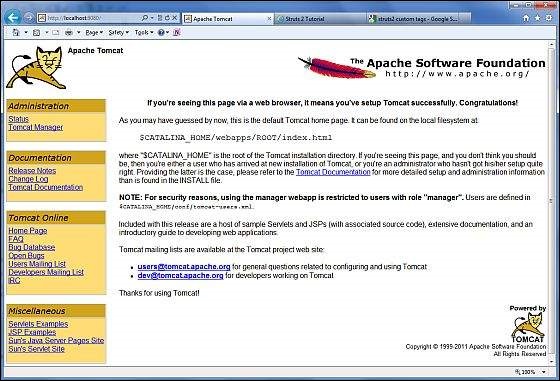
После успешного запуска веб-приложения по умолчанию, включенные в Tomcat, будут доступны по адресу http: // localhost: 8080 / . Если все хорошо, то должен отобразиться следующий результат –
Дополнительную информацию о настройке и запуске Tomcat можно найти в документации, включенной здесь, а также на веб-сайте Tomcat: http://tomcat.apache.org
Tomcat можно остановить, выполнив следующие команды на машине с Windows –
%CATALINA_HOME%binshutdown
Or
C:apache-tomcat-5.5.29binshutdown
Tomcat можно остановить, выполнив следующие команды на компьютере с UNIX (Solaris, Linux и т. Д.):
$CATALINA_HOME/bin/shutdown.sh
Or
/usr/local/apache-tomcat-5.5.29/bin/shutdown.sh
Flex – Приложения
Прежде чем мы начнем создавать настоящее приложение «HelloWorld» с помощью Flash Builder, давайте посмотрим, каковы фактические части приложения Flex:
Приложение Flex состоит из следующих четырех важных частей, из которых последняя часть является необязательной, но первые три части являются обязательными.
- Библиотеки Flex Framework
- Код на стороне клиента
- Общественные ресурсы (HTML / JS / CSS)
- Серверный код
Примеры расположения различных частей типичного приложения Flex, такого как HelloWord, будут такими, как показано ниже:
| название | Место нахождения |
|---|---|
| Корень проекта | Привет, мир/ |
| Библиотеки Flex Framework | Путь сборки |
| Государственные ресурсы | HTML-шаблон |
| Код на стороне клиента | таблица с рамкой / com / tutorialspoint / клиент |
| Серверный код | таблица с рамкой / com / tutorialspoint / server |
Процесс сборки приложения
Для начала приложению Flex требуются библиотеки инфраструктуры Flex. Позднее Flash Builder автоматически добавляет библиотеки для пути сборки.
Когда мы создаем наш код с использованием Flash Builder, Flash Builder выполняет следующие задачи:
-
Компилирует исходный код в файл HelloWorld.swf.
-
Компилирует HelloWorld.html (файл оболочки для SWF-файла) из файла index.template.html, хранящегося в папке html-template
-
Копирует файлы HelloWorld.swf и HelloWorld.html в целевую папку bin-debug.
-
Копирует swfobject.js, код JavaScript, отвечающий за динамическую загрузку SWF-файла в HelloWorld.html в целевой папке, bin-debug
-
Копирует библиотеки фреймворков в виде SWF-файла с именем frameworks_xxx.swf в целевую папку, bin-debug
-
Копирует другие модули flex (файлы .swf, такие как sparkskins_xxx.swf, textLayout_xxx.swf) в целевую папку.
Компилирует исходный код в файл HelloWorld.swf.
Компилирует HelloWorld.html (файл оболочки для SWF-файла) из файла index.template.html, хранящегося в папке html-template
Копирует файлы HelloWorld.swf и HelloWorld.html в целевую папку bin-debug.
Копирует swfobject.js, код JavaScript, отвечающий за динамическую загрузку SWF-файла в HelloWorld.html в целевой папке, bin-debug
Копирует библиотеки фреймворков в виде SWF-файла с именем frameworks_xxx.swf в целевую папку, bin-debug
Копирует другие модули flex (файлы .swf, такие как sparkskins_xxx.swf, textLayout_xxx.swf) в целевую папку.
Процесс запуска приложения
-
Откройте файл HelloWorld.html, который находится в папке HelloWorld bin-debug в любом веб-браузере.
-
HelloWorld.swf загрузится автоматически, и приложение начнет работать.
Откройте файл HelloWorld.html, который находится в папке HelloWorld bin-debug в любом веб-браузере.
HelloWorld.swf загрузится автоматически, и приложение начнет работать.
Библиотеки Flex Framework
Ниже приводится краткое описание нескольких важных библиотек фреймворков. Обратите внимание, что библиотеки Flex обозначаются с использованием обозначения .swc.
| Sr.No | Узлы и описание |
|---|---|
| 1 |
playerglobal.swc Эта библиотека относится к FlashPlayer, установленному на вашем компьютере, и содержит встроенные методы, поддерживаемые Flash Player. |
| 2 |
textlayout.swc Эта библиотека поддерживает функции, связанные с макетом текста. |
| 3 |
framework.swc Это библиотека Flex Framework содержит основные функции Flex. |
| 4 |
mx.swc В этой библиотеке хранятся определения элементов управления mx UI. |
| 5 |
charts.swc Эта библиотека поддерживает элементы управления графиками. |
| 6 |
spark.swc В этой библиотеке хранятся определения элементов управления спарк-интерфейса. |
| 7 |
sparkskins.swc Эта библиотека поддерживает создание скинов для элементов управления пользовательским интерфейсом spark. |
playerglobal.swc
Эта библиотека относится к FlashPlayer, установленному на вашем компьютере, и содержит встроенные методы, поддерживаемые Flash Player.
textlayout.swc
Эта библиотека поддерживает функции, связанные с макетом текста.
framework.swc
Это библиотека Flex Framework содержит основные функции Flex.
mx.swc
В этой библиотеке хранятся определения элементов управления mx UI.
charts.swc
Эта библиотека поддерживает элементы управления графиками.
spark.swc
В этой библиотеке хранятся определения элементов управления спарк-интерфейса.
sparkskins.swc
Эта библиотека поддерживает создание скинов для элементов управления пользовательским интерфейсом spark.
Код на стороне клиента
Код приложения Flex может быть написан как на MXML, так и на ActionScript .
| Sr.No | Тип и описание |
|---|---|
| 1 |
MXML MXML – это язык разметки XML, который мы будем использовать для размещения компонентов пользовательского интерфейса. MXML компилируется в ActionScript во время процесса сборки. |
| 2 |
ActionScript ActionScript является объектно-ориентированным процедурным языком программирования и основан на спецификации языка проекта ECMAScript (ECMA-262), издание 4. |
MXML
MXML – это язык разметки XML, который мы будем использовать для размещения компонентов пользовательского интерфейса. MXML компилируется в ActionScript во время процесса сборки.
ActionScript
ActionScript является объектно-ориентированным процедурным языком программирования и основан на спецификации языка проекта ECMAScript (ECMA-262), издание 4.
Во Flex мы можем смешать ActionScript и MXML, чтобы сделать следующее:
-
Компоновка компонентов пользовательского интерфейса с использованием тегов MXML
-
Используйте MXML для декларативного определения невизуальных аспектов приложения, таких как доступ к источникам данных на сервере
-
Используйте MXML для создания привязок данных между компонентами пользовательского интерфейса и источниками данных на сервере.
-
Используйте ActionScript для определения прослушивателей событий внутри атрибутов событий MXML.
-
Добавьте блоки скриптов, используя
-
Включить внешние файлы ActionScript.
-
Импорт классов ActionScript.
-
Создайте компоненты ActionScript.
Компоновка компонентов пользовательского интерфейса с использованием тегов MXML
Используйте MXML для декларативного определения невизуальных аспектов приложения, таких как доступ к источникам данных на сервере
Используйте MXML для создания привязок данных между компонентами пользовательского интерфейса и источниками данных на сервере.
Используйте ActionScript для определения прослушивателей событий внутри атрибутов событий MXML.
Добавьте блоки скриптов, используя
Включить внешние файлы ActionScript.
Импорт классов ActionScript.
Создайте компоненты ActionScript.
Публичные ресурсы
Это файлы справки, на которые ссылается приложение Flex, например HTML-страница хоста, CSS или изображения, расположенные в папке html-template. Он содержит следующие файлы –
| Sr.No | Имя файла и описание |
|---|---|
| 1 |
index.template.html Хост HTML-страница, с заполнителями. Flash Builder использует этот шаблон для создания фактической страницы HelloWorld.html с файлом HelloWorld.swf. |
| 2 |
playerProductInstall.swf Это утилита для установки Flash Player в экспресс-режиме. |
| 3 |
swfobject.js Это JavaScript, ответственный за проверку версии установленного флеш плеера и загрузку HelloWorld.swf на странице HelloWorld.html. |
| 4 |
HTML-шаблон / история Эта папка содержит ресурсы для управления историей приложения. |
index.template.html
Хост HTML-страница, с заполнителями. Flash Builder использует этот шаблон для создания фактической страницы HelloWorld.html с файлом HelloWorld.swf.
playerProductInstall.swf
Это утилита для установки Flash Player в экспресс-режиме.
swfobject.js
Это JavaScript, ответственный за проверку версии установленного флеш плеера и загрузку HelloWorld.swf на странице HelloWorld.html.
HTML-шаблон / история
Эта папка содержит ресурсы для управления историей приложения.
HelloWorld.mxml
Это фактический код MXML / AS (ActionScript), написанный для реализации бизнес-логики приложения, и компилятор Flex преобразует его в SWF-файл, который будет выполняться Flash Player в браузере.
Пример класса HelloWorld Entry будет выглядеть следующим образом:
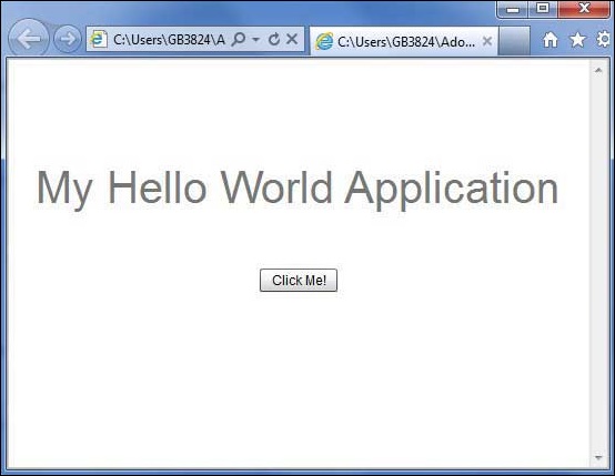
<?xml version = "1.0" encoding = "utf-8"?>
<s:Application xmlns:fx = "http://ns.adobe.com/mxml/2009"
   xmlns:s = "library://ns.adobe.com/flex/spark"
   xmlns:mx = "library://ns.adobe.com/flex/mx"
   width = "100%" height = "100%"
   minWidth = "500" minHeight = "500"
   initialize = "application_initializeHandler(event)">

   <fx:Script>
      <![CDATA[
         import mx.controls.Alert;
         import mx.events.FlexEvent;
         protected function btnClickMe_clickHandler(event:MouseEvent):void {
            Alert.show("Hello World!");
         }

         protected function application_initializeHandler(event:FlexEvent):void {
            lblHeader.text = "My Hello World Application";
         }
      ]]>
   </fx:Script>

   <s:VGroup horizontalAlign = "center" width = "100%" height = "100%"
      paddingTop = "100" gap = "50">
      <s:Label id = "lblHeader" fontSize = "40" color = "0x777777" />
      <s:Button label = "Click Me!" id = "btnClickMe"
         click = "btnClickMe_clickHandler(event)" />
   </s:VGroup>
</s:Application>
В следующей таблице приведено описание всех тегов, используемых в приведенном выше сценарии кода.
| Sr.No | Узел и описание |
|---|---|
| 1 |
заявка Определяет контейнер приложения, который всегда является корневым тегом приложения Flex. |
| 2 |
скрипт Содержит бизнес-логику на языке ActionScript. |
| 3 |
VGroup Определяет контейнер вертикальной группировки, который может содержать элементы управления Flex UI по вертикали. |
| 4 |
этикетка Представляет элемент управления Label, очень простой компонент пользовательского интерфейса, отображающий текст. |
| 5 |
кнопка Представляет элемент управления Button, на который можно нажать, чтобы выполнить какое-либо действие. |
заявка
Определяет контейнер приложения, который всегда является корневым тегом приложения Flex.
скрипт
Содержит бизнес-логику на языке ActionScript.
VGroup
Определяет контейнер вертикальной группировки, который может содержать элементы управления Flex UI по вертикали.
этикетка
Представляет элемент управления Label, очень простой компонент пользовательского интерфейса, отображающий текст.
кнопка
Представляет элемент управления Button, на который можно нажать, чтобы выполнить какое-либо действие.
Серверный код
Это серверная часть вашего приложения, и она очень необязательна. Если вы не выполняете никакой серверной обработки в своем приложении, тогда вам не нужна эта часть, но если в серверной части требуется некоторая обработка, и ваше клиентское приложение взаимодействует с сервером, вам придется разработать эти компоненты.
В следующей главе мы будем использовать все вышеупомянутые концепции для создания приложения HelloWorld с использованием Flash Builder.
Flex – Создать приложение
Мы будем использовать Flash Builder 4.5 для создания приложений Flex. Давайте начнем с простого приложения HelloWorld .
Шаг 1 – Создать проект
Первым шагом является создание простого проекта Flex с использованием IDE Flash Builder. Запустите мастер проектов с помощью параметра « Файл»> «Создать»> «Проект Flex» . Теперь назовите ваш проект как HelloWorld, используя окно мастера следующим образом:
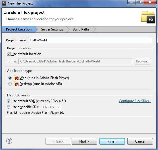
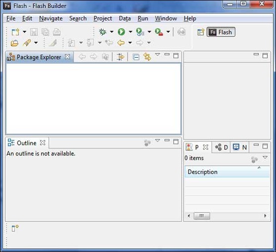
Выберите Тип приложения Веб (запускается в Adobe Flash Player) . Однако, если это не выбрано, оставьте другие значения по умолчанию как таковые и нажмите кнопку Готово. Как только ваш проект будет успешно создан, в вашем Project Explorer появится следующее содержимое:
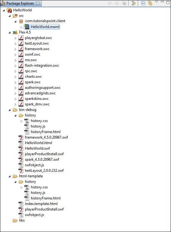
Вот краткое описание всех важных папок –
| скоросшиватель | Место нахождения |
|---|---|
| стол стол окаймленный |
Файлы исходного кода (mxml / as классы). Мы создали структуру папок com / tutorialspoint / client, содержащую специфичные для клиента java-классы, отвечающие за отображение пользовательского интерфейса. |
| бен-отладка |
Это выходная часть, она представляет собой реально развертываемое веб-приложение. Папка истории содержит файлы поддержки для управления историей приложения Flex. framework_xxx.swf, flex-файлы фреймворка должны использоваться приложением flex. HelloWorld.html, HTML-файл оболочки / хоста для приложения flex. HelloWorld.swf, наше приложение на основе Flex. playerProductInstall.swf, быстрый установщик flash player. spark_xxx.swf, библиотека для поддержки компонентов spark. swfobject.js, JavaScript отвечает за загрузку HelloWorld.swf в HelloWorld.html. Он проверяет версию Flash Player и передает параметр инициализации в файл HelloWorld.swf. textLayout_xxx.swf, библиотека для поддержки текстовых компонентов. |
| HTML-шаблон |
Это представляет собой настраиваемое веб-приложение. Flash Builder компилирует файлы из html-шаблона в папку bin-debug. Папка истории содержит файлы поддержки для управления историей приложения Flex. index.template.html, HTML-файл оболочки / хоста для приложения flex, имеющий заполнители для конкретной конфигурации Flash Builder. Компилируется в HelloWorld.html в папке bin-debug во время сборки. playerProductInstall.swf, экспресс-установщик flash player копируется в папку bin-debug во время сборки. swfobject.js, JavaScript отвечает за загрузку HelloWorld.swf в HelloWorld.html. Он проверяет версию Flash Player и передает параметр инициализации в файл HelloWorld.swf, который копируется в папку bindebug во время сборки. |
Файлы исходного кода (mxml / as классы).
Мы создали структуру папок com / tutorialspoint / client, содержащую специфичные для клиента java-классы, отвечающие за отображение пользовательского интерфейса.
Это выходная часть, она представляет собой реально развертываемое веб-приложение.
Папка истории содержит файлы поддержки для управления историей приложения Flex.
framework_xxx.swf, flex-файлы фреймворка должны использоваться приложением flex.
HelloWorld.html, HTML-файл оболочки / хоста для приложения flex.
HelloWorld.swf, наше приложение на основе Flex.
playerProductInstall.swf, быстрый установщик flash player.
spark_xxx.swf, библиотека для поддержки компонентов spark.
swfobject.js, JavaScript отвечает за загрузку HelloWorld.swf в HelloWorld.html. Он проверяет версию Flash Player и передает параметр инициализации в файл HelloWorld.swf.
textLayout_xxx.swf, библиотека для поддержки текстовых компонентов.
Это представляет собой настраиваемое веб-приложение. Flash Builder компилирует файлы из html-шаблона в папку bin-debug.
Папка истории содержит файлы поддержки для управления историей приложения Flex.
index.template.html, HTML-файл оболочки / хоста для приложения flex, имеющий заполнители для конкретной конфигурации Flash Builder. Компилируется в HelloWorld.html в папке bin-debug во время сборки.
playerProductInstall.swf, экспресс-установщик flash player копируется в папку bin-debug во время сборки.
swfobject.js, JavaScript отвечает за загрузку HelloWorld.swf в HelloWorld.html. Он проверяет версию Flash Player и передает параметр инициализации в файл HelloWorld.swf, который копируется в папку bindebug во время сборки.
Шаг 2 – Создание внешнего CSS-файла
Создайте файл CSS styles.css для страницы HTML Wrapper в папке html-template .
html, body {
   height:100%;
}

body {
   margin:0;
   padding:0;
   overflow:auto;
   text-align:center;
}

object:focus {
   outline:none;
}

#flashContent {
   display:none;
}

.pluginHeader {
   font-family:Arial, Helvetica, sans-serif;
   font-size:14px;
   color:#9b1204;
   text-decoration:none;
   font-weight:bold;
}

.pluginInstallText {
   font-family:Arial, Helvetica, sans-serif;
   font-size:12px;
   color:#000000;
   line-height:18px;
   font-style:normal;
}

.pluginText {
   font-family:Arial, Helvetica, sans-serif;
   font-size:12px;
   color:#000000;
   line-height:18px;
   font-style:normal;
}
Шаг 3 – Изменить шаблон HTML-страницы Wrapper
Измените шаблон HTML-страницы Wrapper index.template.html в папке htmltemplate . Flash Builder создаст шаблон HTML- страницы Wrapper по умолчанию html-template / index.template.html , который будет скомпилирован в HelloWorld.html.
Этот файл содержит заполнители, которые Flash Builder заменяет в процессе компиляции. Например, версия флеш-плеера, название приложения и т. Д.
Давайте изменим этот файл для отображения пользовательских сообщений в случае, если флэш-плагин не установлен.
<!DOCTYPE html PUBLIC "-//W3C//DTD XHTML 1.0 Transitional//EN"
"http://www.w3.org/TR/xhtml1/DTD/xhtml1-transitional.dtd">
<html xmlns = "http://www.w3.org/1999/xhtml" lang = "en" xml:lang = "en">

   <head>
      <title>${title}</title>
      <meta name = "google" value = "notranslate" />
      <meta http-equiv = "Content-Type" content = "text/html; charset = utf-8" />
      <link rel = "stylesheet" href = "styles.css" type = "text/css"></link>
      <link rel = "stylesheet" type = "text/css" href = "history/history.css" />
      <script type = "text/javascript" table table-bordered = "history/history.js">
      </script>
      <script type = "text/javascript" table table-bordered = "swfobject.js"></script>

      <script type = "text/javascript">
         // For version detection, set to min. required Flash Player version,
         //or 0 (or 0.0.0), for no version detection.
         var swfVersionStr = "${version_major}.${version_minor}.${version_revision}";

         // To use express install, set to playerProductInstall.swf,
         //otherwise the empty string.
         var xiSwfUrlStr = "${expressInstallSwf}";
         var flashvars = {};
         var params = {};
         params.quality = "high";
         params.bgcolor = "${bgcolor}";
         params.allowscriptaccess = "sameDomain";
         params.allowfullscreen = "true";

         var attributes = {};
         attributes.id = "${application}";
         attributes.name = "${application}";
         attributes.align = "middle";
         swfobject.embedSWF (
            "${swf}.swf", "flashContent",
            "${width}", "${height}",
            swfVersionStr, xiSwfUrlStr,
            flashvars, params, attributes);

         // JavaScript enabled so display the flashContent div in case
         //it is not replaced with a swf object.
         swfobject.createCSS("#flashContent", "display:block;text-align:left;");
      </script>
   </head>

   <body>
      <div id = "flashContent">
         <p style = "margin:100px;">

            <table width = "700" cellpadding = "10" cellspacing = "2" border = "0">
               <tr>
                  <td class = "pluginHeader">Flash Player Required</td>
               </tr>

               <tr>
                  <td class = "pluginText">The Adobe Flash Player version
                     10.2.0 or greater is required.</td>
               </tr>

               <tr>
                  <td class = "pluginInstallText" align = "left">

                  <table border = "0" width = "100%">
                     <tr class = "pluginInstallText" >
                        <td>Click here to download and install Adobe Flash Player:</td>
                        <td> </td>
                        <td align = "right">
                           <script type = "text/javascript">
                              var pageHost
                                 = ((document.location.protocol == "https:") ? "https://" : "http://");
                              document.write("<a target = '_blank'"
                                 +" href = 'http://get.adobe.com/flashplayer/'><"
                                 +"img style = 'border-style: none' table table-bordered = '"
                                 +pageHost
                                 +"www.adobe.com/images/shared/download_buttons/get_flash_player.gif'"
                                 +" alt = 'Get Adobe Flash player' /></a>" );
                           </script>
                        </td>
                     </tr>
                  </table>
               </tr>
            </table>
         </p>
      </div>

      <noscript>
         <object classid = "clsid:D27CDB6E-AE6D-11cf-96B8-444553540000"
            width = "${width}" height = "${height}" id = "${application}">
            <param name = "movie" value = "${swf}.swf" />
            <param name = "quality" value = "high" />
            <param name = "bgcolor" value = "${bgcolor}" />
            <param name = "allowScriptAccess" value = "sameDomain" />
            <param name = "allowFullScreen" value = "true" />

            <!--[if !IE]>-->
            <object type = "application/x-shockwave-flash" data = "${swf}.swf"
               width = "${width}" height = "${height}">
               <param name = "quality" value = "high" />
               <param name = "bgcolor" value = "${bgcolor}" />
               <param name = "allowScriptAccess" value = "sameDomain" />
               <param name = "allowFullScreen" value = "true" />
            <!--<![endif]-->

            <!--[if gte IE 6]>-->
               <p>
                  <p style = "margin:100px;">
                     <table width = "700" cellpadding = "10" cellspacing = "2"
                        border = "0">
                        <tr>
                           <td class = "pluginHeader">Flash Player Required</td>
                        </tr>

                        <tr>
                           <td class = "pluginText">The Adobe Flash Player version
                           10.2.0 or greater is required.</td>
                        </tr>

                        <tr>
                           <td class = "pluginInstallText" align = "left">

                           <table border = "0" width = "100%">
                              <tr class = "pluginInstallText" >
                                 <td>Click here to download and install Adobe Flash
                                    Player:</td>
                                 <td> </td>
                                 <td align = "right">
                                    <script type = "text/javascript">
                                       var pageHost
                                          = ((document.location.protocol == "https:") ? "https://" : "http://");
                                       document.write("<a target = '_blank'"
                                          +" href = 'http://get.adobe.com/flashplayer/'><"
                                          +"img style = 'border-style: none' table table-bordered = '"
                                          +pageHost
                                          +"www.adobe.com/images/shared/download_buttons/get_flash_player.gif'"
                                          +" alt = 'Get Adobe Flash player' /></a>" );
                                    </script>
                                 </td>
                              </tr>
                           </table>
                        </tr>
                     </table>
                  </p>
               </p>
            <!--<![endif]-->

            <p style = "margin:100px;">
               <table width = "700" cellpadding = "10" cellspacing = "2" border = "0">
                  <tr><td class = "pluginHeader">Flash Player Required</td></tr>
                  <tr><td class = "pluginText">The Adobe Flash Player version
                     10.2.0 or greater is required.</td></tr>
                  <tr>
                     <td class = "pluginInstallText" align = "left">
                        <table border = "0" width = "100%">
                           <tr class = "pluginInstallText" >
                              <td>Click here to download and install Adobe Flash
                                 Player:</td>
                              <td> </td>
                              <td align = "right">
                                 <script type = "text/javascript">
                                    var pageHost
                                       = ((document.location.protocol == "https:") ? "https://" : "http://");
                                    document.write("<a target = '_blank'"
                                       +" href = 'http://get.adobe.com/flashplayer/'><"
                                       +"img style = 'border-style: none' table table-bordered = '"
                                       +pageHost
                                       +"www.adobe.com/images/shared/download_buttons/get_flash_player.gif'"
                                       +" alt = 'Get Adobe Flash player' /></a>" );
                                 </script>
                              </td>
                           </tr>
                        </table>
                     </td>
                  </tr>
               </table>
            </p>
         <!--[if !IE]>-->
         </object>
         <!--<![endif]-->
         </object>
      </noscript>
   </body>
</html>
Шаг 4 – Создать внутренний CSS файл
Создайте CSS-файл Style.css для HelloWorld.mxml в таблице tablebordered / com / tutorialspoint . Flex предоставляет аналогичные стили CSS для своих элементов управления пользовательского интерфейса, так как существуют стили CSS для элементов управления пользовательского интерфейса HTML.
/* CSS file */
@namespace s "library://ns.adobe.com/flex/spark";
@namespace mx "library://ns.adobe.com/flex/mx";

.heading {
   fontFamily: Arial, Helvetica, sans-serif;
   fontSize: 17px;
   color: #9b1204;
   textDecoration:none;
   fontWeight:normal;
}

.button {
   fontWeight: bold;
}

.container {
   cornerRadius :10;
   horizontalCenter :0;
   borderColor: #777777;
   verticalCenter:0;
   backgroundColor: #efefef;
}
Шаг 5 – Изменить класс начального уровня
Flash Builder создаст таблицу файлов mxml по умолчанию tablebordered / com.tutorialspoint / HelloWorld.mxml , в которой есть контейнер корневого тега <application> для приложения. Давайте изменим этот файл для отображения «Hello, World!» –
<?xml version = "1.0" encoding = "utf-8"?>
<s:Application xmlns:fx = "http://ns.adobe.com/mxml/2009"
   xmlns:s = "library://ns.adobe.com/flex/spark"
   xmlns:mx = "library://ns.adobe.com/flex/mx
   width = "100%" height = "100%"
      minWidth = "500" minHeight = "500"
      initialize = "application_initializeHandler(event)">

   <fx:Style source = "/com/tutorialspoint/client/Style.css" />
   <fx:Script>
      <![CDATA[
         import mx.controls.Alert;
         import mx.events.FlexEvent;
         protected function btnClickMe_clickHandler(event:MouseEvent):void {
            Alert.show("Hello World!");
         }

         protected function application_initializeHandler(event:FlexEvent):void {
            lblHeader.text = "My Hello World Application";
         }
      ]]>
   </fx:Script>

   <s:BorderContainer width = "500" height = "500" id = "mainContainer"
      styleName = "container">
      <s:VGroup width = "100%" height = "100%" gap = "50" horizontalAlign = "center"
         verticalAlign = "middle">
         <s:Label id = "lblHeader" fontSize = "40" color = "0x777777"
            styleName = "heading" />
         <s:Button label = "Click Me!" id = "btnClickMe"
            click = "btnClickMe_clickHandler(event)" styleName = "button" />
      </s:VGroup>
   </s:BorderContainer>
</s:Application>
Вы можете создать больше файлов mxml или actionscript в одном и том же исходном каталоге для определения новых приложений или вспомогательных процедур.
Шаг 6 – Сборка приложения
В Flash Builder по умолчанию установлен флажок « Сборка автоматически ». Просто проверьте окно « Проблемы» на наличие ошибок. Как только вы закончите с изменениями, вы не увидите никаких ошибок.
Шаг 7 – Запустить приложение
Теперь нажмите на  Запустите приложение и выберите приложение HelloWorld, чтобы запустить приложение.

Если все в порядке, вы должны увидеть всплывающее окно браузера, приложение и работает. Если с вашим приложением все в порядке, оно даст следующий результат: [ Попробуйте онлайн ]
Поскольку вы запускаете приложение во флеш-плеере, то для вашего браузера вам потребуется установить плагин Flash Player. Просто следуйте инструкциям на экране, чтобы установить плагин. Если у вас уже установлен плагин Flash Player для вашего браузера, вы должны увидеть следующий вывод:

Поздравляем! Вы реализовали свое первое приложение, используя Flex .
Flex – Развертывание приложения
Из этого туториала Вы узнаете, как создать файл war для приложения и как его развернуть в корневом каталоге веб-сервера Apache Tomcat.
Если вы поняли этот простой пример, вы также сможете развернуть сложное приложение Flex, выполнив те же действия.
Давайте создадим приложение Flex, выполнив следующие шаги:
| шаг | Описание |
|---|---|
| 1 | Создайте проект с именем HelloWorld в packagecom. tutorialspoint.client, как описано в главе « Создание приложения Flex» . |
| 2 | Измените HelloWorld.mxml, как описано ниже. Сохраните остальные файлы без изменений. |
| 3 | Скомпилируйте и запустите приложение, чтобы убедиться, что бизнес-логика работает в соответствии с требованиями. |
Следуйте приведенным ниже инструкциям, чтобы создать сборку выпуска приложения Flex, а затем развернуть ее на сервере Tomcat.
Первым шагом является создание сборки выпуска с использованием IDE Flash Builder. Запустите мастер сборки релиза, выбрав « Файл»> «Экспорт»> «Flash Builder»> «Сборка релиза» .

Выберите проект как HelloWorld, используя окно мастера следующим образом

Оставьте другие значения по умолчанию как таковые и нажмите кнопку Готово. Теперь Flash Builder создаст папку bin-release, содержащую сборку релиза проекта.
Теперь, когда наша сборка релиза готова, давайте развернем приложение Flex, выполнив следующие шаги:
| шаг | Описание |
|---|---|
| 1 | Заархивируйте содержимое папки bin-release приложения в виде файла HelloWorld.war и разверните его на веб-сервере Apache Tomcat. |
| 2 | Запустите ваше веб-приложение, используя соответствующий URL-адрес, как описано ниже в последнем шаге. |
Ниже приведено содержимое измененной таблицы файлов mxml: table / borded / com.tutorialspoint / HelloWorld.mxml .
<?xml version = "1.0" encoding = "utf-8"?>
<s:Application xmlns:fx = "http://ns.adobe.com/mxml/2009"
   xmlns:s = "library://ns.adobe.com/flex/spark"
   xmlns:mx = "library://ns.adobe.com/flex/mx"
   width = "100%" height = "100%"
   minWidth = "500" minHeight = "500"
   initialize = "application_initializeHandler(event)">

   <fx:Style source = "/com/tutorialspoint/client/Style.css" />
   <fx:Script>
      <![CDATA[
         import mx.controls.Alert;
         import mx.events.FlexEvent;
         protected function btnClickMe_clickHandler(event:MouseEvent):void {
            Alert.show("Hello World!");
         }

         protected function application_initializeHandler(event:FlexEvent):void {
            lblHeader.text = "My Hello World Application";
         }
      ]]>
   </fx:Script>

   <s:BorderContainer width = "500" height = "500" id = "mainContainer"
      styleName = "container">
      <s:VGroup width = "100%" height = "100%" gap = "50" horizontalAlign = "center"
         verticalAlign = "middle">
         <s:Label id = "lblHeader" fontSize = "40" color = "0x777777"
            styleName = "heading" />
         <s:Button label = "Click Me!" id = "btnClickMe"
            click = "btnClickMe_clickHandler(event)" styleName = "button" />
      </s:VGroup>
   </s:BorderContainer>
</s:Application>
Когда вы будете готовы со всеми внесенными изменениями, давайте скомпилируем и запустим приложение в обычном режиме, как мы это делали во главе Flex – Create Application . Если с вашим приложением все в порядке, оно даст следующий результат: [ Попробуйте онлайн ]
Создать WAR-файл
Теперь наше приложение работает нормально, и мы готовы экспортировать его как файл войны. Выполните следующие шаги –
-
Перейдите в каталог bin-релиза вашего проекта C: workspace HelloWorld binrelease
-
Выберите все файлы и папки, доступные в каталоге bin-release.
-
Заархивируйте все выбранные файлы и папки в файл с именем HelloWorld.zip .
-
Переименуйте HelloWorld.zip в HelloWorld.war.
Перейдите в каталог bin-релиза вашего проекта C: workspace HelloWorld binrelease
Выберите все файлы и папки, доступные в каталоге bin-release.
Заархивируйте все выбранные файлы и папки в файл с именем HelloWorld.zip .
Переименуйте HelloWorld.zip в HelloWorld.war.
Развернуть WAR-файл
Остановите сервер Tomcat.
-
Скопируйте файл HelloWorld.war в каталог установки tomcat> в папку webapps.
-
Запустите сервер Tomcat.
-
Загляните в каталог webapps, там должна быть папка HelloWorld, созданная.
-
Теперь HelloWorld.war успешно развернут в корневом каталоге веб-сервера Tomcat.
Скопируйте файл HelloWorld.war в каталог установки tomcat> в папку webapps.
Запустите сервер Tomcat.
Загляните в каталог webapps, там должна быть папка HelloWorld, созданная.
Теперь HelloWorld.war успешно развернут в корневом каталоге веб-сервера Tomcat.
Запустить приложение
Введите URL в веб-браузере –
http: // localhost: 8080 / HelloWorld / HelloWorld.html для запуска приложения.
Имя сервера (localhost) и порт (8080) могут различаться в зависимости от конфигурации tomcat.

Flex – Фазы жизненного цикла
Жизненный цикл приложения Flex
Несмотря на то, что вы можете создавать приложения Flex, не понимая этапы жизненного цикла приложения, полезно знать основной механизм; порядок, в котором происходят вещи. Это поможет вам настроить такие функции, как загрузка других приложений Flex во время выполнения, и управлять процессом загрузки и выгрузки библиотек классов и ресурсов во время выполнения.
Хорошее понимание жизненного цикла приложений Flex позволит вам создавать лучшие приложения и оптимизировать их, потому что вы будете знать, где оптимально выполнять код. Например, если вам нужно убедиться, что какой-то код выполняется во время предварительного загрузчика, вам нужно знать, где разместить код для этого события.

Когда мы загружаем Flex-приложение в браузер, в течение жизненного цикла Flex-приложения происходят следующие события.
Ниже приводится краткое описание различных событий жизненного цикла Flex.
| Sr.No | Описание события |
|---|---|
| 1 |
preInitialize: mx.core.UIComponent.preinitialize Тип события: mx.events.FlexEvent.PREINITIALIZE Это событие отправляется в начале последовательности инициализации компонента. Компонент находится в очень сыром состоянии, когда отправляется это событие. Многие компоненты, такие как элемент управления Button, создают внутренние дочерние компоненты для реализации функциональности. Например, элемент управления Button создает внутренний компонент TextField пользовательского интерфейса для представления текста метки. Когда Flex отправляет событие предварительной инициализации, дочерние элементы, включая все внутренние дочерние элементы, еще не были созданы. |
| 2 |
инициализировать: mx.core.UIComponent.initialize Тип события: mx.events.FlexEvent.INITIALIZE Это событие отправляется после фазы предварительной инициализации. Flex Framework инициализирует внутреннюю структуру этого компонента на этом этапе. Это событие автоматически запускается, когда компонент добавляется в родительский объект. Вам не нужно вызывать initialize () вообще. |
| 3 |
creationComplete: mx.core.UIComponent.creationComplete Тип события: mx.events.FlexEvent.CREATION_COMPLETE Это событие отправляется, когда компонент завершает построение, обработку свойств, измерение, макет и рисование. На данный момент, в зависимости от его свойства visible, компонент не виден, даже если он был нарисован. |
| 4 |
applicationComplete: spark.components.Application.applicationComplete Тип события: mx.events.FlexEvent.APPLICATION_COMPLETE Отправляется после инициализации приложения, его обработки LayoutManager и добавления в список отображения. Это последнее событие жизненного цикла создания приложения и означает, что приложение было загружено полностью. |
preInitialize: mx.core.UIComponent.preinitialize
Тип события: mx.events.FlexEvent.PREINITIALIZE
Это событие отправляется в начале последовательности инициализации компонента. Компонент находится в очень сыром состоянии, когда отправляется это событие. Многие компоненты, такие как элемент управления Button, создают внутренние дочерние компоненты для реализации функциональности. Например, элемент управления Button создает внутренний компонент TextField пользовательского интерфейса для представления текста метки.
Когда Flex отправляет событие предварительной инициализации, дочерние элементы, включая все внутренние дочерние элементы, еще не были созданы.
инициализировать: mx.core.UIComponent.initialize
Тип события: mx.events.FlexEvent.INITIALIZE
Это событие отправляется после фазы предварительной инициализации. Flex Framework инициализирует внутреннюю структуру этого компонента на этом этапе. Это событие автоматически запускается, когда компонент добавляется в родительский объект.
Вам не нужно вызывать initialize () вообще.
creationComplete: mx.core.UIComponent.creationComplete
Тип события: mx.events.FlexEvent.CREATION_COMPLETE
Это событие отправляется, когда компонент завершает построение, обработку свойств, измерение, макет и рисование.
На данный момент, в зависимости от его свойства visible, компонент не виден, даже если он был нарисован.
applicationComplete: spark.components.Application.applicationComplete
Тип события: mx.events.FlexEvent.APPLICATION_COMPLETE
Отправляется после инициализации приложения, его обработки LayoutManager и добавления в список отображения.
Это последнее событие жизненного цикла создания приложения и означает, что приложение было загружено полностью.
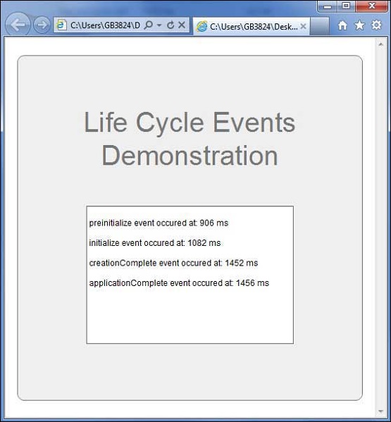
Пример жизненного цикла Flex
Давайте рассмотрим шаги, чтобы понять жизненный цикл тестирования приложения Flex, создав тестовое приложение –
| шаг | Описание |
|---|---|
| 1 | Создайте проект с именем HelloWorld в packagecom. tutorialspoint.client, как описано в главе « Создание приложения Flex» . |
| 2 | Измените HelloWorld.mxml, как описано ниже. Сохраните остальные файлы без изменений. |
| 3 | Скомпилируйте и запустите приложение, чтобы убедиться, что бизнес-логика работает в соответствии с требованиями. |
Ниже приводится содержимое измененного mxml-файла src / com.tutorialspoint / HelloWorld.mxml .
<?xml version = "1.0" encoding = "utf-8"?>
<s:Application xmlns:fx = "http://ns.adobe.com/mxml/2009"
   xmlns:s = "library://ns.adobe.com/flex/spark"
   xmlns:mx = "library://ns.adobe.com/flex/mx"
   width = "100%" height = "100%" minWidth = "500" minHeight = "500"
   initialize = "reportEvent(event)"
   preinitialize = "reportEvent(event)"
   creationComplete = "reportEvent(event)"
   applicationComplete = "reportEvent(event)">

   <fx:Style source = "/com/tutorialspoint/client/Style.css" />
   <fx:Script>
      <![CDATA[
         import mx.controls.Alert;
         import mx.events.FlexEvent;

         [Bindable]
         private var report:String = "";

         private function reportEvent(event:FlexEvent):void {
            report += "n" + (event.type + " event occured at: "
            + getTimer() + " ms" + "n");
         }
      ]]>
   </fx:Script>

   <s:BorderContainer width = "500" height = "500" id = "mainContainer"
      styleName = "container">
      <s:VGroup width = "100%" height = "100%" gap = "50"
         horizontalAlign = "center" verticalAlign = "middle">
         <s:Label textAlign = "center" width="100%" id = "lblHeader"
         fontSize = "40" color = "0x777777" styleName = "heading"
         text = "Life Cycle Events Demonstration" />
         <s:TextArea id = "reportText" text = "{report}" editable = "false"
         width = "300" height = "200">
         </s:TextArea>
      </s:VGroup>
   </s:BorderContainer>
</s:Application>
Когда вы будете готовы со всеми внесенными изменениями, давайте скомпилируем и запустим приложение в обычном режиме, как мы это делали во главе Flex – Create Application . Если с вашим приложением все в порядке, оно даст следующий результат: [ Попробуйте онлайн ]
Flex – стиль с CSS
Flex поддерживает использование синтаксиса и стилей CSS для применения к своим элементам управления пользовательского интерфейса таким же образом, как CSS для компонентов HTML.
Способ № 1: Использование внешнего файла таблицы стилей
Вы можете обратиться к таблице стилей, доступной в пути к классам приложения. Например, рассмотрим файл Style.css в папке com / tutorialspoint / client, где также находится файл HelloWorld.mxml.
/* CSS file */
@namespace s "library://ns.adobe.com/flex/spark";
@namespace mx "library://ns.adobe.com/flex/mx";
...
.container {
   cornerRadius :10;
   horizontalCenter :0;
   borderColor: #777777;
   verticalCenter:0;
   backgroundColor: #efefef;
}
Тогда файл CSS может быть передан следующим фрагментом кода
<fx:Style source = "/com/tutorialspoint/client/Style.css" />
Присвойте стили компоненту пользовательского интерфейса, используя свойство styleName
<s:BorderContainer width = "500" height = "500" id = "mainContainer"
   styleName = "container">
   ...
</s:BorderContainer>
Способ № 2: Использование стилей в компоненте контейнера пользовательского интерфейса
Вы можете определить стили в компоненте контейнера пользовательского интерфейса, используя тег <fx: Style>
Селектор уровня класса
<fx:Style>
   @namespace s "library://ns.adobe.com/flex/spark";
   @namespace mx "library://ns.adobe.com/flex/mx";

   /* class level selector  */
   .errorLabel {
      color: red;
   }
</fx:Style>
Присвойте стили компоненту пользовательского интерфейса, используя свойство styleName.
<s:Label id = "errorMsg" text = "This is an error message" styleName = "errorLabel" />
Id Level Selector
Стиль пользовательского интерфейса компонента с помощью идентификатора селектора.
<fx:Style>
   /* id level selector  */
   #msgLabel {
      color: gray;
   }
</fx:Style>

<s:Label id = "msgLabel" text = "This is a normal message" />
Выбор уровня типа
Стиль одного типа компонента пользовательского интерфейса в одном GO.
<fx:Style>
   /* style applied on all buttons  */
   s|Button {
      fontSize: 15;
      color: #9933FF;
   }
</fx:Style>

<s:Button label = "Click Me!" id = "btnClickMe"
   click = "btnClickMe_clickHandler(event)" />
Пример Flex Style с CSS
Давайте выполним шаги для проверки CSS-стиля приложения Flex, создав тестовое приложение.
| шаг | Описание |
|---|---|
| 1 | Создайте проект с именем HelloWorld в пакете com.tutorialspoint.client, как описано в главе « Создание приложения Flex» . |
| 2 | Измените Style.css, HelloWorld.mxml, как описано ниже. Сохраните остальные файлы без изменений. |
| 3 | Скомпилируйте и запустите приложение, чтобы убедиться, что бизнес-логика работает в соответствии с требованиями. |
Ниже приводится содержимое измененного файла CSS src / com.tutorialspoint / Style.css .
/* CSS file */
@namespace s "library://ns.adobe.com/flex/spark";
@namespace mx "library://ns.adobe.com/flex/mx";

.heading
{
   fontFamily: Arial, Helvetica, sans-serif;
   fontSize: 17px;
   color: #9b1204;
   textDecoration:none;
   fontWeight:normal;
}

.button {
   fontWeight: bold;
}

.container {
   cornerRadius :10;
   horizontalCenter :0;
   borderColor: #777777;
   verticalCenter:0;
   backgroundColor: #efefef;
}
Ниже приводится содержимое измененного mxml-файла src / com.tutorialspoint / HelloWorld.mxml .
<?xml version = "1.0" encoding = "utf-8"?>
<s:Application xmlns:fx = "http://ns.adobe.com/mxml/2009"
   xmlns:s = "library://ns.adobe.com/flex/spark"
   xmlns:mx = "library://ns.adobe.com/flex/mx"
   width = "100%" height = "100%" minWidth = "500" minHeight = "500"
   initialize = "application_initializeHandler(event)">

   <!--Add reference to style sheet -->
   <fx:Style source = "/com/tutorialspoint/client/Style.css" />

   <!--Using styles within mxml file -->
   <fx:Style>
      @namespace s "library://ns.adobe.com/flex/spark";
      @namespace mx "library://ns.adobe.com/flex/mx";

      /* class level selector  */
      .errorLabel {
         color: red;
      }

      /* id level selector  */
      #msgLabel {
         color: gray;
      }

      /* style applied on all buttons  */
      s|Button {
         fontSize: 15;
         color: #9933FF;
      }
   </fx:Style>

   <fx:Script>
      <![CDATA[
         import mx.controls.Alert;
         import mx.events.FlexEvent;
         protected function btnClickMe_clickHandler(event:MouseEvent):void {
            Alert.show("Hello World!");
         }

         protected function application_initializeHandler(event:FlexEvent):void {
            lblHeader.text = "CSS Demonstrating Application";
         }
      ]]>
   </fx:Script>

   <s:BorderContainer width = "560" height = "500" id = "mainContainer"
      styleName = "container">
      <s:VGroup width = "100%" height = "100%" gap = "50"
         horizontalAlign = "center" verticalAlign = "middle">
         <s:Label width = "100%" id = "lblHeader" fontSize = "40"
            color = "0x777777" styleName = "heading" />
         <s:Button label = "Click Me!" id = "btnClickMe"
            click = "btnClickMe_clickHandler(event)"  />
         <s:Label id = "errorMsg"
            text = "This is an error message" styleName = "errorLabel" />
         <s:Label id = "msgLabel" text = "This is a normal message" />
      </s:VGroup>
   </s:BorderContainer>
</s:Application>
Когда вы будете готовы со всеми внесенными изменениями, давайте скомпилируем и запустим приложение в обычном режиме, как мы это делали во главе Flex – Create Application . Если с вашим приложением все в порядке, это даст следующий результат: [ Попробуйте онлайн ]
Flex – Стиль с кожей
Что такое Скиннинг?
-
Скиннинг во Flex – это процесс полной настройки внешнего вида компонента пользовательского интерфейса.
-
Скин может определять текст, изображение, фильтры, переходы и состояния компонента.
-
Скин может быть создан как отдельный компонент mxml или ActionScript.
-
Используя скин, мы можем контролировать все визуальные аспекты компонента пользовательского интерфейса.
-
Процесс определения скина одинаков для всех компонентов пользовательского интерфейса.
Скиннинг во Flex – это процесс полной настройки внешнего вида компонента пользовательского интерфейса.
Скин может определять текст, изображение, фильтры, переходы и состояния компонента.
Скин может быть создан как отдельный компонент mxml или ActionScript.
Используя скин, мы можем контролировать все визуальные аспекты компонента пользовательского интерфейса.
Процесс определения скина одинаков для всех компонентов пользовательского интерфейса.
Шаг 1 – Создать скин
Запустите мастер создания обложки MXML, выбрав « Файл»> «Создать»> «обложка MXML» .
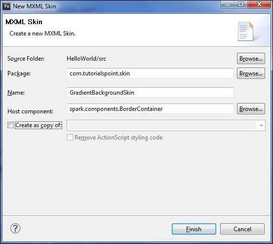
Введите Package как com.tutorialspoint.skin , назовите GradientBackgroundSkin и выберите хост-компонент в качестве существующего элемента управления Flex BorderContainer spark.component.BorderContainer .
Теперь вы создали скин для BorderContainer. Измените содержимое файла скина mxml src / com.tutorialspoint / skin / GradientBackgroundSkin.mxml .
Обновите заливочный слой следующим образом –
<!-- fill -->
<s:Rect id = "backgroundRect" left = "0" right = "0" height = "100%" top = "0">
   <s:fill>
      <s:LinearGradient rotation = "90">
         <s:GradientEntry color = "0x888888" ratio = "0.2" />
         <s:GradientEntry color = "0x111111" ratio = "1" />
      </s:LinearGradient>
   </s:fill>
</s:Rect>
Шаг 2: нанесите скин
Вы можете нанести скин поверх компонента двумя способами:
Применить скин в MXML-скрипте (статически)
Примените GradientBackgroundSkin к BorderContainer с идентификатором mainContainer, используя его атрибут skinClass .
<s:BorderContainer width = "560" height = "500" id = "mainContainer"
   styleName = "container">
   <s:VGroup width = "100%" height = "100%" gap = "50"
      horizontalAlign = "center" verticalAlign = "middle"
      skinClass = "com.tutorialspoint.skin.GradientBackgroundSkin">
Применить скин в ActionScript (динамически)
Примените GradientBackgroundSkin к BorderContainer с идентификатором mainContainer, используя его свойство skinClass .
protected function gradientBackground_clickHandler(event:MouseEvent):void {
   mainContainer.setStyle("skinClass", GradientBackgroundSkin);
}
Пример Flex Style с кожей
Давайте выполним следующие шаги, чтобы увидеть скин в действии в приложении Flex, создав тестовое приложение.
| шаг | Описание |
|---|---|
| 1 | Создайте проект с именем HelloWorld в пакете com.tutorialspoint.client, как описано в главе « Создание приложения Flex» . |
| 2 | Создайте скин GradientBackgroundSkin.mxml в пакете com.tutorialspoint.skin, как описано выше. Сохраните остальные файлы без изменений. |
| 3 | Измените HelloWorld.mxml, как описано ниже. Сохраните остальные файлы без изменений. |
| 4 | Скомпилируйте и запустите приложение, чтобы убедиться, что бизнес-логика работает в соответствии с требованиями. |
Ниже приводится содержимое файла GradientBackgroundSkin.mxml src / com / tutorialspoint / skin / GradientBackg roundSkin.mxml .
<?xml version = "1.0" encoding = "utf-8"?>
<s:Skin xmlns:fx = "http://ns.adobe.com/mxml/2009"
   xmlns:s = "library://ns.adobe.com/flex/spark"
   xmlns:mx = "library://ns.adobe.com/flex/mx">

   <!-- host component -->
   <fx:Metadata>
      [HostComponent("spark.components.BorderContainer")]
   </fx:Metadata>

   <!-- states -->
   <s:states>
      <s:State name = "disabled" />
      <s:State name = "disabled" />
      <s:State name = "normal" />
   </s:states>

   <!-- SkinParts
   name = contentGroup, type = spark.components.Group, required = false
   -->

   <!-- fill -->
   <s:Rect id = "backgroundRect" left = "0" right = "0" height = "100%" top = "0">
      <s:fill>
         <s:LinearGradient rotation = "90">
            <s:GradientEntry color = "0x111111" ratio = "0.2" />
            <s:GradientEntry color = "0x888888" ratio = "1" />
         </s:LinearGradient>
      </s:fill>
   </s:Rect>

   <!-- must specify this for the host component -->
   <s:Group id = "contentGroup" left = "0" right = "0" top = "0" bottom = "0" />
</s:Skin>
Ниже приводится содержимое измененного файла HelloWorld.mxml rc / com / tutorialspoint / client / HelloWorld.mxml .
<?xml version = "1.0" encoding = "utf-8"?>
<s:Application xmlns:fx = "http://ns.adobe.com/mxml/2009"
   xmlns:s = "library://ns.adobe.com/flex/spark"
   xmlns:mx = "library://ns.adobe.com/flex/mx"
   width = "100%" height = "100%" minWidth = "500" minHeight = "500"
   initialize = "application_initializeHandler(event)">

   <fx:Style source = "/com/tutorialspoint/client/Style.css" />
   <fx:Script>
      <![CDATA[
         import com.tutorialspoint.skin.GradientBackgroundSkin;
         import mx.controls.Alert;
         import mx.events.FlexEvent;
         import spark.skins.spark.BorderContainerSkin;

         protected function btnClickMe_clickHandler(event:MouseEvent):void {
            Alert.show("Hello World!");
         }

         protected function application_initializeHandler(event:FlexEvent):void {
            lblHeader.text = "My Hello World Application";
         }

         protected function gradientBackground_clickHandler(event:MouseEvent):void {
            mainContainer.setStyle("skinClass", GradientBackgroundSkin );
         }

         protected function standardBackground_clickHandler(event:MouseEvent):void {
            mainContainer.setStyle("skinClass", BorderContainerSkin );
         }
      ]]>
   </fx:Script>

   <fx:Declarations>
      <s:RadioButtonGroup id = "selectorGroup" />
   </fx:Declarations>

   <s:BorderContainer width = "500" height = "500" id = "mainContainer"
      skinClass = "spark.skins.spark.BorderContainerSkin"
      horizontalCenter = "0" verticalCenter = "0" cornerRadius = "10">

      <s:VGroup width = "100%" height = "100%" gap = "50" horizontalAlign = "center"
         verticalAlign = "middle">
         <s:Label id = "lblHeader" fontSize = "40" color = "green"
            styleName = "heading" />
         <s:Button label = "Click Me!" id = "btnClickMe"
            click = "btnClickMe_clickHandler(event)" />
         <s:RadioButton color = "gray" fontWeight = "bold"
            group = "{selectorGroup}" label = "Standard Background"
            click = "standardBackground_clickHandler(event)" selected = "true" />
         <s:RadioButton color = "gray" fontWeight = "bold"
            group = "{selectorGroup}" label = "Gradient Background"
            click = "gradientBackground_clickHandler(event)" />
      </s:VGroup>
   </s:BorderContainer>
</s:Application>
Когда вы будете готовы со всеми внесенными изменениями, давайте скомпилируем и запустим приложение в обычном режиме, как мы это делали во главе Flex – Create Application . Если с вашим приложением все в порядке, оно даст следующий результат: [ Попробуйте онлайн ]


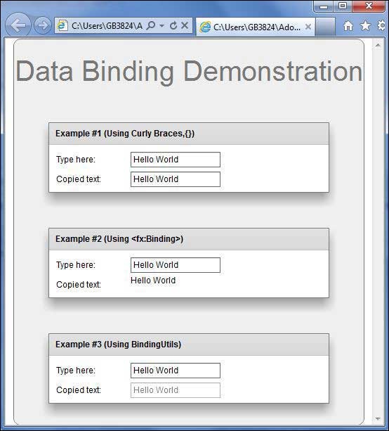
Flex – привязка данных
Что такое привязка данных?
Привязка данных – это процесс, в котором данные одного объекта связаны с другим объектом. Это требует свойства источника, свойства назначения и запускающего события, которое указывает, когда копировать данные из источника в место назначения.
Flex предоставляет три способа связывания данных, как показано ниже
- Синтаксис фигурных скобок в MXML-скрипте ({})
- Тег <fx: binding> в MXML
- BindingUtils в ActionScript
Привязка данных – использование фигурных скобок в MXML
В следующем примере показано, как использовать фигурные скобки для указания привязки данных источника к месту назначения.
<s:TextInput id = "txtInput1" />
<s:TextInput id = "txtInput2" text = "{txtInput1.text}" />
Привязка данных – использование тега <fx: Binding> в MXML
Следующий пример демонстрирует, как использовать тег для указания привязки данных источника к месту назначения.
<fx:Binding source = "txtInput1.text" destination = "txtInput2.text" />
<s:TextInput id = "txtInput1" />
<s:TextInput id = "txtInput2" />
Привязка данных – Использование BindingUtils в ActionScript
В следующем примере показано, как использовать BindingUtils для указания привязки данных источника к месту назначения.
<fx:Script>
   <![CDATA[
      import mx.binding.utils.BindingUtils;
      import mx.events.FlexEvent;

      protected function txtInput2_preinitializeHandler(event:FlexEvent):void {
         BindingUtils.bindProperty(txtInput2,"text",txtInput1, "text");
      }
   ]]>
</fx:Script>

<s:TextInput id = "txtInput1" />
<s:TextInput id = "txtInput2"
   preinitialize = "txtInput2_preinitializeHandler(event)" />
Пример связывания данных Flex
Давайте следуем инструкциям ниже, чтобы увидеть скин в действии в приложении Flex, создав тестовое приложение –
| шаг | Описание |
|---|---|
| 1 | Создайте проект с именем HelloWorld в пакете com.tutorialspoint.client, как описано в главе « Создание приложения Flex» . |
| 2 | Измените HelloWorld.mxml, как описано ниже. Сохраните остальные файлы без изменений. |
| 3 | Скомпилируйте и запустите приложение, чтобы убедиться, что бизнес-логика работает в соответствии с требованиями. |
Ниже приводится содержимое измененного файла HelloWorld.mxml src / com / tutorialspoint / client / HelloWorld.mxml .
<?xml version = "1.0" encoding = "utf-8"?>
<s:Application xmlns:fx = "http://ns.adobe.com/mxml/2009"
xmlns:s = "library://ns.adobe.com/flex/spark"
xmlns:mx = "library://ns.adobe.com/flex/mx
width = "100%" height = "100%" minWidth = "500" minHeight = "500">
<fx:Style source = "/com/tutorialspoint/client/Style.css" />
<fx:Script>
<![CDATA[
import mx.binding.utils.BindingUtils;
import mx.events.FlexEvent;
protected function txtInput6_preinitializeHandler(event:FlexEvent):void {
BindingUtils.bindProperty(txtInput6,"text",txtInput5, "text");
}
]]>
</fx:Script>
<fx:Binding source = "txtInput3.text" destination = "txtInput4.text" />
<s:BorderContainer width = "500" height = "550" id = "mainContainer"
styleName = "container">
<s:VGroup width = "100%" height = "100%" gap = "50" horizontalAlign = "center"
verticalAlign = "middle">
<s:Label id = "lblHeader" text = "Data Binding Demonstration"
fontSize = "40" color = "0x777777" styleName = "heading" />
<s:Panel title = "Example #1 (Using Curly Braces,{})" width = "400"
height = "100" >
<s:layout>
<s:VerticalLayout paddingTop = "10" paddingLeft = "10" />
</s:layout>
<s:HGroup >
<s:Label text = "Type here: " width = "100" paddingTop = "6" />
<s:TextInput id = "txtInput1" />
</s:HGroup>
<s:HGroup >
<s:Label text = "Copied text: " width = "100" paddingTop = "6" />
<s:TextInput id = "txtInput2" text = "{txtInput1.text}" />
</s:HGroup>
</s:Panel>
<s:Panel title = "Example #2 (Using <fx:Binding>)" width = "400"
height = "100" >
<s:layout>
<s:VerticalLayout paddingTop = "10" paddingLeft = "10" />
</s:layout>
<s:HGroup >
<s:Label text = "Type here: " width = "100" paddingTop = "6" />
<s:TextInput id = "txtInput3" />
</s:HGroup>
<s:HGroup >
<s:Label text = "Copied text: " width = "100" paddingTop = "6" />
<s:Label id = "txtInput4" />
</s:HGroup>
</s:Panel>
<s:Panel title = "Example #3 (Using BindingUtils)" width = "400"
height = "100" >
<s:layout>
<s:VerticalLayout paddingTop = "10" paddingLeft = "10" />
</s:layout>
<s:HGroup >
<s:Label text = "Type here: " width = "100" paddingTop = "6" />
<s:TextInput id = "txtInput5" />
</s:HGroup>
<s:HGroup >
<s:Label text = "Copied text: " width = "100" paddingTop = "6" />
<s:TextInput enabled = "false" id = "txtInput6"
preinitialize = "txtInput6_preinitializeHandler(event)" />
</s:HGroup>
</s:Panel>
</s:VGroup>
</s:BorderContainer>
</s:Application>
Когда вы будете готовы со всеми внесенными изменениями, давайте скомпилируем и запустим приложение в обычном режиме, как мы это делали во главе Flex – Create Application . Если с вашим приложением все в порядке, оно даст следующий результат: [ Попробуйте онлайн ]
Flex – Основные элементы управления
Каждый пользовательский интерфейс рассматривает следующие три основных аспекта:
-
Элементы пользовательского интерфейса – это основные визуальные элементы, с которыми пользователь в конечном итоге видит и взаимодействует. Flex предоставляет огромный список широко используемых и общих элементов, варьирующихся от базовых до сложных, которые мы рассмотрим в этом руководстве.
-
Макеты – они определяют, как элементы пользовательского интерфейса должны быть организованы на экране, и обеспечивают окончательный внешний вид графического интерфейса пользователя. Эта часть будет рассмотрена в главе «Макет».
-
Поведение – эти события происходят, когда пользователь взаимодействует с элементами пользовательского интерфейса. Эта часть будет рассмотрена в главе «Обработка событий».
Элементы пользовательского интерфейса – это основные визуальные элементы, с которыми пользователь в конечном итоге видит и взаимодействует. Flex предоставляет огромный список широко используемых и общих элементов, варьирующихся от базовых до сложных, которые мы рассмотрим в этом руководстве.
Макеты – они определяют, как элементы пользовательского интерфейса должны быть организованы на экране, и обеспечивают окончательный внешний вид графического интерфейса пользователя. Эта часть будет рассмотрена в главе «Макет».
Поведение – эти события происходят, когда пользователь взаимодействует с элементами пользовательского интерфейса. Эта часть будет рассмотрена в главе «Обработка событий».
Элементы Flex UI
Библиотека Flex UI предоставляет классы в четко определенной иерархии классов для создания сложных веб-интерфейсов пользователя. Все классы в этой иерархии компонентов были получены из базового класса EventDispatcher, как показано ниже –

Каждый элемент управления Basic UI наследует свойства от класса Component UI, который, в свою очередь, наследует свойства от EventDispatcher и других классов верхнего уровня.
| Sr.No | Контроль и описание |
|---|---|
| 1 | Flex EventDispatcher Class
Класс EventDispatcher является базовым классом для всех классов, которые могут отправлять события. Класс EventDispatcher позволяет любому объекту в списке отображения быть целью события и, таким образом, использовать методы интерфейса IEventDispatcher. |
| 2 | Flex UIComponent
Класс UIComponent является базовым классом для всех визуальных компонентов, как интерактивных, так и неинтерактивных. |
Класс EventDispatcher является базовым классом для всех классов, которые могут отправлять события. Класс EventDispatcher позволяет любому объекту в списке отображения быть целью события и, таким образом, использовать методы интерфейса IEventDispatcher.
Класс UIComponent является базовым классом для всех визуальных компонентов, как интерактивных, так и неинтерактивных.
Основные элементы управления
Ниже приведены несколько важных основных элементов управления –
| Sr.No | Управление и описание |
|---|---|
| 1 | этикетка
Метка – это низкоуровневый компонент UIComponent, который может отображать одну или несколько строк текста одинакового формата. |
| 2 | Текст
Элемент управления «Текст» позволяет отображать содержимое HTML, а также обычный текст в вашем приложении. |
| 3 | Образ
Элемент управления изображения позволяет импортировать файлы JPEG, PNG, GIF и SWF во время выполнения. |
| 4 | LinkButton
Элемент управления LinkButton представляет собой элемент управления Button без полей, содержимое которого выделяется, когда пользователь наводит на него указатель мыши. |
Метка – это низкоуровневый компонент UIComponent, который может отображать одну или несколько строк текста одинакового формата.
Элемент управления «Текст» позволяет отображать содержимое HTML, а также обычный текст в вашем приложении.
Элемент управления изображения позволяет импортировать файлы JPEG, PNG, GIF и SWF во время выполнения.
Элемент управления LinkButton представляет собой элемент управления Button без полей, содержимое которого выделяется, когда пользователь наводит на него указатель мыши.
Flex – Элементы управления формой
Элементы управления формой позволяют пользователям вводить данные и предоставляют им возможность взаимодействия с приложением. Каждый пользовательский интерфейс формы контролирует и наследует свойства от класса UIComponent, который, в свою очередь, наследует свойства от EventDispatcher и других классов верхнего уровня.
| Sr.No | Контроль и описание |
|---|---|
| 1 | Flex EventDispatcher Class
Класс EventDispatcher является базовым классом для всех классов, которые могут отправлять события. Класс EventDispatcher позволяет любому объекту в списке отображения быть целью события и, таким образом, использовать методы интерфейса IEventDispatcher. |
| 2 | Flex UIComponent
Класс UIComponent является базовым классом для всех визуальных компонентов, как интерактивных, так и неинтерактивных. |
Класс EventDispatcher является базовым классом для всех классов, которые могут отправлять события. Класс EventDispatcher позволяет любому объекту в списке отображения быть целью события и, таким образом, использовать методы интерфейса IEventDispatcher.
Класс UIComponent является базовым классом для всех визуальных компонентов, как интерактивных, так и неинтерактивных.
Элементы управления формой
Ниже приведены несколько важных элементов управления формы.
| Sr.No | Контроль и описание |
|---|---|
| 1 | кнопка
Компонент Button является обычно используемой прямоугольной кнопкой. |
| 2 | Кнопка-переключатель
Компонент ToggleButton определяет кнопку переключения. |
| 3 | CheckBox
Компонент CheckBox состоит из дополнительной метки и небольшого поля, которое может содержать или не содержать галочку. |
| 4 | ColorPicker
Элемент управления ColorPicker позволяет пользователю выбрать цвет из списка образцов. |
| 5 | Поле со списком
Элемент управления ComboBox является дочерним классом элемента управления DropDownListBase. |
| 6 | DateChooser
Элемент управления DateChooser отображает название месяца, года и сетку дней месяца со столбцами, помеченными для дня недели. |
| 7 | Переключатель
Компонент RadioButton позволяет пользователю сделать один выбор в рамках набора взаимоисключающих вариантов. |
| 8 | TextArea
TextArea – это элемент управления вводом текста, который позволяет пользователям вводить и редактировать несколько строк форматированного текста. |
| 9 | Ввод текста
TextInput – это элемент управления вводом текста, который позволяет пользователям вводить и редактировать одну строку текста одинакового формата. |
| 10 | Выпадающий список
Элемент управления DropDownList содержит раскрывающийся список, из которого пользователь может выбрать одно значение. |
| 11 | NumericStepper
Элемент управления NumericStepper позволяет выбрать число из упорядоченного набора. |
Компонент Button является обычно используемой прямоугольной кнопкой.
Компонент ToggleButton определяет кнопку переключения.
Компонент CheckBox состоит из дополнительной метки и небольшого поля, которое может содержать или не содержать галочку.
Элемент управления ColorPicker позволяет пользователю выбрать цвет из списка образцов.
Элемент управления ComboBox является дочерним классом элемента управления DropDownListBase.
Элемент управления DateChooser отображает название месяца, года и сетку дней месяца со столбцами, помеченными для дня недели.
Компонент RadioButton позволяет пользователю сделать один выбор в рамках набора взаимоисключающих вариантов.
TextArea – это элемент управления вводом текста, который позволяет пользователям вводить и редактировать несколько строк форматированного текста.
TextInput – это элемент управления вводом текста, который позволяет пользователям вводить и редактировать одну строку текста одинакового формата.
Элемент управления DropDownList содержит раскрывающийся список, из которого пользователь может выбрать одно значение.
Элемент управления NumericStepper позволяет выбрать число из упорядоченного набора.
Flex – Комплексное управление
Сложные элементы управления предоставляют пользователям расширенные возможности для более простого обращения с большими объемами данных и предоставляют им возможность взаимодействия с приложением. Каждый элемент управления Complex UI наследует свойства от класса UIComponent, который, в свою очередь, наследует свойства от EventDispatcher и других классов верхнего уровня.
| Sr.No | Контроль и описание |
|---|---|
| 1 | Flex EventDispatcher Class
Класс EventDispatcher является базовым классом для всех классов, которые могут отправлять события. Класс EventDispatcher позволяет любому объекту в списке отображения быть целью события и, таким образом, использовать методы интерфейса IEventDispatcher. |
| 2 | Flex UIComponent
Класс UIComponent является базовым классом для всех визуальных компонентов, как интерактивных, так и неинтерактивных. |
Класс EventDispatcher является базовым классом для всех классов, которые могут отправлять события. Класс EventDispatcher позволяет любому объекту в списке отображения быть целью события и, таким образом, использовать методы интерфейса IEventDispatcher.
Класс UIComponent является базовым классом для всех визуальных компонентов, как интерактивных, так и неинтерактивных.
Комплексное управление
Ниже приведены несколько важных сложных элементов управления –
| Sr.No | Контроль и описание |
|---|---|
| 1 | DataGrid
Элемент управления DataGrid отображает строку заголовков столбцов над прокручиваемой сеткой. |
| 2 | AdvancedDataGrid
AdvancedDataGrid добавляет несколько дополнительных функций в стандартный элемент управления DataGrid для добавления функций визуализации данных. |
| 3 | Меню
Элемент управления Menu создает всплывающее меню с возможностью индивидуального выбора. |
| 4 | Индикатор
Элемент управления ProgressBar обеспечивает визуальное представление хода выполнения задачи за определенный период времени. |
| 5 | RichTextEditor
Элемент управления RichTextEditor позволяет пользователям вводить и форматировать текст. |
| 6 | TileList
Элемент управления TileList Элемент управления TileList отображает количество элементов, разложенных на листах. |
| 7 | дерево
Элемент управления Tree позволяет пользователю просматривать иерархические данные, расположенные в виде расширяемого дерева. |
| 8 | Видео-плеер
Элемент управления VideoPlayer – это видеопроигрыватель с поддержкой скинов, который поддерживает прогрессивную загрузку, потоковую передачу с несколькими битрейтами и потоковое видео. |
| 9 | Accordian
Элемент управления Accordian имеет коллекцию дочерних контейнеров MX или контейнеров Spark NavigatorContent, но одновременно виден только один из них. |
| 10 | TabNavigator
Элемент управления TabNavigator включает контейнер TabBar для навигации между его дочерними контейнерами. |
| 11 | ToggleButtonBar
Элемент управления ToggleButtonBar определяет горизонтальную или вертикальную группу кнопок, которые поддерживают свое выбранное или отмененное состояние. |
Элемент управления DataGrid отображает строку заголовков столбцов над прокручиваемой сеткой.
AdvancedDataGrid добавляет несколько дополнительных функций в стандартный элемент управления DataGrid для добавления функций визуализации данных.
Элемент управления Menu создает всплывающее меню с возможностью индивидуального выбора.
Элемент управления ProgressBar обеспечивает визуальное представление хода выполнения задачи за определенный период времени.
Элемент управления RichTextEditor позволяет пользователям вводить и форматировать текст.
Элемент управления TileList Элемент управления TileList отображает количество элементов, разложенных на листах.
Элемент управления Tree позволяет пользователю просматривать иерархические данные, расположенные в виде расширяемого дерева.
Элемент управления VideoPlayer – это видеопроигрыватель с поддержкой скинов, который поддерживает прогрессивную загрузку, потоковую передачу с несколькими битрейтами и потоковое видео.
Элемент управления Accordian имеет коллекцию дочерних контейнеров MX или контейнеров Spark NavigatorContent, но одновременно виден только один из них.
Элемент управления TabNavigator включает контейнер TabBar для навигации между его дочерними контейнерами.
Элемент управления ToggleButtonBar определяет горизонтальную или вертикальную группу кнопок, которые поддерживают свое выбранное или отмененное состояние.
Flex – Макетные панели
Элементы управления панели макета позволяют пользователям организовать элементы управления пользовательского интерфейса на странице. Каждый элемент управления Layout наследует свойства от класса UIComponent, который, в свою очередь, наследует свойства от EventDispatcher и других классов верхнего уровня.
| Sr.No | Контроль и описание |
|---|---|
| 1 | Flex EventDispatcher Class
Класс EventDispatcher является базовым классом для всех классов, которые могут отправлять события. Класс EventDispatcher позволяет любому объекту в списке отображения быть целью события и, таким образом, использовать методы интерфейса IEventDispatcher. |
| 2 | Flex UIComponent
Класс UIComponent является базовым классом для всех визуальных компонентов, как интерактивных, так и неинтерактивных. |
Класс EventDispatcher является базовым классом для всех классов, которые могут отправлять события. Класс EventDispatcher позволяет любому объекту в списке отображения быть целью события и, таким образом, использовать методы интерфейса IEventDispatcher.
Класс UIComponent является базовым классом для всех визуальных компонентов, как интерактивных, так и неинтерактивных.
Макет Панели
Ниже приведены несколько важных макетов –
| Sr.No | Панель и описание |
|---|---|
| 1 | BorderContainer
Класс BorderContainer предоставляет набор стилей CSS, которые управляют внешним видом границы и фоновой заливкой контейнера. |
| 2 | форма
Контейнер формы обеспечивает контроль над макетом формы, помечает поля формы как обязательные или необязательные, обрабатывает сообщения об ошибках и привязывает данные формы к модели данных Flex для выполнения проверки и проверки данных. |
| 3 | VGroup
Контейнер VGroup – это контейнер Group, который использует класс VerticalLayout. |
| 4 | HGroup
Контейнер HGroup – это контейнер Group, который использует класс HorizontalLayout. |
| 5 | панель
Класс Panel – это контейнер, который содержит строку заголовка, заголовок, рамку и область содержимого для своих дочерних элементов. |
| 6 | SkinnableContainer
Класс SkinnableContainer является базовым классом для контейнеров с поддержкой скинов, которые предоставляют визуальный контент. |
| 7 | TabBar
Панель вкладок отображает набор идентичных вкладок. |
| 8 | TitleWindow
Окно TitleWindow расширяет панель для включения кнопки закрытия и области перемещения. |
Класс BorderContainer предоставляет набор стилей CSS, которые управляют внешним видом границы и фоновой заливкой контейнера.
Контейнер формы обеспечивает контроль над макетом формы, помечает поля формы как обязательные или необязательные, обрабатывает сообщения об ошибках и привязывает данные формы к модели данных Flex для выполнения проверки и проверки данных.
Контейнер VGroup – это контейнер Group, который использует класс VerticalLayout.
Контейнер HGroup – это контейнер Group, который использует класс HorizontalLayout.
Класс Panel – это контейнер, который содержит строку заголовка, заголовок, рамку и область содержимого для своих дочерних элементов.
Класс SkinnableContainer является базовым классом для контейнеров с поддержкой скинов, которые предоставляют визуальный контент.
Панель вкладок отображает набор идентичных вкладок.
Окно TitleWindow расширяет панель для включения кнопки закрытия и области перемещения.
Flex – Визуальные эффекты
Мы можем добавить поведение к гибкому приложению, используя концепцию Effects. Например, когда текстовое поле получает фокус, мы можем сделать его текст более жирным и немного увеличить его размер.
Каждый эффект наследует свойства от класса Effect, который, в свою очередь, наследует свойства от EventDispatcher и других классов верхнего уровня.
| Sr.No | Эффект и описание |
|---|---|
| 1 | Flex Effect Class
Класс Effect – это абстрактный базовый класс, который определяет основные функциональные возможности всех эффектов Flex. Этот класс определяет базовый класс фабрики для всех эффектов. |
Класс Effect – это абстрактный базовый класс, который определяет основные функциональные возможности всех эффектов Flex. Этот класс определяет базовый класс фабрики для всех эффектов.
Основные эффекты
Ниже приведены несколько важных базовых визуальных эффектов.
| Sr.No | Эффект и описание |
|---|---|
| 1 | увядать
Эффект Fade анимирует альфа-свойство компонента. |
| 2 | WipeLeft
Класс WipeLeft определяет эффект стирания влево. |
| 3 | WipeRight
Класс WipeRight определяет правильный эффект стирания. |
| 4 | Move3D
Класс Move3D перемещает целевой объект в измерениях x, y и z. |
| 5 | Scale3D
Класс Scale3D масштабирует целевой объект в трех измерениях вокруг центра преобразования. |
| 6 | Rotate3D
Класс Rotate3D вращает целевой объект в трех измерениях вокруг осей x, y или z. |
| 7 | оживлять
Этот эффект анимации анимирует произвольный набор свойств между значениями. Укажите свойства и значения для анимации, установив свойство motionPaths. |
Эффект Fade анимирует альфа-свойство компонента.
Класс WipeLeft определяет эффект стирания влево.
Класс WipeRight определяет правильный эффект стирания.
Класс Move3D перемещает целевой объект в измерениях x, y и z.
Класс Scale3D масштабирует целевой объект в трех измерениях вокруг центра преобразования.
Класс Rotate3D вращает целевой объект в трех измерениях вокруг осей x, y или z.
Этот эффект анимации анимирует произвольный набор свойств между значениями. Укажите свойства и значения для анимации, установив свойство motionPaths.
Flex – обработка событий
Flex использует концепцию события для передачи данных от одного объекта к другому в зависимости от состояния или взаимодействия пользователя в приложении.
ActionScript имеет общий класс Event, который определяет большую часть функциональности, необходимой для работы с событиями. Каждый раз, когда событие происходит в приложении Flex, создаются три типа объектов из иерархии классов Event.
Событие имеет следующие три ключевых свойства
| Sr.No | Описание недвижимости |
|---|---|
| 1 |
Тип Тип сообщает о том, какое событие только что произошло. Это может быть щелчок, инициализация, наведение мыши, изменение и т. Д. Фактические значения будут представлены константами, такими как MouseEvent.CLICK. |
| 2 |
цель Свойство target объекта Event является ссылкой на объект, сгенерировавший событие. Если вы нажмете кнопку Button с идентификатором clickMeButton, целью этого события click будет clickMeButton. |
| 3 |
CurrentTarget Свойство currentTarget меняет иерархию контейнера. В основном это касается потока событий. |
Тип
Тип сообщает о том, какое событие только что произошло. Это может быть щелчок, инициализация, наведение мыши, изменение и т. Д. Фактические значения будут представлены константами, такими как MouseEvent.CLICK.
цель
Свойство target объекта Event является ссылкой на объект, сгенерировавший событие. Если вы нажмете кнопку Button с идентификатором clickMeButton, целью этого события click будет clickMeButton.
CurrentTarget
Свойство currentTarget меняет иерархию контейнера. В основном это касается потока событий.
Фазы потока событий
Событие проходит три этапа в поисках обработчиков событий.
| Sr.No | Фаза и описание |
|---|---|
| 1 |
Захватить На этапе захвата программа начнет поиск обработчиков событий от внешнего (или верхнего) родителя до самого внутреннего. Фаза захвата заканчивается у родителя объекта, вызвавшего событие. |
| 2 |
цель На целевом этапе компонент, вызвавший событие, проверяется на наличие обработчика события. |
| 3 |
Пузырь Фаза пузыря обратна фазе захвата и работает обратно через структуру, начиная с родительского целевого компонента и далее. |
Захватить
На этапе захвата программа начнет поиск обработчиков событий от внешнего (или верхнего) родителя до самого внутреннего. Фаза захвата заканчивается у родителя объекта, вызвавшего событие.
цель
На целевом этапе компонент, вызвавший событие, проверяется на наличие обработчика события.
Пузырь
Фаза пузыря обратна фазе захвата и работает обратно через структуру, начиная с родительского целевого компонента и далее.
Рассмотрим следующий код приложения –
<?xml version = "1.0" encoding = "utf-8"?>
<s:Application xmlns:fx = "http://ns.adobe.com/mxml/2009"
   xmlns:s = "library://ns.adobe.com/flex/spark"
   xmlns:mx = "library://ns.adobe.com/flex/mx
   width = "100%" height = "100%" minWidth = "500" minHeight = "500" >

   <s:Panel>
      <s:Button id = "clickMeButton" label = "Click Me!" click = "doAction( );" />
   </s:Panel>
</s:Application>
Когда пользователь нажимает кнопку, он или она также щелкает панель и приложение.
Событие проходит три фазы в поисках назначений обработчиков событий.

Давайте выполним следующие шаги, чтобы протестировать обработку событий в приложении Flex:
| шаг | Описание |
|---|---|
| 1 | Создайте проект с именем HelloWorld в пакете com.tutorialspoint.client, как описано в главе « Создание приложения Flex» . |
| 2 | Измените HelloWorld.mxml, как описано ниже. Сохраните остальные файлы без изменений. |
| 3 | Скомпилируйте и запустите приложение, чтобы убедиться, что бизнес-логика работает в соответствии с требованиями. |
Ниже приводится содержимое измененного mxml-файла src / com.tutorialspoint / HelloWorld.mxml .
<?xml version = "1.0" encoding = "utf-8"?>
<s:Application xmlns:fx = "http://ns.adobe.com/mxml/2009"
   xmlns:s = "library://ns.adobe.com/flex/spark"
   xmlns:mx = "library://ns.adobe.com/flex/mx
   width = "100%" height = "100%" minWidth = "500" minHeight = "500">

   <fx:Style source = "/com/tutorialspoint/client/Style.css" />
   <fx:Script>
      <![CDATA[
         protected function reportEvent(event:MouseEvent):void {
            var target:String = event.target.id;
            var currentTarget:String = event.target.id;
            var eventPhase: String;

            if(event.target is Button) {
               var button:Button = event.target as Button;
               target = button.label + " Button";
            } else if(event.target is HGroup) {
               var hGroup:HGroup = event.target as HGroup;
               target = hGroup.id + " HGroup";
            } else if(event.target is Panel) {
               var panel:Panel = event.target as Panel;
               target = panel.id + " Panel";
            }

            if(event.currentTarget is Button) {
               var button1:Button = event.currentTarget as Button;
               currentTarget = button1.label + " Button";
            } else if(event.currentTarget is HGroup) {
               var hGroup1:HGroup = event.currentTarget as HGroup;
               currentTarget = hGroup1.id + " HGroup";
            } else if(event.currentTarget is Panel) {
               var panel1:Panel = event.currentTarget as Panel;
               currentTarget = panel1.id + " Panel";
            }

            var eventPhaseInt:uint = event.eventPhase;

            if(eventPhaseInt == EventPhase.AT_TARGET) {
               eventPhase = "Target";
            } else if(eventPhaseInt == EventPhase.BUBBLING_PHASE) {
               eventPhase = "Bubbling";
            } else if(eventPhaseInt == EventPhase.CAPTURING_PHASE) {
               eventPhase = "Capturing";
            }

            reports.text += " Target: " + target + "n currentTarget: " +
               currentTarget + "n Phase: " + eventPhase + "n----------n";
         }
      ]]>
   </fx:Script>

   <s:BorderContainer width = "630" height = "480" id = "mainContainer"
      styleName = "container">
      <s:VGroup width = "100%" height = "100%" gap = "10"
         horizontalAlign = "center" verticalAlign = "middle">
         <s:Label id = "lblHeader" text = "Event Handling Demonstration"
            fontSize = "40" color = "0x777777" styleName = "heading" />

         <s:Panel id = "parentPanel" title = "Main Parent"
            click = "reportEvent(event)" width = "500"
            height = "100" includeInLayout = "true" visible = "true">
            <s:layout>
               <s:VerticalLayout  gap = "10" verticalAlign = "middle"
                  horizontalAlign = "center" />
            </s:layout>

            <s:HGroup id = "mainHGroup" click = "reportEvent(event)">
               <s:Button label = "Click Me" click = "reportEvent(event)" />
            </s:HGroup>
         </s:Panel>

         <s:Panel id = "reportPanel" title = "Events" width = "500" height = "230">
            <mx:Text id = "reports" />
         </s:Panel>
      </s:VGroup>
   </s:BorderContainer>
</s:Application>
Когда вы будете готовы со всеми внесенными изменениями, давайте скомпилируем и запустим приложение в обычном режиме, как мы это делали во главе Flex – Create Application . Если с вашим приложением все в порядке, оно даст следующий результат: [ Попробуйте онлайн ]
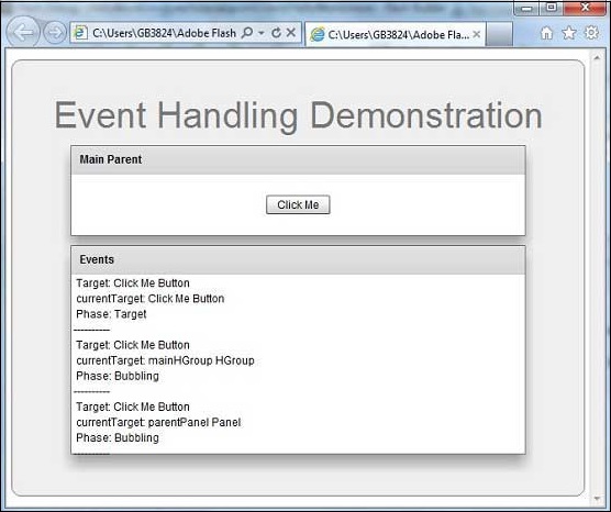
Flex – Пользовательские элементы управления
Flex предоставляет два способа создания пользовательских компонентов.
- Использование ActionScript
- Использование MXML
Использование ActionScript
Вы можете создать компонент, расширив существующий компонент. Чтобы создать компонент с помощью Flash Builder, выберите « Файл»> «Создать»> «Класс ActionScript» .
Введите детали, как показано ниже –
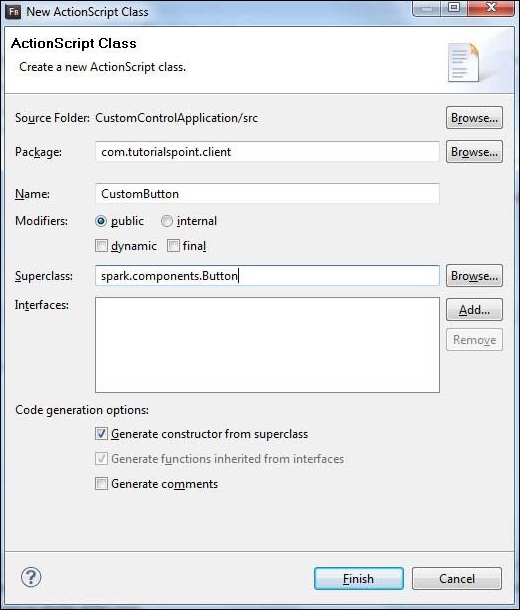
Flash Builder создаст следующий файл CustomButton.as.
package com.tutorialspoint.client {
   import spark.components.Button;

   public class CustomButton extends Button {
      public function CustomButton() {
         super();
      }
   }
}
Использование MXML
Вы можете создать компонент, расширив существующий компонент. Чтобы создать компонент с помощью Flash Builder, выберите « Файл»> «Создать»> «MXML-компонент» .
Введите детали, как показано ниже.

Flash Builder создаст следующий файл CustomLogin.mxml.
<?xml version = "1.0" encoding = "utf-8"?>
<s:Group xmlns:fx = "http://ns.adobe.com/mxml/2009"
   xmlns:s = "library://ns.adobe.com/flex/spark"
   xmlns:mx = "library://ns.adobe.com/flex/mx"
   width = "400" height = "300">
</s:Group>
Давайте выполним следующие шаги для тестирования пользовательских элементов управления в приложении Flex:
| шаг | Описание |
|---|---|
| 1 | Создайте проект с именем HelloWorld в пакете com.tutorialspoint.client, как описано в главе « Создание приложения Flex» . |
| 2 | Измените HelloWorld.mxml, как описано ниже. Сохраните остальные файлы без изменений. |
| 3 | Создайте компоненты CustomLogin.mxml и CustomButton.as, как описано выше. Измените эти файлы, как описано ниже. Сохраните остальные файлы без изменений. |
| 4 | Скомпилируйте и запустите приложение, чтобы убедиться, что бизнес-логика работает в соответствии с требованиями. |
Ниже приведено содержимое измененного mxml-файла src / com.tutorialspoint / client / CustomLogin.mxml .
<?xml version = "1.0" encoding = "utf-8"?>
<s:Group xmlns:fx = "http://ns.adobe.com/mxml/2009"
   xmlns:s = "library://ns.adobe.com/flex/spark"
   xmlns:mx = "library://ns.adobe.com/flex/mx" width = "400" height = "300">

   <s:Form>
      <s:FormItem label = "UserName:">
         <s:TextInput width = "200" />
      </s:FormItem>

      <s:FormItem label = "Password:">
         <s:TextInput width = "200" displayAsPassword = "true" />
      </s:FormItem>

      <s:FormItem>
         <s:Button label = "Login" />
      </s:FormItem>
   </s:Form>
</s:Group>
Ниже приводится содержание измененного mxml-файла src / com.tutorialspoint / client / CustomButton.as .
package com.tutorialspoint.client {
   import spark.components.Button;

   public class CustomButton extends Button {

      public function CustomButton() {
         super();
         this.setStyle("color","green");
         this.label = "Submit";
      }
   }
}
Ниже приведено содержимое модифицированного mxml-файла src / com.tutorialspoint / client / HelloWorld.mxml .
<?xml version = "1.0" encoding = "utf-8"?>
<s:Application xmlns:fx = "http://ns.adobe.com/mxml/2009"
   xmlns:s = "library://ns.adobe.com/flex/spark"
   xmlns:mx = "library://ns.adobe.com/flex/mx"
   xmlns:client = "com.tutorialspoint.client.*"
   initialize = "application_initializeHandler(event)">

   <fx:Style source = "/com/tutorialspoint/client/Style.css" />
   <fx:Script>
      <![CDATA[
        import mx.events.FlexEvent;

        protected function application_initializeHandler(event:FlexEvent):void {
           //create a new custom button
           var customButton: CustomButton = new CustomButton();
           asPanel.addElement(customButton);
        }

      ]]>
   </fx:Script>

   <s:BorderContainer width = "630" height = "480" id = "mainContainer"
      styleName = "container">
      <s:VGroup width = "100%" height = "100%" gap = "10"
         horizontalAlign = "center" verticalAlign = "middle">
         <s:Label id = "lblHeader" text = "Custom Controls Demonstration"
            fontSize = "40" color = "0x777777" styleName = "heading" />

         <s:Panel title = "Using MXML Component" width = "400" height = "200">
            <client:CustomLogin>
            </client:CustomLogin>
         </s:Panel>

         <s:Panel  title = "Using AS Component" width = "400" height = "100">
            <s:VGroup id = "asPanel" width = "100%" height = "100%" gap = "10"
               horizontalAlign = "center" verticalAlign = "middle">
            </s:VGroup>
         </s:Panel>
      </s:VGroup>
   </s:BorderContainer>
</s:Application>
Когда вы будете готовы со всеми внесенными изменениями, давайте скомпилируем и запустим приложение в обычном режиме, как мы это делали во главе Flex – Create Application . Если с вашим приложением все в порядке, оно даст следующий результат: [ Попробуйте онлайн ]
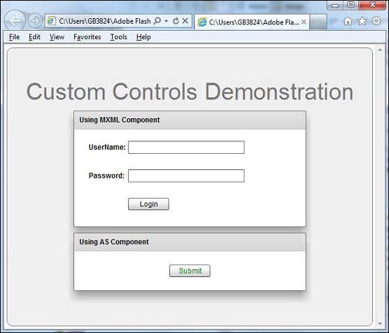
Flex – RPC Сервисы
Flex предоставляет службы RPC для предоставления данных на стороне сервера стороне клиента. Flex обеспечивает достаточный контроль над данными на стороне сервера.
-
Используя сервисы Flex RPC, мы можем определить действия пользователя, которые будут выполняться на стороне сервера.
-
Flex RPC Sservices можно интегрировать с любыми серверными технологиями.
-
Один из сервисов Flex RPC обеспечивает встроенную поддержку сжатых двоичных данных, передаваемых по проводам, и работает довольно быстро.
Используя сервисы Flex RPC, мы можем определить действия пользователя, которые будут выполняться на стороне сервера.
Flex RPC Sservices можно интегрировать с любыми серверными технологиями.
Один из сервисов Flex RPC обеспечивает встроенную поддержку сжатых двоичных данных, передаваемых по проводам, и работает довольно быстро.
Flex предоставляет следующие три типа RPC-сервисов
| Sr.No | RPC Сервис и описание |
|---|---|
| 1 |
HTTPService Тег <mx: HTTPService> используется для представления объекта HTTPService в файле MXML. Когда вы вызываете метод send () объекта HTTPService, он отправляет HTTP-запрос к указанному URL-адресу и возвращает HTTP-ответ. Вы также можете использовать методы HTTP HEAD, OPTIONS, TRACE и DELETE. |
| 2 |
Веб-сервис <Mx: WebService> используется для получения доступа к операциям SOAP-совместимых веб-служб. |
| 3 |
RemoteObject Тег <mx: RemoteObject> используется для представления объекта HTTPService в файле MXML. Этот тег дает вам доступ к методам объектов Java, использующим кодировку Action Message Format (AMF). |
HTTPService
Тег <mx: HTTPService> используется для представления объекта HTTPService в файле MXML. Когда вы вызываете метод send () объекта HTTPService, он отправляет HTTP-запрос к указанному URL-адресу и возвращает HTTP-ответ. Вы также можете использовать методы HTTP HEAD, OPTIONS, TRACE и DELETE.
Веб-сервис
<Mx: WebService> используется для получения доступа к операциям SOAP-совместимых веб-служб.
RemoteObject
Тег <mx: RemoteObject> используется для представления объекта HTTPService в файле MXML. Этот тег дает вам доступ к методам объектов Java, использующим кодировку Action Message Format (AMF).
Мы собираемся обсудить HTTP-сервис подробно. Мы будем использовать исходный файл XML, размещенный на сервере, и обращаться к нему на стороне клиента через службу HTTP.
items.xml
<items>
   <item name = "Book" description = "History of France"></item>
   <item name = "Pen" description = "Parker Pen"></item>
   <item name = "Pencil" description = "Stationary"></item>
<items>
HTTPService Декларация
Теперь объявите HTTPService и передайте ему URL вышеуказанного файла.
<fx:Declarations>
   <mx:HTTPService id = "itemRequest"
   url = "http://www.tutorialspoint.com/flex/Items.xml" />
</fx:Declarations>
RPC Call
Выполните вызов метода itemRequest.send () и привяжите значения из объекта lastResult веб-службы itemRequest к компоненту Flex UI.
...
itemRequest.send();
...
<mx:DataGrid id = "dgItems" height = "80%" width = "75%"
   dataProvider = "{itemRequest.lastResult.items.item}">
   <mx:columns>
      <mx:DataGridColumn headerText = "Name" dataField = "name" />
      <mx:DataGridColumn headerText = "Description" dataField = "description" />
   </mx:columns>
</mx:DataGrid>
Пример вызова службы RPC
Теперь давайте выполним шаги для тестирования служб RPC в приложении Flex –
| шаг | Описание |
|---|---|
| 1 | Создайте проект с именем HelloWorld в пакете com.tutorialspoint.client, как описано в главе « Создание приложения Flex» . |
| 2 | Измените HelloWorld.mxml, как описано ниже. Сохраните остальные файлы без изменений. |
| 3 | Скомпилируйте и запустите приложение, чтобы убедиться, что бизнес-логика работает в соответствии с требованиями. |
Ниже приводится содержимое измененного mxml-файла src / com.tutorialspoint / HelloWorld.mxml .
<?xml version = "1.0" encoding = "utf-8"?>
<s:Application xmlns:fx = "http://ns.adobe.com/mxml/2009"
   xmlns:s = "library://ns.adobe.com/flex/spark"
   xmlns:mx = "library://ns.adobe.com/flex/mx"
   minWidth = "500" minHeight = "500" creationComplete = "init(event)">

   <fx:Style source = "/com/tutorialspoint/client/Style.css" />
   <fx:Script>
      <![CDATA[
         import mx.events.FlexEvent;
         import mx.rpc.events.FaultEvent;
         import mx.rpc.events.ResultEvent;

         protected function init(event:FlexEvent):void {
            itemRequest.send();
         }
      ]]>
   </fx:Script>

   <fx:Declarations>
      <mx:HTTPService id = "itemRequest"
         url = "http://www.tutorialspoint.com/flex/Items.xml" />
   </fx:Declarations>

   <s:BorderContainer width = "630" height = "480" id = "mainContainer"
      styleName = "container">
      <s:VGroup width = "100%" height = "100%" gap = "10"
         horizontalAlign = "center" verticalAlign = "middle">
         <s:Label id = "lblHeader" text = "RPC Service Demonstration"
            fontSize = "40" color = "0x777777" styleName = "heading" />

         <s:Panel id = "parentPanel" title = "Using RPC Services"
            width = "500" height = "200" >
            <s:layout>
               <s:VerticalLayout  gap = "10"
                  verticalAlign = "middle" horizontalAlign = "center" />
            </s:layout>

            <mx:DataGrid id = "dgItems" height = "80%" width = "75%"
               dataProvider = "{itemRequest.lastResult.items.item}">

               <mx:columns>
                  <mx:DataGridColumn headerText = "Name" dataField = "name" />
                  <mx:DataGridColumn headerText = "Description"
                     dataField = "description" />
               </mx:columns>
            </mx:DataGrid>
         </s:Panel>
      </s:VGroup>
   </s:BorderContainer>
</s:Application>
Когда вы будете готовы со всеми внесенными изменениями, давайте скомпилируем и запустим приложение в обычном режиме, как мы это делали во главе Flex – Create Application . Если с вашим приложением все в порядке, оно даст следующий результат: [ Попробуйте онлайн ]
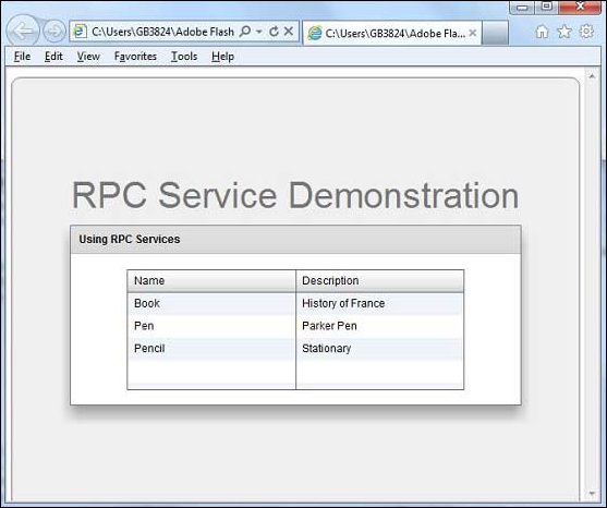
Flex – интеграция FlexUnit
Flash Builder 4 имеет отличную встроенную поддержку интеграции FlexUnit в цикле разработки Flex.
Создать класс теста
Вы можете создать тестовый класс с помощью мастера создания тестового класса Flash Builder. Запускать тестовые сценарии с Flash Builder очень просто, как вы увидите в этой статье.
Чтобы создать класс тестового примера с помощью Flash Builder, выберите « Файл»> «Создать»> «Класс тестового набора» . Введите детали, как показано ниже.

Flash Builder создаст следующий файл TestClass1.as в качестве файла.
package com.tutorialspoint.client {
   public class TestClass1 {
      [Before]
      public function setUp():void {}

      [After]
      public function tearDown():void {}

      [BeforeClass]
      public static function setUpBeforeClass():void {}

      [AfterClass]
      public static function tearDownAfterClass():void {}
   }
}
Пример интеграции FlexUnit
Теперь давайте следуем инструкциям по тестированию интеграции FlexUnit в приложении Flex –
| шаг | Описание |
|---|---|
| 1 | Создайте проект с именем HelloWorld в пакете com.tutorialspoint.client, как описано в главе « Создание приложения Flex» . |
| 2 | Измените HelloWorld.mxml, как описано ниже. Сохраните остальные файлы без изменений. |
| 3 | Создайте контрольный пример TestClass1.as, как описано выше, и измените TestClass1.as, как описано ниже. |
| 4 | Скомпилируйте и запустите приложение, чтобы убедиться, что бизнес-логика работает в соответствии с требованиями. |
Ниже приводится содержание измененного файла src / com.tutorialspoint / client / TestClass1.as .
package com.tutorialspoint.client {
   import org.flexunit.asserts.assertEquals;

   public class TestClass1 {
      private var counter: int = 1;

      [Before]
      public function setUp():void {
         //this code will run before every test case execution
      }

      [After]
      public function tearDown():void {
         //this code will run after every test case execution
      }

      [BeforeClass]
      public static function setUpBeforeClass():void {
         //this code will run once when test cases start execution
      }

      [AfterClass]
      public static function tearDownAfterClass():void {
         //this code will run once when test cases ends execution
      }

      [Test]
      public function testCounter():void {
         assertEquals(counter, 1);
      }
   }
}
Ниже приводится содержимое измененного mxml-файла src / com.tutorialspoint / HelloWorld.mxml .
<?xml version = "1.0" encoding = "utf-8"?>
<s:Application xmlns:fx = "http://ns.adobe.com/mxml/2009"
   xmlns:s = "library://ns.adobe.com/flex/spark"
   xmlns:mx = "library://ns.adobe.com/flex/mx"
   minWidth = "500" minHeight = "500">
</s:Application>
Когда вы будете готовы со всеми внесенными изменениями, давайте скомпилируем в обычном режиме, как мы это делали во главе Flex – Create Application .
Запуск тестовых случаев
Теперь щелкните правой кнопкой мыши TestClass1 в проводнике пакетов и выберите « Запуск от имени»> «Тесты FlexUnit» . Вы увидите следующий вывод в тестовом окне Flash Builder.

Flash Builder также показывает результаты теста в браузере.

Flex – приложение для отладки
Flex предоставляет отличную возможность отладки кода Flex, а Flash Builder 4 имеет превосходную встроенную поддержку отладчика и перспективы отладки.
-
В режиме отладки приложение Flex работает на версии Flash Player Debugger, встроенной в Flash Builder 4, которая поддерживает возможность отладки.
-
Таким образом, разработчики получают простую и встроенную конфигурацию отладки в Flash Builder.
В режиме отладки приложение Flex работает на версии Flash Player Debugger, встроенной в Flash Builder 4, которая поддерживает возможность отладки.
Таким образом, разработчики получают простую и встроенную конфигурацию отладки в Flash Builder.
В этой статье мы продемонстрируем использование отладки кода клиента Flex с помощью Flash Builder. Мы выполним следующие задачи
- Установите точки останова в коде и посмотрите их в Breakpoint Explorer.
- Пошаговое выполнение кода во время отладки.
- Просмотр значений переменной.
- Проверьте значения всех переменных.
- Проверьте значение выражения.
- Показать кадр стека для приостановленных потоков.
Пример отладки
| шаг | Описание |
|---|---|
| 1 | Создайте проект с именем HelloWorld в пакете com.tutorialspoint.client, как описано в главе « Создание приложения Flex» . |
| 2 | Измените HelloWorld.mxml, как описано ниже. Сохраните остальные файлы без изменений. |
| 3 | Скомпилируйте и запустите приложение, чтобы убедиться, что бизнес-логика работает в соответствии с требованиями. |
Ниже приводится содержимое измененного mxml-файла src / com.tutorialspoint / HelloWorld.mxml .
<?xml version = "1.0" encoding = "utf-8"?>
<s:Application xmlns:fx = "http://ns.adobe.com/mxml/2009"
   xmlns:s = "library://ns.adobe.com/flex/spark"
   xmlns:mx = "library://ns.adobe.com/flex/mx"
   width = "100%" height = "100%"
   minWidth = "500" minHeight = "500"
   initialize = "application_initializeHandler(event)">

   <fx:Style source = "/com/tutorialspoint/client/Style.css" />
   <fx:Script>
      <![CDATA[
         import mx.controls.Alert;
         import mx.events.FlexEvent;
         protected function btnClickMe_clickHandler(event:MouseEvent):void {
            Alert.show("Hello World!");
         }

         protected function application_initializeHandler(event:FlexEvent):void {
            lblHeader.text = "My Hello World Application";
         }
      ]]>
   </fx:Script>

   <s:BorderContainer width = "500" height = "500" id = "mainContainer"
      styleName = "container">
      <s:VGroup width = "100%" height = "100%" gap = "50" horizontalAlign = "center"
         verticalAlign = "middle">
         <s:Label id = "lblHeader" fontSize = "40" color = "0x777777"
            styleName = "heading" />
         <s:Button label = "Click Me!" id = "btnClickMe"
            click = "btnClickMe_clickHandler(event)" styleName = "button" />
      </s:VGroup>
   </s:BorderContainer>
</s:Application>
Когда вы будете готовы со всеми внесенными изменениями, давайте скомпилируем в обычном режиме, как мы это делали во главе Flex – Create Application .
Шаг 1 – установка точек останова
Поместите точку останова в первую строку приложения, инициализируйте обработчик HelloWorld.mxml

Шаг 2 – Отладка приложения
Теперь нажмите на  Отладка меню приложения и выберите приложение HelloWorld для отладки приложения.
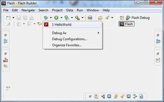
Если все в порядке, приложение запустится в браузере, и вы увидите следующие журналы отладки в консоли Flash Builder.
[SWF] HelloWorldbin-debugHelloWorld.swf
- 181,509 bytes after decompression
[SWF] HelloWorldbin-debugHelloWorld.swf[[DYNAMIC]]1
- 763,122 bytes after decompression
[SWF] HelloWorldbin-debugHelloWorld.swf[[DYNAMIC]]2
- 1,221,837 bytes after decompression
[SWF] HelloWorldbin-debugHelloWorld.swf[[DYNAMIC]]3
- 1,136,788 bytes after decompression
[SWF] HelloWorldbin-debugHelloWorld.swf[[DYNAMIC]]4
- 2,019,570 bytes after decompression
[SWF] HelloWorldbin-debugHelloWorld.swf[[DYNAMIC]]5
- 318,334 bytes after decompression
Как только приложение запустится, вы увидите фокус на точке останова Flash Builder, поскольку мы поместили точку останова в первую строку метода-обработчика application_initialize.

Вы можете увидеть трассировку стека для приостановленных потоков.

Вы можете увидеть значения для выражений.
Вы можете увидеть список точек останова.
Теперь продолжайте нажимать F6, пока не дойдете до последней строки метода application_initializeHandler (). Что касается функциональных клавиш, F6 проверяет код построчно, F5 шагает дальше и F8 возобновляет приложение. Теперь вы можете увидеть список значений всех переменных метода application_initializeHandler ().
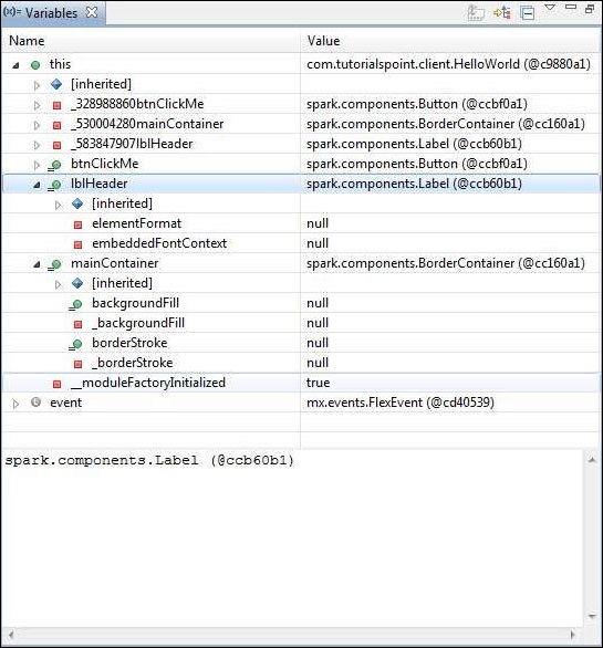
Теперь вы можете видеть, что гибкий код можно отлаживать так же, как можно отлаживать Java-приложение. Размещайте точки останова на любой линии и играйте с возможностями отладки flex.
Flex – Интернационализация
Flex предоставляет два способа интернационализации приложения Flex. Мы продемонстрируем использование интернационализации времени компиляции, наиболее часто используемой среди проектов.
| Sr.No | Техника и описание |
|---|---|
| 1 |
Интернационализация времени компиляции Этот метод наиболее распространен и требует очень мало накладных расходов во время выполнения; это очень эффективный метод для перевода как константных, так и параметризованных строк, простейший в реализации. Интернационализация времени компиляции использует стандартные файлы свойств для хранения переведенных строк и параметризованных сообщений, и эти файлы свойств компилируются непосредственно в приложении. |
| 2 |
Интернационализация во время выполнения Этот метод очень гибкий, но медленнее, чем интернационализация статических строк. Вам необходимо отдельно скомпилировать файлы свойств локализации, оставить их внешними для приложения и загрузить их во время выполнения. |
Интернационализация времени компиляции
Этот метод наиболее распространен и требует очень мало накладных расходов во время выполнения; это очень эффективный метод для перевода как константных, так и параметризованных строк, простейший в реализации. Интернационализация времени компиляции использует стандартные файлы свойств для хранения переведенных строк и параметризованных сообщений, и эти файлы свойств компилируются непосредственно в приложении.
Интернационализация во время выполнения
Этот метод очень гибкий, но медленнее, чем интернационализация статических строк. Вам необходимо отдельно скомпилировать файлы свойств локализации, оставить их внешними для приложения и загрузить их во время выполнения.
Рабочий процесс интернационализации приложения Flex
Шаг 1 – Создать структуру папок
Создайте папку локали в папке src проекта Flex. Это будет родительский каталог для всех файлов свойств для локалей, которые будет поддерживать приложение. Внутри папки локали создайте подпапки, по одной для каждой локали приложения, которая будет поддерживаться. Соглашение об именовании локали
{language}_{country code}
Например, en_US представляет английский язык Соединенных Штатов. Локаль de_DE представляет немецкий язык. Пример приложения будет поддерживать два распространенных языка: английский и немецкий.
Шаг 2 – Создание файлов свойств
Создайте файл свойств, содержащий сообщения, которые будут использоваться в приложении. В нашем примере мы создали файл HelloWorldMessages.properties в папке src> locale> en_US .
enterName = Enter your name
clickMe = Click Me
applicationTitle = Application Internationalization Demonstration
greeting = Hello {0}
Создайте файлы свойств, содержащие переведенные значения, специфичные для локали. В нашем примере мы создали файл HelloWorldMessages.properties в папке src> locale> de_DE . Этот файл содержит переводы на немецкий язык. _de указывает немецкую локаль, и мы собираемся поддерживать немецкий язык в нашем приложении.
Если вы создаете файл свойств с помощью Flash Builder, измените кодировку файла на UTF-8 . Выберите файл и щелкните его правой кнопкой мыши, чтобы открыть окно его свойств. Выберите кодировку текстового файла как « Другой UTF-8» . Применить и сохранить изменения.
enterName = Geben Sie Ihren Namen
clickMe = Klick mich
applicationTitle = Anwendung Internationalisierung Demonstration
greeting = Hallo {0}
Шаг 3 – Укажите параметры компилятора
-
Щелкните правой кнопкой мыши свой проект и выберите «Свойства».
-
Выберите Flex Compiler и добавьте следующее в настройки «Дополнительные параметры компилятора»:
Щелкните правой кнопкой мыши свой проект и выберите «Свойства».
Выберите Flex Compiler и добавьте следующее в настройки «Дополнительные параметры компилятора»:
-locale en_US de_DE
-
Щелкните правой кнопкой мыши свой проект и выберите «Свойства».
-
Выберите Flex Build Path и добавьте следующее в настройки Source Path –
Щелкните правой кнопкой мыши свой проект и выберите «Свойства».
Выберите Flex Build Path и добавьте следующее в настройки Source Path –
srclocale{locale}
Пример интернализации
Теперь давайте выполним следующие шаги для тестирования техники интернализации в приложении Flex:
| шаг | Описание |
|---|---|
| 1 | Создайте проект с именем HelloWorld в пакете com.tutorialspoint.client, как описано в главе « Создание приложения Flex» . |
| 2 | Измените HelloWorld.mxml, как описано ниже. Сохраните остальные файлы без изменений. |
| 3 | Скомпилируйте и запустите приложение, чтобы убедиться, что бизнес-логика работает в соответствии с требованиями. |
Ниже приводится содержимое измененного mxml-файла src / com.tutorialspoint / HelloWorld.mxml .
<?xml version = "1.0" encoding = "utf-8"?>
   <s:Application xmlns:fx = "http://ns.adobe.com/mxml/2009"
   xmlns:s = "library://ns.adobe.com/flex/spark"
   xmlns:mx = "library://ns.adobe.com/flex/mx"
   minWidth = "500" minHeight = "500">

   <fx:Metadata>
      [ResourceBundle("HelloWorldMessages")]
   </fx:Metadata>

   <fx:Style source = "/com/tutorialspoint/client/Style.css" />
   <fx:Script>
      <![CDATA[
         import mx.controls.Alert;
         [Bindable]
         private var locales:Array =  [{label:"English", locale:"en_US"},
            {label:"German", locale:"de_DE"}];

         private function comboChangeHandler():void {
           resourceManager.localeChain = [localeComboBox.selectedItem.locale];
         }

         protected function clickMe_clickHandler(event:MouseEvent):void {
            var name:String = txtName.text;
            var inputArray:Array = new Array();
            inputArray.push(name);
            Alert.show(resourceManager.getString('HelloWorldMessages'
               ,'greeting',inputArray));
         }
      ]]>
   </fx:Script>

   <s:BorderContainer width = "500" height = "500" id = "mainContainer"
      styleName = "container">
      <s:VGroup width = "100%" height = "100%" gap = "50"
	  horizontalAlign = "center" verticalAlign = "middle">

         <s:Label id = "lblHeader" fontSize = "40"
            color = "0x777777"
            text  = "{resourceManager.getString('HelloWorldMessages','applicationTitle')}"
            styleName = "heading" width = "90%" height = "150" />

         <s:Panel width = "300" height = "150">
            <s:layout>
               <s:VerticalLayout paddingTop = "10" paddingLeft = "10" />
            </s:layout>

            <s:HGroup >
               <s:Label text = "{resourceManager.getString('HelloWorldMessages','enterName')}"
                  paddingTop = "2" />
               <s:TextInput id = "txtName" />
            </s:HGroup>

            <s:Button
               label = "{resourceManager.getString('HelloWorldMessages','clickMe')}"
               click = "clickMe_clickHandler(event)" right = "10" />
         </s:Panel>

         <mx:ComboBox id = "localeComboBox" dataProvider = "{locales}"
            change = "comboChangeHandler()" />
      </s:VGroup>
   </s:BorderContainer>
</s:Application>
Когда вы будете готовы со всеми внесенными изменениями, давайте скомпилируем и запустим приложение в обычном режиме, как мы это делали во главе Flex – Create Application . Если с вашим приложением все в порядке, оно даст следующий результат: [ Попробуйте онлайн ]

Измените язык, используя язык, выпадающий и посмотрите результат.

Flex – Поддержка печати
Flex предоставляет специальный класс FlexPrintJob для печати объектов Flex.
-
FlexPrintJob может использоваться для печати одного или нескольких объектов Flex, таких как контейнер Form или VBox.
-
FlexPrintJob печатает объект и все объекты, которые он содержит.
-
Объекты могут быть полностью или частично отображаемым интерфейсом.
-
Объекты могут быть компонентами, которые форматируют данные специально для печати.
-
Класс FlexPrintJob позволяет вам масштабировать вывод, чтобы он соответствовал странице.
-
Класс FlexPrintJob автоматически использует несколько страниц для печати объекта, который не помещается на одной странице.
-
Класс FlexPrintJob заставляет операционную систему отображать диалоговое окно «Печать». Вы не можете печатать без каких-либо действий пользователя.
FlexPrintJob может использоваться для печати одного или нескольких объектов Flex, таких как контейнер Form или VBox.
FlexPrintJob печатает объект и все объекты, которые он содержит.
Объекты могут быть полностью или частично отображаемым интерфейсом.
Объекты могут быть компонентами, которые форматируют данные специально для печати.
Класс FlexPrintJob позволяет вам масштабировать вывод, чтобы он соответствовал странице.
Класс FlexPrintJob автоматически использует несколько страниц для печати объекта, который не помещается на одной странице.
Класс FlexPrintJob заставляет операционную систему отображать диалоговое окно «Печать». Вы не можете печатать без каких-либо действий пользователя.
Подготовьте и отправьте задание на печать
Вы печатаете вывод, подготовив и отправив задание на печать. Давайте создадим экземпляр класса FlexPrintJob
var printJob:FlexPrintJob = new FlexPrintJob();
Начать задание на печать
printJob.start();
Flex заставит операционную систему отобразить диалоговое окно «Печать». Добавьте один или несколько объектов в задание на печать и укажите, как их масштабировать
printJob.addObject(myObject, FlexPrintJobScaleType.MATCH_WIDTH);
Каждый объект начинается на новой странице. Отправьте задание на печать на принтер
printJob.send();
Пример печати
| шаг | Описание |
|---|---|
| 1 | Создайте проект с именем HelloWorld в пакете com.tutorialspoint.client, как описано в главе « Создание приложения Flex» . |
| 2 | Измените HelloWorld.mxml, как описано ниже. Сохраните остальные файлы без изменений. |
| 3 | Скомпилируйте и запустите приложение, чтобы убедиться, что бизнес-логика работает в соответствии с требованиями. |
Ниже приводится содержимое измененного mxml-файла src / com.tutorialspoint / HelloWorld.mxml .
<?xml version = "1.0" encoding = "utf-8"?>
<s:Application xmlns:fx = "http://ns.adobe.com/mxml/2009"
   xmlns:s = "library://ns.adobe.com/flex/spark"
   xmlns:mx = "library://ns.adobe.com/flex/mx"
   width = "100%" height = "100%"
   minWidth = "500" minHeight = "500"
   initialize = "application_initializeHandler(event)">

   <fx:Style source = "/com/tutorialspoint/client/Style.css" />
   <fx:Script>
     <![CDATA[
         import mx.controls.Alert;
         import mx.events.FlexEvent;
         import mx.printing.FlexPrintJob;
         import mx.printing.FlexPrintJobScaleType;

         protected function btnClickMe_clickHandler(event:MouseEvent):void {

            // Create an instance of the FlexPrintJob class.
            var printJob:FlexPrintJob = new FlexPrintJob();

            // Start the print job.
            if (printJob.start() != true) return;

            // Add the object to print. Do not scale it.
            printJob.addObject(myDataGrid, FlexPrintJobScaleType.NONE);

            // Send the job to the printer.
            printJob.send();
        }

        protected function application_initializeHandler(event:FlexEvent):void {
            lblHeader.text = "My Hello World Application";
        }
     ]]>
   </fx:Script>

   <s:BorderContainer width = "500" height = "500" id = "mainContainer"
      styleName = "container">
      <s:VGroup width = "100%" height = "100%" gap = "50"
         horizontalAlign = "center"
         verticalAlign = "middle">
         <s:Label id = "lblHeader" fontSize = "40" color = "0x777777"
            styleName = "heading" />

         <mx:DataGrid id = "myDataGrid" width = "300">
            <mx:dataProvider>
               <fx:Object Product = "Flex" Code = "1000" />
               <fx:Object Product = "GWT" Code = "2000" />
               <fx:Object Product = "JAVA" Code = "3000" />
               <fx:Object Product = "JUnit" Code = "4000" />
            </mx:dataProvider>
         </mx:DataGrid>

         <s:Button label = "Print Me!" id = "btnClickMe"
            click = "btnClickMe_clickHandler(event)"
            styleName = "button" />
      </s:VGroup>
   </s:BorderContainer>
</s:Application>
Когда вы будете готовы со всеми внесенными изменениями, давайте скомпилируем и запустим приложение в обычном режиме, как мы это делали во главе Flex – Create Application . Если с вашим приложением все в порядке, оно даст следующий результат: [ Попробуйте онлайн ]
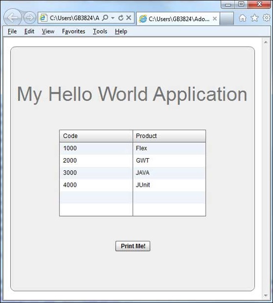
Нажмите на кнопку распечатать меня, и вы можете увидеть распечатку сетки данных, показанную ниже.
Flex — Overview
What is Flex?
Flex is a powerful, open source application framework that allows you to build traditional applications for browser, mobile and desktop using the same programming model, tool, and codebase.
Flex provides FLEX SDK consisting of the Flex class library (ActionScript classes), the Flex compilers, the debugger, the MXML and ActionScript programming languages, and other utilities to build expressive and interactive rich internet applications (RIA)
Flex takes care of the user interface (UI) or the client-side functionality of a web application. Server-side functionality is dependent on server-side components written in a traditional scripting language (Java/ PHP etc.)
A Flex based application actually delivered as a SWF file and it closely resembles the HTML / JavaScript portion of a traditional web application.
Flex application is deployed as SWF file(s) plus an HTML wrapper, the CSS file(s) and any server-side script files (i.e. Java, .CFM, .PHP, etc.) to the server. Like traditional web applications.
These resources are delivered from a server to the client’s browser using the customary HTTP request / response fashion and Flash Player which runs the application in a browser.
Advantages of Flex
-
Flex applications are usually Flash Player based which can access device capabilities like GPS, camera, local database, graphics accelerometer.
-
Flex applications can run on Android, BlackBerry Tablet OS, and iOS devices.
-
Flex applications can run on Browsers as well as on Desktop.
-
Flex applications are platform independent. UI can be native to platform or can be made same on each platform.
-
Flex applications can interact with server with all major server side technologies like Java, Spring, Hibernate, PHP, Ruby, .NET, Adobe ColdFusion, and SAP using industry standards such as REST, SOAP, JSON, JMS, and AMF.
-
Flex Applications assures rich user experience through intuitive interaction with the application and presenting information in a visually richer interface.
-
Flex application is a single page application where states can transition from one state to other state without having to fetch a new page from the server or to refresh the browser.
-
Flex application reduces the load on the server to great extent because it is only required to return the application once, rather than a new page every time when the user changes views.
Disadvantages of Flex
-
Flex applications are single threaded applications but Flex provides an asynchronous programming model to mitigate this concern.
-
Flex is ActionScript and XML based. Learning of these two is a must to work in Flex.
Flex — Environment Setup
This tutorial will guide you on how to prepare a development environment to start your work with Adobe Flex Framework. This tutorial will also teach you how to setup JDK and Adobe Flash Builder on your machine before you setup Flex Framework.
System Requirement
FLEX requires JDK 1.4 or higher, so the very first requirement is to have JDK installed in your machine.
| JDK | 1.4 Or above. |
|---|---|
| Memory | No minimum requirement. |
| Disk Space | No minimum requirement. |
| Operating System | No minimum requirement. |
Follow the given steps to setup your environment to start with Flex application development.
Step 1 — Verify Java installation on your machine
Now open the console and execute the following java command.
| OS | Task | Command |
|---|---|---|
| Windows | Open Command Console | c:> java -version |
| Linux | Open Command Terminal | $ java -version |
| Mac | Open Terminal | machine:~ joseph$ java -version |
Let’s verify the output for all the operating systems −
| OS | Generated Output |
|---|---|
| Windows |
java version «1.6.0_21» Java(TM) SE Runtime Environment (build 1.6.0_21-b07) Java HotSpot(TM) Client VM (build 17.0-b17, mixed mode, sharing) |
| Linux |
java version «1.6.0_21» Java(TM) SE Runtime Environment (build 1.6.0_21-b07) Java HotSpot(TM) Client VM (build 17.0-b17, mixed mode, sharing) |
| Mac |
java version «1.6.0_21» Java(TM) SE Runtime Environment (build 1.6.0_21-b07) Java HotSpot(TM)64-Bit Server VM (build 17.0-b17, mixed mode, sharing) |
Step 2 — Setup Java Development Kit (JDK)
If you do not have Java installed, then you can install the Java Software Development Kit (SDK) from Oracle’s Java site Java SE Downloads. You will find instructions for installing JDK in downloaded files, then follow the given instructions to install and configure the setup. Finally set PATH and JAVA_HOME environment variables to refer to the directory that contains java and javac, typically java_install_dir/bin and java_install_dir respectively.
Set the JAVA_HOME environment variable to point to the base directory location where Java is installed on your machine. For example −
| OS | Output |
|---|---|
| Windows | Set the environment variable JAVA_HOME to C:Program FilesJavajdk1.6.0_21 |
| Linux | export JAVA_HOME=/usr/local/java-current |
| Mac | export JAVA_HOME=/Library/Java/Home |
Append the Java compiler location to the System Path.
| OS | Output |
|---|---|
| Windows | Append the string ;%JAVA_HOME%bin to the end of the system variable, Path. |
| Linux | export PATH=$PATH:$JAVA_HOME/bin/ |
| Mac | not required |
Step 3 — Setup Adobe Flash Builder 4.5
All the examples in this tutorial has been written using Adobe Flash Builder 4.5 Profession IDE Trial Version. Hence, suggest you to have latest version of Adobe Flash Builder installed on your machine. Also, check compatibility of operating system.
To install Adobe Flash Builder IDE, download the latest Adobe Flash Builder binaries from https://www.adobe.com/in/products/flash-builder.html. Once you downloaded the installation, unpack the binary distribution into a convenient location. For example, in C:flash-builder on windows, or /usr/local/flash-builder on Linux/Unix and finally set PATH variable appropriately.
Flash Builder will start, when you execute the following commands on windows machine, or when you can simply double click on FlashBuilder.exe
%C:flash-builderFlashBuilder.exe
Flash Builder can be started by executing the following commands on Unix (Solaris, Linux, etc.) machine −
$/usr/local/flash-builder/FlashBuilder
Adobe Flash Builder Trial Version can be used for 60 days. Just accept the terms and conditions, and skip the initial registration steps to continue with the IDE. For our understanding, we’re using the trial version for teaching purpose.
After a successful startup, if everything is fine then it should display the following result −

Adobe Flash Builder comes pre-configured with FLEX SDKs. We’re using FLEX SDK 4.5 in our examples which come bundled with Adobe Flash Builder 4.5.
Step 4 – Setup Apache Tomcat
You can download the latest version of Tomcat from https://tomcat.apache.org/. Once, you downloaded the installation, unpack the binary distribution into a convenient location. For example, in C:apache-tomcat-6.0.33 on windows, or /usr/local/apache-tomcat-6.0.33 on Linux/Unix and set CATALINA_HOME environment variable pointing to the installation locations.
Tomcat can be started by executing the following commands on windows machine, or you can simply double click on startup.bat
%CATALINA_HOME%binstartup.bat
or
C:apache-tomcat-6.0.33binstartup.bat
Tomcat can be started by executing the following commands on UNIX (Solaris, Linux, etc.) machine −
$CATALINA_HOME/bin/startup.sh
Or
/usr/local/apache-tomcat-6.0.33/bin/startup.sh
After a successful startup, the default web applications included with Tomcat will be available by visiting http://localhost:8080/. If everything is fine, then it should display the following result −

Further information about configuring and running Tomcat can be found in the documentation included here, as well as on the Tomcat web site: http://tomcat.apache.org
Tomcat can be stopped by executing the following commands on windows machine −
%CATALINA_HOME%binshutdown
Or
C:apache-tomcat-5.5.29binshutdown
Tomcat can be stopped by executing the following commands on UNIX (Solaris, Linux, etc.) machine −
$CATALINA_HOME/bin/shutdown.sh
Or
/usr/local/apache-tomcat-5.5.29/bin/shutdown.sh
Flex — Applications
Before we start creating actual “HelloWorld” application using Flash Builder, let us see what the actual parts of a Flex application are −
A Flex application consists of the following four important parts, out of which last part is optional but first three parts are mandatory.
- Flex Framework Libraries
- Client-side code
- Public Resources (HTML/JS/CSS)
- Server-side code
Sample locations of different parts of a typical Flex application like HelloWord will be as shown below −
| Name | Location |
|---|---|
| Project root | HelloWorld/ |
| Flex Framework Libraries | Build Path |
| Public resources | html-template |
| Client-side code | table table-bordered/com/tutorialspoint/client |
| Server-side code | table table-bordered/com/tutorialspoint/server |
Application Build Process
To start with, Flex application requires Flex framework libraries. Later, Flash Builder automatically adds the libraries to build path.
When we build our code using Flash builder, Flash builder will do the following tasks −
-
Compiles the source code to HelloWorld.swf file.
-
Compiles a HelloWorld.html (a wrapper file for swf file) from a file index.template.html stored in html-template folder
-
Copies HelloWorld.swf and HelloWorld.html files in target folder, bin-debug.
-
Copies swfobject.js, a JavaScript code responsible to load swf file dynamically in HelloWorld.html in target folder, bin-debug
-
Copies framework libraries in form of swf file named frameworks_xxx.swf in target folder, bin-debug
-
Copies other flex modules (.swf files such as sparkskins_xxx.swf, textLayout_xxx.swf) in target folder.
Application Launch Process
-
Open the HelloWorld.html file available in HelloWorldbin-debug folder in any web-browser.
-
HelloWorld.swf will load automatically and application will start running.
Flex Framework Libraries
Following is the brief detail about few important framework libraries. Please note that, Flex libraries are denoted using .swc notation
| Sr.No | Nodes & Description |
|---|---|
| 1 |
playerglobal.swc This library is specific to FlashPlayer installed on your machine and contains native methods supported by flash player. |
| 2 |
textlayout.swc This library supports the text layout related features. |
| 3 |
framework.swc This is the flex framework library contains the core features of Flex. |
| 4 |
mx.swc This library stores the definitions of mx UI controls. |
| 5 |
charts.swc This library supports the charting controls. |
| 6 |
spark.swc This library stores the definitions of spark UI controls. |
| 7 |
sparkskins.swc This library supports the skinning of spark UI controls. |
Client-side Code
Flex application code can be written in MXML as well as ActionScript.
| Sr.No | Type & Description |
|---|---|
| 1 |
MXML MXML is an XML markup language that we’ll use to lay out user interface components. MXML is compiled into ActionScript during build process. |
| 2 |
ActionScript ActionScript is an object-oriented procedural programming language and is based on the ECMAScript (ECMA-262) edition 4 draft language specification. |
In Flex, we can mix ActionScript and MXML, to do the following −
-
Layout user interface components using MXML tags
-
Use MXML to declaratively define nonvisual aspects of an application, such as access to data sources on the server
-
Use MXML to create data bindings between user interface components and data sources on the server.
-
Use ActionScript to define event listeners inside MXML event attributes.
-
Add script blocks using the tag.
-
Include external ActionScript files.
-
Import ActionScript classes.
-
Create ActionScript components.
Public Resources
These are help files referenced by Flex application, such as Host HTML page, CSS or images located under html-template folder. It contains following files −
| Sr.No | File Name & Description |
|---|---|
| 1 |
index.template.html Host HTML page, with place holders. Flash Builder uses this template to build actual page HelloWorld.html with HelloWorld.swf file. |
| 2 |
playerProductInstall.swf This is a flash utility to install Flash Player in express mode. |
| 3 |
swfobject.js This is the JavaScript responsible to check version of flash player installed and to load HelloWorld.swf in HelloWorld.html page. |
| 4 |
html-template/history This folder contains resources for history management of the application. |
HelloWorld.mxml
This is the actual MXML/AS (ActionScript) code written implementing the business logic of the application and that the Flex compiler translates into SWF file which will be executed by flash player in the browser.
A sample HelloWorld Entry class will be as follows −
<?xml version = "1.0" encoding = "utf-8"?>
<s:Application xmlns:fx = "http://ns.adobe.com/mxml/2009"
   xmlns:s = "library://ns.adobe.com/flex/spark"
   xmlns:mx = "library://ns.adobe.com/flex/mx"
   width = "100%" height = "100%"
   minWidth = "500" minHeight = "500"
   initialize = "application_initializeHandler(event)">

   <fx:Script>
      <![CDATA[
         import mx.controls.Alert;
         import mx.events.FlexEvent;
         protected function btnClickMe_clickHandler(event:MouseEvent):void {
            Alert.show("Hello World!");
         }

         protected function application_initializeHandler(event:FlexEvent):void {
            lblHeader.text = "My Hello World Application";
         }
      ]]>
   </fx:Script>

   <s:VGroup horizontalAlign = "center" width = "100%" height = "100%"
      paddingTop = "100" gap = "50">
      <s:Label id = "lblHeader" fontSize = "40" color = "0x777777" />
      <s:Button label = "Click Me!" id = "btnClickMe"
         click = "btnClickMe_clickHandler(event)" />
   </s:VGroup>
</s:Application>
Following table gives the description of all the tags used in the above code script.
| Sr.No | Node & Description |
|---|---|
| 1 |
Application Defines the Application container that is always the root tag of a Flex application. |
| 2 |
Script Contains the business logic in ActionScript language. |
| 3 |
VGroup Defines a Vertical Grouping Container which can contain Flex UI controls in vertical fashion. |
| 4 |
Label Represents a Label control, a very simple user interface component that displays text. |
| 5 |
Button Represents a Button control, which can be clicked to do some action. |
Server-side code
This is the server side part of your application and it’s very much optional. If you are not doing any backend processing within your application, then you do not need this part but if there is some processing required at backend and your clientside application interacts with the server, then you will have to develop these components.
In the next chapter, we will use all the above-mentioned concepts to create a HelloWorld application using Flash Builder.
Flex — Create Application
We’ll use Flash Builder 4.5 to create Flex Applications. Let’s start with a simple HelloWorld application.
Step 1 – Create Project
The first step is to create a simple Flex Project using Flash Builder IDE. Launch project wizard using the option File > New > Flex Project. Now name your project as HelloWorld using the wizard window as follows −

Select Application Type Web (runs in Adobe Flash Player). However, if this is not selected, then leave other default values as such and click Finish Button. Once your project is created successfully, then you will have the following content in your Project Explorer −

Here is a brief description of all the important folders −
| Folder | Location |
|---|---|
| table table-bordered |
Source code (mxml / as classes) files. We’ve created com/tutorialspoint/client folder structure containing the client-side specific java classes responsible for client UI display. |
| bin-debug |
This is the output part, it represents the actual deployable web application. History folder contains support files for history management of Flex application. framework_xxx.swf, flex framework files should be used by flex application. HelloWorld.html, wrapper/host HTML File for flex application. HelloWorld.swf, our flex based application. playerProductInstall.swf, flash player express installer. spark_xxx.swf, library for spark component support. swfobject.js, JavaScript responsible to load HelloWorld.swf in HelloWorld.html. It checks flash player version and passes initialization parameter to HelloWorld.swf file. textLayout_xxx.swf, library for text component support. |
| html-template |
This represents the configurable web application. Flash Builder compiles files from html-template to bin-debug folder. History folder contains support files for history management of Flex application. index.template.html, wrapper/host HTML File for flex application having place holders for Flash Builder specific configuration. Gets compiled to HelloWorld.html in bin-debug folder during build. playerProductInstall.swf, flash player express installer gets copied to bin-debug folder during build. swfobject.js, JavaScript responsible to load HelloWorld.swf in HelloWorld.html. It checks flash player version and passes initialization parameter to HelloWorld.swf file gets copied to bindebug folder during build. |
Step 2 – Create External CSS File
Create a CSS file styles.css for Wrapper HTML page in html-template folder.
html, body {
   height:100%;
}

body {
   margin:0;
   padding:0;
   overflow:auto;
   text-align:center;
}

object:focus {
   outline:none;
}

#flashContent {
   display:none;
}

.pluginHeader {
   font-family:Arial, Helvetica, sans-serif;
   font-size:14px;
   color:#9b1204;
   text-decoration:none;
   font-weight:bold;
}

.pluginInstallText {
   font-family:Arial, Helvetica, sans-serif;
   font-size:12px;
   color:#000000;
   line-height:18px;
   font-style:normal;
}

.pluginText {
   font-family:Arial, Helvetica, sans-serif;
   font-size:12px;
   color:#000000;
   line-height:18px;
   font-style:normal;
}
Step 3 – Modify Wrapper HTML page template
Modify Wrapper HTML page template index.template.html in htmltemplate folder. Flash Builder will create a default Wrapper HTML page template html-template/index.template.html, which will be compiled to HelloWorld.html.
This file contains placeholders which Flash Builder replaces during the compilation process. For example, flash player version, application name, etc.
Let us modify this file to display custom messages in case flash plugin is not installed.
<!DOCTYPE html PUBLIC "-//W3C//DTD XHTML 1.0 Transitional//EN"
"http://www.w3.org/TR/xhtml1/DTD/xhtml1-transitional.dtd">
<html xmlns = "http://www.w3.org/1999/xhtml" lang = "en" xml:lang = "en">

   <head>
      <title>${title}</title>
      <meta name = "google" value = "notranslate" />
      <meta http-equiv = "Content-Type" content = "text/html; charset = utf-8" />
      <link rel = "stylesheet" href = "styles.css" type = "text/css"></link>
      <link rel = "stylesheet" type = "text/css" href = "history/history.css" />
      <script type = "text/javascript" table table-bordered = "history/history.js">
      </script>
      <script type = "text/javascript" table table-bordered = "swfobject.js"></script>

      <script type = "text/javascript">
         // For version detection, set to min. required Flash Player version,
         //or 0 (or 0.0.0), for no version detection.
         var swfVersionStr = "${version_major}.${version_minor}.${version_revision}";

         // To use express install, set to playerProductInstall.swf,
         //otherwise the empty string.
         var xiSwfUrlStr = "${expressInstallSwf}";
         var flashvars = {};
         var params = {};
         params.quality = "high";
         params.bgcolor = "${bgcolor}";
         params.allowscriptaccess = "sameDomain";
         params.allowfullscreen = "true";

         var attributes = {};
         attributes.id = "${application}";
         attributes.name = "${application}";
         attributes.align = "middle";
         swfobject.embedSWF (
            "${swf}.swf", "flashContent",
            "${width}", "${height}",
            swfVersionStr, xiSwfUrlStr,
            flashvars, params, attributes);

         // JavaScript enabled so display the flashContent div in case
         //it is not replaced with a swf object.
         swfobject.createCSS("#flashContent", "display:block;text-align:left;");
      </script>
   </head>

   <body>
      <div id = "flashContent">
         <p style = "margin:100px;">

            <table width = "700" cellpadding = "10" cellspacing = "2" border = "0">
               <tr>
                  <td class = "pluginHeader">Flash Player Required</td>
               </tr>

               <tr>
                  <td class = "pluginText">The Adobe Flash Player version
                     10.2.0 or greater is required.</td>
               </tr>

               <tr>
                  <td class = "pluginInstallText" align = "left">

                  <table border = "0" width = "100%">
                     <tr class = "pluginInstallText" >
                        <td>Click here to download and install Adobe Flash Player:</td>
                        <td> </td>
                        <td align = "right">
                           <script type = "text/javascript">
                              var pageHost
                                 = ((document.location.protocol == "https:") ? "https://" : "http://");
                              document.write("<a target = '_blank'"
                                 +" href = 'http://get.adobe.com/flashplayer/'><"
                                 +"img style = 'border-style: none' table table-bordered = '"
                                 +pageHost
                                 +"www.adobe.com/images/shared/download_buttons/get_flash_player.gif'"
                                 +" alt = 'Get Adobe Flash player' /></a>" );
                           </script>
                        </td>
                     </tr>
                  </table>
               </tr>
            </table>
         </p>
      </div>

      <noscript>
         <object classid = "clsid:D27CDB6E-AE6D-11cf-96B8-444553540000"
            width = "${width}" height = "${height}" id = "${application}">
            <param name = "movie" value = "${swf}.swf" />
            <param name = "quality" value = "high" />
            <param name = "bgcolor" value = "${bgcolor}" />
            <param name = "allowScriptAccess" value = "sameDomain" />
            <param name = "allowFullScreen" value = "true" />

            <!--[if !IE]>-->
            <object type = "application/x-shockwave-flash" data = "${swf}.swf"
               width = "${width}" height = "${height}">
               <param name = "quality" value = "high" />
               <param name = "bgcolor" value = "${bgcolor}" />
               <param name = "allowScriptAccess" value = "sameDomain" />
               <param name = "allowFullScreen" value = "true" />
            <!--<![endif]-->

            <!--[if gte IE 6]>-->
               <p>
                  <p style = "margin:100px;">
                     <table width = "700" cellpadding = "10" cellspacing = "2"
                        border = "0">
                        <tr>
                           <td class = "pluginHeader">Flash Player Required</td>
                        </tr>

                        <tr>
                           <td class = "pluginText">The Adobe Flash Player version
                           10.2.0 or greater is required.</td>
                        </tr>

                        <tr>
                           <td class = "pluginInstallText" align = "left">

                           <table border = "0" width = "100%">
                              <tr class = "pluginInstallText" >
                                 <td>Click here to download and install Adobe Flash
                                    Player:</td>
                                 <td> </td>
                                 <td align = "right">
                                    <script type = "text/javascript">
                                       var pageHost
                                          = ((document.location.protocol == "https:") ? "https://" : "http://");
                                       document.write("<a target = '_blank'"
                                          +" href = 'http://get.adobe.com/flashplayer/'><"
                                          +"img style = 'border-style: none' table table-bordered = '"
                                          +pageHost
                                          +"www.adobe.com/images/shared/download_buttons/get_flash_player.gif'"
                                          +" alt = 'Get Adobe Flash player' /></a>" );
                                    </script>
                                 </td>
                              </tr>
                           </table>
                        </tr>
                     </table>
                  </p>
               </p>
            <!--<![endif]-->

            <p style = "margin:100px;">
               <table width = "700" cellpadding = "10" cellspacing = "2" border = "0">
                  <tr><td class = "pluginHeader">Flash Player Required</td></tr>
                  <tr><td class = "pluginText">The Adobe Flash Player version
                     10.2.0 or greater is required.</td></tr>
                  <tr>
                     <td class = "pluginInstallText" align = "left">
                        <table border = "0" width = "100%">
                           <tr class = "pluginInstallText" >
                              <td>Click here to download and install Adobe Flash
                                 Player:</td>
                              <td> </td>
                              <td align = "right">
                                 <script type = "text/javascript">
                                    var pageHost
                                       = ((document.location.protocol == "https:") ? "https://" : "http://");
                                    document.write("<a target = '_blank'"
                                       +" href = 'http://get.adobe.com/flashplayer/'><"
                                       +"img style = 'border-style: none' table table-bordered = '"
                                       +pageHost
                                       +"www.adobe.com/images/shared/download_buttons/get_flash_player.gif'"
                                       +" alt = 'Get Adobe Flash player' /></a>" );
                                 </script>
                              </td>
                           </tr>
                        </table>
                     </td>
                  </tr>
               </table>
            </p>
         <!--[if !IE]>-->
         </object>
         <!--<![endif]-->
         </object>
      </noscript>
   </body>
</html>
Step 4 – Create Internal CSS file
Create a CSS file Style.css for HelloWorld.mxml in table tablebordered/com/tutorialspoint folder. Flex provides similar css styles for its UI Controls as there are css styles for HTML UI controls.
/* CSS file */
@namespace s "library://ns.adobe.com/flex/spark";
@namespace mx "library://ns.adobe.com/flex/mx";

.heading {
   fontFamily: Arial, Helvetica, sans-serif;
   fontSize: 17px;
   color: #9b1204;
   textDecoration:none;
   fontWeight:normal;
}

.button {
   fontWeight: bold;
}

.container {
   cornerRadius :10;
   horizontalCenter :0;
   borderColor: #777777;
   verticalCenter:0;
   backgroundColor: #efefef;
}
Step 5 – Modify Entry Level Class
Flash Builder will create a default mxml file table tablebordered/com.tutorialspoint/HelloWorld.mxml, which is having root tag <application> container for the application. Let us modify this file to display «Hello,World!» −
<?xml version = "1.0" encoding = "utf-8"?>
<s:Application xmlns:fx = "http://ns.adobe.com/mxml/2009"
   xmlns:s = "library://ns.adobe.com/flex/spark"
   xmlns:mx = "library://ns.adobe.com/flex/mx
   width = "100%" height = "100%"
      minWidth = "500" minHeight = "500"
      initialize = "application_initializeHandler(event)">

   <fx:Style source = "/com/tutorialspoint/client/Style.css" />
   <fx:Script>
      <![CDATA[
         import mx.controls.Alert;
         import mx.events.FlexEvent;
         protected function btnClickMe_clickHandler(event:MouseEvent):void {
            Alert.show("Hello World!");
         }

         protected function application_initializeHandler(event:FlexEvent):void {
            lblHeader.text = "My Hello World Application";
         }
      ]]>
   </fx:Script>

   <s:BorderContainer width = "500" height = "500" id = "mainContainer"
      styleName = "container">
      <s:VGroup width = "100%" height = "100%" gap = "50" horizontalAlign = "center"
         verticalAlign = "middle">
         <s:Label id = "lblHeader" fontSize = "40" color = "0x777777"
            styleName = "heading" />
         <s:Button label = "Click Me!" id = "btnClickMe"
            click = "btnClickMe_clickHandler(event)" styleName = "button" />
      </s:VGroup>
   </s:BorderContainer>
</s:Application>
You can create more mxml or actionscript files in the same source directory to define either new applications or to define helper routines.
Step 6 – Build Application
Flash Builder has Build Automatically by default checked. Just check the Problems View if there is any error. Once you are done with the changes, you will not see any errors.
Step 7 – Run Application
Now click on  Run application menu and select HelloWorld application to run the application.
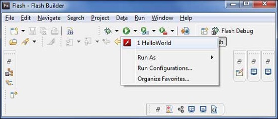
If everything is fine, you must see browser pop up, application up, and running. If everything is fine with your application, it will produce the following result: [ Try it online ]
Because, you are running your application in flash player, then it will need to install Flash Player plugin for your browser. Simply follow the onscreen instructions to install the plugin. If you already have Flash Player plugin set for your browser, then you should be able to see the following output −

Congratulations! You have implemented your first application using Flex.
Flex — Deploy Application
This tutorial will explain you how to create an application war file and how to deploy that in Apache Tomcat Web server root.
If you understood this simple example then you will also be able to deploy a complex Flex application following the same steps.
Let us follow the following steps to create a Flex application −
| Step | Description |
|---|---|
| 1 | Create a project with a name HelloWorld under a packagecom.tutorialspoint.client as explained in the Flex — Create Application chapter. |
| 2 | Modify HelloWorld.mxml as explained below. Keep rest of the files unchanged. |
| 3 | Compile and run the application to make sure business logic is working as per the requirements. |
Follow the steps given below to create a release build of a Flex application and then deploy it to tomcat server −
The first step is to create a release build using Flash Builder IDE. Launch release build wizard using the option File > Export > Flash Builder > Release Build.
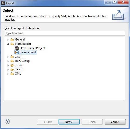
Select project as HelloWorld using the wizard window as follows
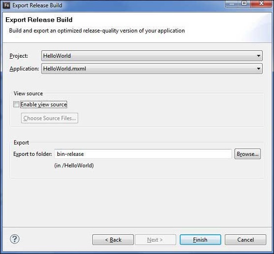
Leave other default values as such and click Finish Button. Now, Flash Builder will create a bin-release folder containing the project’s release build.
Now our release build is ready, let us follow the following steps to deploy a Flex application −
| Step | Description |
|---|---|
| 1 | Zip the content of the bin-release folder of the application in the form of HelloWorld.war file and deploy it in Apache Tomcat Webserver. |
| 2 | Launch your web application using appropriate URL as explained below in the last step. |
Following is the content of the modified mxml file table table-bordered/com.tutorialspoint/HelloWorld.mxml.
<?xml version = "1.0" encoding = "utf-8"?>
<s:Application xmlns:fx = "http://ns.adobe.com/mxml/2009"
   xmlns:s = "library://ns.adobe.com/flex/spark"
   xmlns:mx = "library://ns.adobe.com/flex/mx"
   width = "100%" height = "100%"
   minWidth = "500" minHeight = "500"
   initialize = "application_initializeHandler(event)">

   <fx:Style source = "/com/tutorialspoint/client/Style.css" />
   <fx:Script>
      <![CDATA[
         import mx.controls.Alert;
         import mx.events.FlexEvent;
         protected function btnClickMe_clickHandler(event:MouseEvent):void {
            Alert.show("Hello World!");
         }

         protected function application_initializeHandler(event:FlexEvent):void {
            lblHeader.text = "My Hello World Application";
         }
      ]]>
   </fx:Script>

   <s:BorderContainer width = "500" height = "500" id = "mainContainer"
      styleName = "container">
      <s:VGroup width = "100%" height = "100%" gap = "50" horizontalAlign = "center"
         verticalAlign = "middle">
         <s:Label id = "lblHeader" fontSize = "40" color = "0x777777"
            styleName = "heading" />
         <s:Button label = "Click Me!" id = "btnClickMe"
            click = "btnClickMe_clickHandler(event)" styleName = "button" />
      </s:VGroup>
   </s:BorderContainer>
</s:Application>
Once you are ready with all the changes done, let us compile and run the application in normal mode as we did in Flex — Create Application chapter. If everything is fine with your application, then it will produce the following result: [ Try it online ]
Create WAR File
Now our application is working fine and we are ready to export it as a war file. Follow the following steps −
-
Go into your project’s bin-release directory C:workspaceHelloWorldbinrelease
-
Select all the files & folders available inside bin-release directory.
-
Zip all the selected files & folders in a file called HelloWorld.zip.
-
Rename HelloWorld.zip to HelloWorld.war.
Deploy WAR file
Stop the tomcat server.
-
Copy the HelloWorld.war file to tomcat installation directory > webapps folder.
-
Start the tomcat server.
-
Look inside webapps directory, there should be a folder HelloWorld got created.
-
Now HelloWorld.war is successfully deployed in Tomcat Webserver root.
Run Application
Enter a URL in web browser −
http://localhost:8080/HelloWorld/HelloWorld.html to launch the application.
Server name (localhost) and port (8080) may vary as per your tomcat configuration.
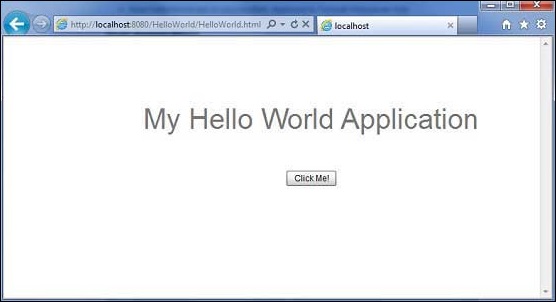
Flex — Life Cycle Phases
Life Cycle of Flex Application
Although, you can build Flex applications without understanding the life cycle phases of an application, it is good to know the basic mechanism; the order in which things occur. It will help you to configure features such as loading other Flex applications at runtime, and manage the process of loading and unloading class libraries and assets at runtime.
A good understanding of the Flex application life cycle will enable you to build better applications and optimize them because you will know where to optimally run code. For example, if you need to ensure that some code runs during a preloader, you need to know where to place the code for that event.
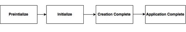
When we load flex application in a browser, the following events occurs during the lifecycle of flex application.
Following is the brief detail about different Flex Life cycle events.
| Sr.No | Event & Description |
|---|---|
| 1 |
preInitialize: mx.core.UIComponent.preinitialize Event Type: mx.events.FlexEvent.PREINITIALIZE This event is dispatched at the beginning of the component initialization sequence. The component is in a very raw state when this event is dispatched. Many components, such as Button control creates internal child components to implement functionality. For example, the Button control creates an internal UI TextField component to represent its label text. When Flex dispatches the pre-initialize event, the children, including all the internal children, of a component have not yet been created. |
| 2 |
initialize: mx.core.UIComponent.initialize Event Type: mx.events.FlexEvent.INITIALIZE This event is dispatched after pre-initialize phase. Flex framework initializes the internal structure of this component during this phase. This event automatically fires when the component is added to a parent. You do not need to call initialize() generally. |
| 3 |
creationComplete: mx.core.UIComponent.creationComplete Event Type: mx.events.FlexEvent.CREATION_COMPLETE This event is dispatched when the component has finished its construction, property processing, measuring, layout, and drawing. At this point, depending on its visible property, the component is not visible even though it has been drawn. |
| 4 |
applicationComplete: spark.components.Application.applicationComplete Event Type:mx.events.FlexEvent.APPLICATION_COMPLETE Dispatched after the Application has been initialized, processed by the LayoutManager, and attached to the display list. This is the last event of the application creation life cycle and signifies that application has been loaded completely. |
Flex Life Cycle Example
Let us follow the steps to understand test life cycle of a Flex application by creating a test application −
| Step | Description |
|---|---|
| 1 | Create a project with a name HelloWorld under a packagecom.tutorialspoint.client as explained in the Flex — Create Application chapter. |
| 2 | Modify HelloWorld.mxml as explained below. Keep rest of the files unchanged. |
| 3 | Compile and run the application to make sure business logic is working as per the requirements. |
Following is the content of the modified mxml file src/com.tutorialspoint/HelloWorld.mxml.
<?xml version = "1.0" encoding = "utf-8"?>
<s:Application xmlns:fx = "http://ns.adobe.com/mxml/2009"
   xmlns:s = "library://ns.adobe.com/flex/spark"
   xmlns:mx = "library://ns.adobe.com/flex/mx"
   width = "100%" height = "100%" minWidth = "500" minHeight = "500"
   initialize = "reportEvent(event)"
   preinitialize = "reportEvent(event)"
   creationComplete = "reportEvent(event)"
   applicationComplete = "reportEvent(event)">

   <fx:Style source = "/com/tutorialspoint/client/Style.css" />
   <fx:Script>
      <![CDATA[
         import mx.controls.Alert;
         import mx.events.FlexEvent;

         [Bindable]
         private var report:String = "";

         private function reportEvent(event:FlexEvent):void {
            report += "n" + (event.type + " event occured at: "
            + getTimer() + " ms" + "n");
         }
      ]]>
   </fx:Script>

   <s:BorderContainer width = "500" height = "500" id = "mainContainer"
      styleName = "container">
      <s:VGroup width = "100%" height = "100%" gap = "50"
         horizontalAlign = "center" verticalAlign = "middle">
         <s:Label textAlign = "center" width="100%" id = "lblHeader"
         fontSize = "40" color = "0x777777" styleName = "heading"
         text = "Life Cycle Events Demonstration" />
         <s:TextArea id = "reportText" text = "{report}" editable = "false"
         width = "300" height = "200">
         </s:TextArea>
      </s:VGroup>
   </s:BorderContainer>
</s:Application>
Once you are ready with all the changes done, let us compile and run the application in normal mode as we did in Flex — Create Application chapter. If everything is fine with your application, it will produce the following result: [ Try it online ]

Flex — Style with CSS
Flex supports the use of CSS syntax and styles to apply to its UI controls in the same way as CSS to HTML components.
Way # 1: Using External Style Sheet File
You can refer to a style sheet available in the class path of the application. For example consider Style.css file in com/tutorialspoint/client folder where HelloWorld.mxml file also lies.
/* CSS file */
@namespace s "library://ns.adobe.com/flex/spark";
@namespace mx "library://ns.adobe.com/flex/mx";
...
.container {
   cornerRadius :10;
   horizontalCenter :0;
   borderColor: #777777;
   verticalCenter:0;
   backgroundColor: #efefef;
}
Then css file can be referred by following code snippet
<fx:Style source = "/com/tutorialspoint/client/Style.css" />
Assign styles to UI component using styleName property
<s:BorderContainer width = "500" height = "500" id = "mainContainer"
   styleName = "container">
   ...
</s:BorderContainer>
Way # 2: Using Styles Within Ui Container Component
You can define styles within UI container component using <fx:Style> tag
Class Level Selector
<fx:Style>
   @namespace s "library://ns.adobe.com/flex/spark";
   @namespace mx "library://ns.adobe.com/flex/mx";

   /* class level selector  */
   .errorLabel {
      color: red;
   }
</fx:Style>
Assign styles to UI component using styleName property.
<s:Label id = "errorMsg" text = "This is an error message" styleName = "errorLabel" />
Id Level Selector
Style UI component using id selector.
<fx:Style>
   /* id level selector  */
   #msgLabel {
      color: gray;
   }
</fx:Style>

<s:Label id = "msgLabel" text = "This is a normal message" />
Type Level Selector
Style one type of UI Component in one GO.
<fx:Style>
   /* style applied on all buttons  */
   s|Button {
      fontSize: 15;
      color: #9933FF;
   }
</fx:Style>

<s:Button label = "Click Me!" id = "btnClickMe"
   click = "btnClickMe_clickHandler(event)" />
Flex Style with CSS Example
Let us follow the steps to check CSS styling of a Flex application by creating a test application −
| Step | Description |
|---|---|
| 1 | Create a project with a name HelloWorld under a packagecom.tutorialspoint.client as explained in the Flex — Create Application chapter. |
| 2 | Modify Style.css, HelloWorld.mxml as explained below. Keep rest of the files unchanged. |
| 3 | Compile and run the application to make sure business logic is working as per the requirements. |
Following is the content of the modified CSS file src/com.tutorialspoint/Style.css.
/* CSS file */
@namespace s "library://ns.adobe.com/flex/spark";
@namespace mx "library://ns.adobe.com/flex/mx";

.heading
{
   fontFamily: Arial, Helvetica, sans-serif;
   fontSize: 17px;
   color: #9b1204;
   textDecoration:none;
   fontWeight:normal;
}

.button {
   fontWeight: bold;
}

.container {
   cornerRadius :10;
   horizontalCenter :0;
   borderColor: #777777;
   verticalCenter:0;
   backgroundColor: #efefef;
}
Following is the content of the modified mxml file src/com.tutorialspoint/HelloWorld.mxml.
<?xml version = "1.0" encoding = "utf-8"?>
<s:Application xmlns:fx = "http://ns.adobe.com/mxml/2009"
   xmlns:s = "library://ns.adobe.com/flex/spark"
   xmlns:mx = "library://ns.adobe.com/flex/mx"
   width = "100%" height = "100%" minWidth = "500" minHeight = "500"
   initialize = "application_initializeHandler(event)">

   <!--Add reference to style sheet -->
   <fx:Style source = "/com/tutorialspoint/client/Style.css" />

   <!--Using styles within mxml file -->
   <fx:Style>
      @namespace s "library://ns.adobe.com/flex/spark";
      @namespace mx "library://ns.adobe.com/flex/mx";

      /* class level selector  */
      .errorLabel {
         color: red;
      }

      /* id level selector  */
      #msgLabel {
         color: gray;
      }

      /* style applied on all buttons  */
      s|Button {
         fontSize: 15;
         color: #9933FF;
      }
   </fx:Style>

   <fx:Script>
      <![CDATA[
         import mx.controls.Alert;
         import mx.events.FlexEvent;
         protected function btnClickMe_clickHandler(event:MouseEvent):void {
            Alert.show("Hello World!");
         }

         protected function application_initializeHandler(event:FlexEvent):void {
            lblHeader.text = "CSS Demonstrating Application";
         }
      ]]>
   </fx:Script>

   <s:BorderContainer width = "560" height = "500" id = "mainContainer"
      styleName = "container">
      <s:VGroup width = "100%" height = "100%" gap = "50"
         horizontalAlign = "center" verticalAlign = "middle">
         <s:Label width = "100%" id = "lblHeader" fontSize = "40"
            color = "0x777777" styleName = "heading" />
         <s:Button label = "Click Me!" id = "btnClickMe"
            click = "btnClickMe_clickHandler(event)"  />
         <s:Label id = "errorMsg"
            text = "This is an error message" styleName = "errorLabel" />
         <s:Label id = "msgLabel" text = "This is a normal message" />
      </s:VGroup>
   </s:BorderContainer>
</s:Application>
Once you are ready with all the changes done, let us compile and run the application in normal mode as we did in Flex — Create Application chapter. If everything is fine with your application, this will produce following result: [ Try it online ]

Flex — Style with Skin
What is Skinning?
-
Skinning in Flex, is a process of customizing look and feel of a UI Component completely.
-
A Skin can define text, image, filters, transitions and states of a component.
-
A Skin can be created as a separate mxml or ActionScript component.
-
Using skin, we can control all visual aspects of a UI component.
-
The process of defining skin is same for all the UI component.
Step 1 – Create a Skin
Launch Create MXML Skin wizard using the option File > New > MXML Skin.

Enter Package as com.tutorialspoint.skin, name as GradientBackgroundSkin and choose host component as existing flex BorderContainer controlspark.component.BorderContainer.
Now you’ve created a skin for a BorderContainer. Modify content of the mxml skin file src/com.tutorialspoint/skin/GradientBackgroundSkin.mxml.
Update fill layer as follows −
<!-- fill -->
<s:Rect id = "backgroundRect" left = "0" right = "0" height = "100%" top = "0">
   <s:fill>
      <s:LinearGradient rotation = "90">
         <s:GradientEntry color = "0x888888" ratio = "0.2" />
         <s:GradientEntry color = "0x111111" ratio = "1" />
      </s:LinearGradient>
   </s:fill>
</s:Rect>
Step 2: Apply Skin
You can apply skin over a component in two ways −
Apply skin in MXML script (statically)
Apply GradientBackgroundSkin to a BorderContainer with id mainContainer using its skinClass attribute.
<s:BorderContainer width = "560" height = "500" id = "mainContainer"
   styleName = "container">
   <s:VGroup width = "100%" height = "100%" gap = "50"
      horizontalAlign = "center" verticalAlign = "middle"
      skinClass = "com.tutorialspoint.skin.GradientBackgroundSkin">
Apply skin in ActionScript (dynamically)
Apply GradientBackgroundSkin to a BorderContainer with id mainContainer using its skinClass property.
protected function gradientBackground_clickHandler(event:MouseEvent):void {
   mainContainer.setStyle("skinClass", GradientBackgroundSkin);
}
Flex Style with Skin Example
Let us follow the following steps to see skinning in action in a Flex application by creating a test application −
| Step | Description |
|---|---|
| 1 | Create a project with a name HelloWorld under a packagecom.tutorialspoint.client as explained in the Flex — Create Application chapter. |
| 2 | Create skin GradientBackgroundSkin.mxml under a packagecom.tutorialspoint.skin as explained above. Keep rest of the files unchanged. |
| 3 | Modify HelloWorld.mxml as explained below. Keep rest of the files unchanged. |
| 4 | Compile and run the application to make sure business logic is working as per the requirements. |
Following is the content of the GradientBackgroundSkin.mxml file src/com/tutorialspoint/skin/GradientBackg roundSkin.mxml.
<?xml version = "1.0" encoding = "utf-8"?>
<s:Skin xmlns:fx = "http://ns.adobe.com/mxml/2009"
   xmlns:s = "library://ns.adobe.com/flex/spark"
   xmlns:mx = "library://ns.adobe.com/flex/mx">

   <!-- host component -->
   <fx:Metadata>
      [HostComponent("spark.components.BorderContainer")]
   </fx:Metadata>

   <!-- states -->
   <s:states>
      <s:State name = "disabled" />
      <s:State name = "disabled" />
      <s:State name = "normal" />
   </s:states>

   <!-- SkinParts
   name = contentGroup, type = spark.components.Group, required = false
   -->

   <!-- fill -->
   <s:Rect id = "backgroundRect" left = "0" right = "0" height = "100%" top = "0">
      <s:fill>
         <s:LinearGradient rotation = "90">
            <s:GradientEntry color = "0x111111" ratio = "0.2" />
            <s:GradientEntry color = "0x888888" ratio = "1" />
         </s:LinearGradient>
      </s:fill>
   </s:Rect>

   <!-- must specify this for the host component -->
   <s:Group id = "contentGroup" left = "0" right = "0" top = "0" bottom = "0" />
</s:Skin>
Following is the content of the modified HelloWorld.mxml filesrc/com/tutorialspoint/client/HelloWorld.mxml.
<?xml version = "1.0" encoding = "utf-8"?>
<s:Application xmlns:fx = "http://ns.adobe.com/mxml/2009"
   xmlns:s = "library://ns.adobe.com/flex/spark"
   xmlns:mx = "library://ns.adobe.com/flex/mx"
   width = "100%" height = "100%" minWidth = "500" minHeight = "500"
   initialize = "application_initializeHandler(event)">

   <fx:Style source = "/com/tutorialspoint/client/Style.css" />
   <fx:Script>
      <![CDATA[
         import com.tutorialspoint.skin.GradientBackgroundSkin;
         import mx.controls.Alert;
         import mx.events.FlexEvent;
         import spark.skins.spark.BorderContainerSkin;

         protected function btnClickMe_clickHandler(event:MouseEvent):void {
            Alert.show("Hello World!");
         }

         protected function application_initializeHandler(event:FlexEvent):void {
            lblHeader.text = "My Hello World Application";
         }

         protected function gradientBackground_clickHandler(event:MouseEvent):void {
            mainContainer.setStyle("skinClass", GradientBackgroundSkin );
         }

         protected function standardBackground_clickHandler(event:MouseEvent):void {
            mainContainer.setStyle("skinClass", BorderContainerSkin );
         }
      ]]>
   </fx:Script>

   <fx:Declarations>
      <s:RadioButtonGroup id = "selectorGroup" />
   </fx:Declarations>

   <s:BorderContainer width = "500" height = "500" id = "mainContainer"
      skinClass = "spark.skins.spark.BorderContainerSkin"
      horizontalCenter = "0" verticalCenter = "0" cornerRadius = "10">

      <s:VGroup width = "100%" height = "100%" gap = "50" horizontalAlign = "center"
         verticalAlign = "middle">
         <s:Label id = "lblHeader" fontSize = "40" color = "green"
            styleName = "heading" />
         <s:Button label = "Click Me!" id = "btnClickMe"
            click = "btnClickMe_clickHandler(event)" />
         <s:RadioButton color = "gray" fontWeight = "bold"
            group = "{selectorGroup}" label = "Standard Background"
            click = "standardBackground_clickHandler(event)" selected = "true" />
         <s:RadioButton color = "gray" fontWeight = "bold"
            group = "{selectorGroup}" label = "Gradient Background"
            click = "gradientBackground_clickHandler(event)" />
      </s:VGroup>
   </s:BorderContainer>
</s:Application>
Once you are ready with all the changes done, let us compile and run the application in normal mode as we did in Flex — Create Application chapter. If everything is fine with your application, it will produce the following result: [ Try it online ]
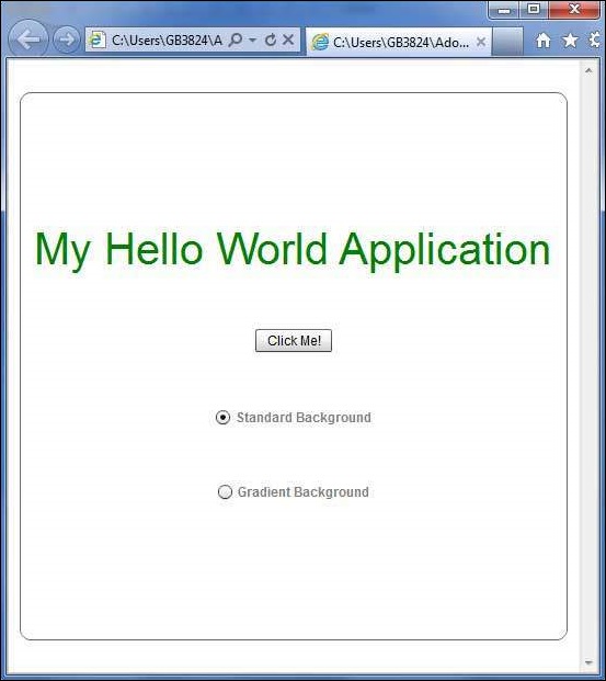
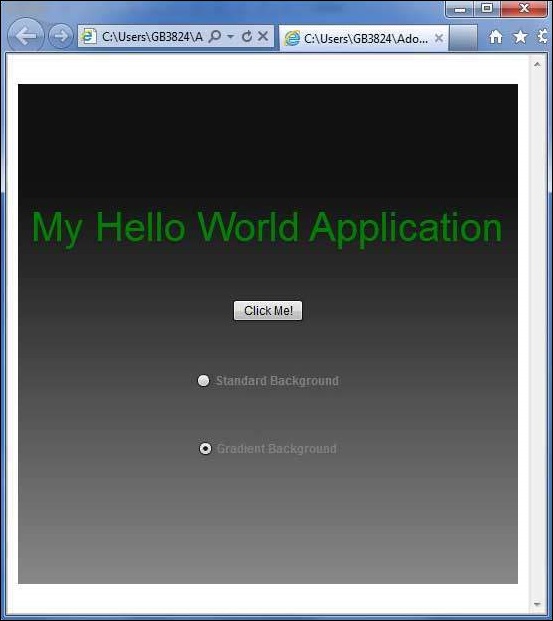
Flex — Data Binding
What is Data Binding?
Data Binding is a process in which data of one object is tied to another object. It requires a source property, a destination property and a triggering event which indicates, when to copy the data from source to destination.
Flex provides three ways to do Data Binding as below
- Curly brace syntax in MXML Script ({})
- <fx:binding> tag in MXML
- BindingUtils in ActionScript
Data Binding – Using Curly Braces in MXML
The following example demonstrates how to use curly braces to specify data binding of a source to destination.
<s:TextInput id = "txtInput1" />
<s:TextInput id = "txtInput2" text = "{txtInput1.text}" />
Data Binding – Using <fx:Binding> tag in MXML
The following example demonstrates how to use tag to specify data binding of a source to destination.
<fx:Binding source = "txtInput1.text" destination = "txtInput2.text" />
<s:TextInput id = "txtInput1" />
<s:TextInput id = "txtInput2" />
Data Binding – Using BindingUtils in ActionScript
The following example demonstrates how to use BindingUtils to specify data binding of a source to destination.
<fx:Script>
   <![CDATA[
      import mx.binding.utils.BindingUtils;
      import mx.events.FlexEvent;

      protected function txtInput2_preinitializeHandler(event:FlexEvent):void {
         BindingUtils.bindProperty(txtInput2,"text",txtInput1, "text");
      }
   ]]>
</fx:Script>

<s:TextInput id = "txtInput1" />
<s:TextInput id = "txtInput2"
   preinitialize = "txtInput2_preinitializeHandler(event)" />
Flex Data Binding Example
Let us follow the steps given below to see skinning in action in a Flex application by creating a test application −
| Step | Description |
|---|---|
| 1 | Create a project with a name HelloWorld under a packagecom.tutorialspoint.client as explained in the Flex — Create Application chapter. |
| 2 | Modify HelloWorld.mxml as explained below. Keep rest of the files unchanged. |
| 3 | Compile and run the application to make sure business logic is working as per the requirements. |
Following is the content of the modified HelloWorld.mxml filesrc/com/tutorialspoint/client/HelloWorld.mxml.
<?xml version = "1.0" encoding = "utf-8"?>
<s:Application xmlns:fx = "http://ns.adobe.com/mxml/2009"
xmlns:s = "library://ns.adobe.com/flex/spark"
xmlns:mx = "library://ns.adobe.com/flex/mx
width = "100%" height = "100%" minWidth = "500" minHeight = "500">
<fx:Style source = "/com/tutorialspoint/client/Style.css" />
<fx:Script>
<![CDATA[
import mx.binding.utils.BindingUtils;
import mx.events.FlexEvent;
protected function txtInput6_preinitializeHandler(event:FlexEvent):void {
BindingUtils.bindProperty(txtInput6,"text",txtInput5, "text");
}
]]>
</fx:Script>
<fx:Binding source = "txtInput3.text" destination = "txtInput4.text" />
<s:BorderContainer width = "500" height = "550" id = "mainContainer"
styleName = "container">
<s:VGroup width = "100%" height = "100%" gap = "50" horizontalAlign = "center"
verticalAlign = "middle">
<s:Label id = "lblHeader" text = "Data Binding Demonstration"
fontSize = "40" color = "0x777777" styleName = "heading" />
<s:Panel title = "Example #1 (Using Curly Braces,{})" width = "400"
height = "100" >
<s:layout>
<s:VerticalLayout paddingTop = "10" paddingLeft = "10" />
</s:layout>
<s:HGroup >
<s:Label text = "Type here: " width = "100" paddingTop = "6" />
<s:TextInput id = "txtInput1" />
</s:HGroup>
<s:HGroup >
<s:Label text = "Copied text: " width = "100" paddingTop = "6" />
<s:TextInput id = "txtInput2" text = "{txtInput1.text}" />
</s:HGroup>
</s:Panel>
<s:Panel title = "Example #2 (Using <fx:Binding>)" width = "400"
height = "100" >
<s:layout>
<s:VerticalLayout paddingTop = "10" paddingLeft = "10" />
</s:layout>
<s:HGroup >
<s:Label text = "Type here: " width = "100" paddingTop = "6" />
<s:TextInput id = "txtInput3" />
</s:HGroup>
<s:HGroup >
<s:Label text = "Copied text: " width = "100" paddingTop = "6" />
<s:Label id = "txtInput4" />
</s:HGroup>
</s:Panel>
<s:Panel title = "Example #3 (Using BindingUtils)" width = "400"
height = "100" >
<s:layout>
<s:VerticalLayout paddingTop = "10" paddingLeft = "10" />
</s:layout>
<s:HGroup >
<s:Label text = "Type here: " width = "100" paddingTop = "6" />
<s:TextInput id = "txtInput5" />
</s:HGroup>
<s:HGroup >
<s:Label text = "Copied text: " width = "100" paddingTop = "6" />
<s:TextInput enabled = "false" id = "txtInput6"
preinitialize = "txtInput6_preinitializeHandler(event)" />
</s:HGroup>
</s:Panel>
</s:VGroup>
</s:BorderContainer>
</s:Application>
Once you are ready with all the changes done, let us compile and run the application in normal mode as we did in Flex — Create Application chapter. If everything is fine with your application, it will produce the following result: [ Try it online ]

Flex — Basic Controls
Every user interface considers the following three main aspects −
-
UI Elements − These are the core visual elements the user eventually sees and interacts with. Flex provides a huge list of widely used and common elements varying from basic to complex which we will cover in this tutorial.
-
Layouts − They define how UI elements should be organized on the screen and provide a final look and feel to the GUI (Graphical User Interface). This part will be covered in Layout chapter.
-
Behavior − These events occur when the user interacts with UI elements. This part will be covered in Event Handling chapter.
Flex UI Elements
The Flex UI library provides classes in a well-defined class hierarchy to create complex web-based user interfaces. All classes in this component hierarchy have been derived from the EventDispatcher base class as shown below −
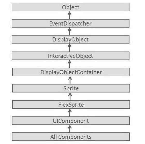
Every Basic UI control inherits properties from UI Component class which in turn inherits properties from EventDispatcher and other top level classes.
| Sr.No | Control & Description |
|---|---|
| 1 | Flex EventDispatcher Class
The EventDispatcher class is the base class for all classes that can dispatch events. The EventDispatcher class allows any object on the display list to be an event target and as such, to use the methods of the IEventDispatcher interface. |
| 2 | Flex UIComponent
The UIComponent class is the base class for all visual components, both interactive and non-interactive. |
Basic Controls
Following are the few important Basic Controls −
| Sr.No | Controls & Description |
|---|---|
| 1 | Label
Label is a low-level UIComponent that can render one or more lines of uniformly-formatted text. |
| 2 | Text
The Text control lets you display HTML content as well as normal text in your application. |
| 3 | Image
The Image control lets you import JPEG, PNG, GIF, and SWF files at runtime. |
| 4 | LinkButton
The LinkButton control is a borderless Button control whose contents are highlighted when a user moves the mouse over it. |
Flex — Form Controls
Form controls allow the users to input data and provides them interaction capability with the application. Every Form UI controls and inherits properties from UIComponent class which in turn inherits properties from EventDispatcher and other top level classes.
| Sr.No | Control & Description |
|---|---|
| 1 | Flex EventDispatcher Class
The EventDispatcher class is the base class for all classes that can dispatch events. The EventDispatcher class allows any object on the display list to be an event target and as such, to use the methods of the IEventDispatcher interface. |
| 2 | Flex UIComponent
The UIComponent class is the base class for all visual components, both interactive and noninteractive. |
Form Controls
Following are few important Form Controls −
| Sr.No | Control & Description |
|---|---|
| 1 | Button
The Button component is a commonly used rectangular button. |
| 2 | ToggleButton
The ToggleButton component defines a toggle button. |
| 3 | CheckBox
The CheckBox component consists of an optional label and a small box that can contain a check mark or not. |
| 4 | ColorPicker
The ColorPicker control provides a way for a user to choose a color from a swatch list. |
| 5 | ComboBox
The ComboBox control is a child class of the DropDownListBase control. |
| 6 | DateChooser
The DateChooser control displays the name of a month, the year, and a grid of the days of the month, with columns labeled for the day of the week. |
| 7 | RadioButton
The RadioButton component allows the user make a single choice within a set of mutually exclusive choices. |
| 8 | TextArea
TextArea is a text-entry control that lets users enter and edit multiple lines of formatted text. |
| 9 | TextInput
TextInput is a text-entry control that lets users enter and edit a single line of uniformly-formatted text. |
| 10 | DropDownList
The DropDownList control contains a drop-down list from which the user can select a single value. |
| 11 | NumericStepper
The NumericStepper control lets you select a number from an ordered set. |
Flex — Complex Controls
Complex controls provide users with advanced capabilities to deal with large amount of data in an easier way and provides them interaction capability with the application. Every Complex UI control inherits properties from UIComponent class which in turn inherits properties from EventDispatcher and other top level classes.
| Sr.No | Control & Description |
|---|---|
| 1 | Flex EventDispatcher Class
The EventDispatcher class is the base class for all classes that can dispatch events. The EventDispatcher class allows any object on the display list to be an event target and as such, to use the methods of the IEventDispatcher interface. |
| 2 | Flex UIComponent
The UIComponent class is the base class for all visual components, both interactive and noninteractive. |
Complex Controls
Following are the few important Complex Controls −
| Sr.No | Control & Description |
|---|---|
| 1 | DataGrid
The DataGrid control displays a row of column headings above a scrollable grid. |
| 2 | AdvancedDataGrid
The AdvancedDataGrid adds few additional functionality to the standard DataGrid control to add data visualization features. |
| 3 | Menu
The Menu control creates a pop-up menu of individually selectable choices. |
| 4 | ProgressBar
The ProgressBar control provides a visual representation of the progress of a task over time. |
| 5 | RichTextEditor
The RichTextEditor control lets users enter and format text. |
| 6 | TileList
The TileList control The TileList control displays a number of items laid out in tiles. |
| 7 | Tree
The Tree control lets a user view hierarchical data arranged as an expandable tree. |
| 8 | VideoPlayer
The VideoPlayer control is a skinnable video player that supports progressive download, multi-bitrate streaming, and streaming video. |
| 9 | Accordian
An Accordian control has a collection of child MX containers or Spark NavigatorContent containers, but only one of them at a time is visible. |
| 10 | TabNavigator
The TabNavigator control includes a TabBar container for navigating between its child containers. |
| 11 | ToggleButtonBar
The ToggleButtonBar control defines a horizontal or vertical group of buttons that maintain their selected or deselected state. |
Flex — Layout Panels
Layout panel controls provides users to organize UI controls on the page. Every Layout control inherits properties from UIComponent class which in turn inherits properties from EventDispatcher and other top level classes.
| Sr.No | Control & Description |
|---|---|
| 1 | Flex EventDispatcher Class
The EventDispatcher class is the base class for all classes that can dispatch events. The EventDispatcher class allows any object on the display list to be an event target and as such, to use the methods of the IEventDispatcher interface. |
| 2 | Flex UIComponent
The UIComponent class is the base class for all visual components, both interactive and noninteractive. |
Layout Panels
Following are few important Layout Panels −
| Sr.No | Panel & Description |
|---|---|
| 1 | BorderContainer
The BorderContainer class provides a set of CSS styles that control the appearance of the border and background fill of the container. |
| 2 | Form
The Form container provides control over the layout of a form, mark form fields as required or optional, handle error messages, and bind form data to the Flex data model to perform data checking and validation. |
| 3 | VGroup
The VGroup container is a Group container that uses the VerticalLayout class. |
| 4 | HGroup
The HGroup container is a Group container that uses the HorizontalLayout class. |
| 5 | Panel
The Panel class is a container that includes a title bar, a caption, a border, and a content area for its children. |
| 6 | SkinnableContainer
The SkinnableContainer class is the base class for skinnable containers that provide visual content. |
| 7 | TabBar
The TabBar displays a set of identical tabs. |
| 8 | TitleWindow
The TitleWindow extends Panel to include a close button and move area. |
Flex — Visual Effects
We can add behavior to flex application using the concept of Effects. For example, when a text box gets focus, we can make its text become bolder and make its size slight bigger.
Every effect inherits properties from Effect class which in turn inherits properties from EventDispatcher and other top level classes.
| Sr.No | Effect & Description |
|---|---|
| 1 | Flex Effect Class
The Effect class is an abstract base class that defines the basic functionality of all Flex effects. This class defines the base factory class for all effects. |
Basic Effects
Following are the few important Basic Visual Effects −
| Sr.No | Effect & Description |
|---|---|
| 1 | Fade
The Fade effect animates the alpha property of a component. |
| 2 | WipeLeft
The WipeLeft class defines a wipe left effect. |
| 3 | WipeRight
The WipeRight class defines a wipe right effect. |
| 4 | Move3D
The Move3D class moves a target object in the x, y, and z dimensions. |
| 5 | Scale3D
The Scale3D class scales a target object in three dimensions around the transform center. |
| 6 | Rotate3D
The Rotate3D class rotate a target object in three dimensions around the x, y, or z axes. |
| 7 | Animate
This Animate effect animates an arbitrary set of properties between values. Specify the properties and values to animate by setting the motionPaths property. |
Flex — Event Handling
Flex uses concept of event to pass data from one object to another depending upon the state or user interaction within the application.
ActionScript has a generic Event class which defines much of the functionality needed to work with events. Every time an event occurs within a Flex application, three types of objects from the Event class hierarchy are created.
Event has the following three key properties
| Sr.No | Property & Description |
|---|---|
| 1 |
Type The type states about what kind of event just happened. This may be click, initialize, mouseover, change, etc. The actual values will be represented by constants like MouseEvent.CLICK. |
| 2 |
Target The target property of Event is an object reference to the component that generated the event.If you click a Button with an id of clickMeButton, the target of that click event will be clickMeButton |
| 3 |
CurrentTarget The currentTarget property varies container hierarchy. It mainly deals with flow of events. |
Event Flow Phases
An event goes through three phases looking for event handlers.
| Sr.No | Phase & Description |
|---|---|
| 1 |
Capture In the capture phase, the program will start looking for event handlers from the outside (or top) parent to the innermost one. The capture phase stops at the parent of the object that triggered the event. |
| 2 |
Target In the target phase, the component that triggered the event, is checked for an event handler. |
| 3 |
Bubble The Bubble phase is reverse of capture phase, working back through the structure, from the target component’s parent on up. |
Consider the following application code −
<?xml version = "1.0" encoding = "utf-8"?>
<s:Application xmlns:fx = "http://ns.adobe.com/mxml/2009"
   xmlns:s = "library://ns.adobe.com/flex/spark"
   xmlns:mx = "library://ns.adobe.com/flex/mx
   width = "100%" height = "100%" minWidth = "500" minHeight = "500" >

   <s:Panel>
      <s:Button id = "clickMeButton" label = "Click Me!" click = "doAction( );" />
   </s:Panel>
</s:Application>
When the user clicks the Button, he or she has also clicks the Panel and the Application.
The event goes through three phases looking for event-handler assignments.
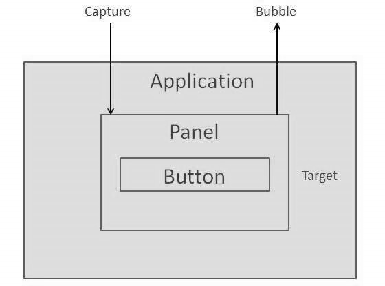
Let us follow the steps below to test event handing in a Flex application −
| Step | Description |
|---|---|
| 1 | Create a project with a name HelloWorld under a package com.tutorialspoint.client as explained in the Flex — Create Application chapter. |
| 2 | Modify HelloWorld.mxml as explained below. Keep rest of the files unchanged. |
| 3 | Compile and run the application to make sure business logic is working as per the requirements. |
Following is the content of the modified mxml file src/com.tutorialspoint/HelloWorld.mxml.
<?xml version = "1.0" encoding = "utf-8"?>
<s:Application xmlns:fx = "http://ns.adobe.com/mxml/2009"
   xmlns:s = "library://ns.adobe.com/flex/spark"
   xmlns:mx = "library://ns.adobe.com/flex/mx
   width = "100%" height = "100%" minWidth = "500" minHeight = "500">

   <fx:Style source = "/com/tutorialspoint/client/Style.css" />
   <fx:Script>
      <![CDATA[
         protected function reportEvent(event:MouseEvent):void {
            var target:String = event.target.id;
            var currentTarget:String = event.target.id;
            var eventPhase: String;

            if(event.target is Button) {
               var button:Button = event.target as Button;
               target = button.label + " Button";
            } else if(event.target is HGroup) {
               var hGroup:HGroup = event.target as HGroup;
               target = hGroup.id + " HGroup";
            } else if(event.target is Panel) {
               var panel:Panel = event.target as Panel;
               target = panel.id + " Panel";
            }

            if(event.currentTarget is Button) {
               var button1:Button = event.currentTarget as Button;
               currentTarget = button1.label + " Button";
            } else if(event.currentTarget is HGroup) {
               var hGroup1:HGroup = event.currentTarget as HGroup;
               currentTarget = hGroup1.id + " HGroup";
            } else if(event.currentTarget is Panel) {
               var panel1:Panel = event.currentTarget as Panel;
               currentTarget = panel1.id + " Panel";
            }

            var eventPhaseInt:uint = event.eventPhase;

            if(eventPhaseInt == EventPhase.AT_TARGET) {
               eventPhase = "Target";
            } else if(eventPhaseInt == EventPhase.BUBBLING_PHASE) {
               eventPhase = "Bubbling";
            } else if(eventPhaseInt == EventPhase.CAPTURING_PHASE) {
               eventPhase = "Capturing";
            }

            reports.text += " Target: " + target + "n currentTarget: " +
               currentTarget + "n Phase: " + eventPhase + "n----------n";
         }
      ]]>
   </fx:Script>

   <s:BorderContainer width = "630" height = "480" id = "mainContainer"
      styleName = "container">
      <s:VGroup width = "100%" height = "100%" gap = "10"
         horizontalAlign = "center" verticalAlign = "middle">
         <s:Label id = "lblHeader" text = "Event Handling Demonstration"
            fontSize = "40" color = "0x777777" styleName = "heading" />

         <s:Panel id = "parentPanel" title = "Main Parent"
            click = "reportEvent(event)" width = "500"
            height = "100" includeInLayout = "true" visible = "true">
            <s:layout>
               <s:VerticalLayout  gap = "10" verticalAlign = "middle"
                  horizontalAlign = "center" />
            </s:layout>

            <s:HGroup id = "mainHGroup" click = "reportEvent(event)">
               <s:Button label = "Click Me" click = "reportEvent(event)" />
            </s:HGroup>
         </s:Panel>

         <s:Panel id = "reportPanel" title = "Events" width = "500" height = "230">
            <mx:Text id = "reports" />
         </s:Panel>
      </s:VGroup>
   </s:BorderContainer>
</s:Application>
Once you are ready with all the changes done, let us compile and run the application in normal mode as we did in Flex — Create Application chapter. If everything is fine with your application, it will produce the following result: [ Try it online ]

Flex — Custom Controls
Flex provides two ways to create custom components.
- Using ActionScript
- Using MXML
Using ActionScript
You can create a component by extending existing component. To create a component using Flash Builder, Click on File > New > ActionScript Class.
Enter the details as shown below −

Flash Builder will create the following CustomButton.as file.
package com.tutorialspoint.client {
   import spark.components.Button;

   public class CustomButton extends Button {
      public function CustomButton() {
         super();
      }
   }
}
Using MXML
You can create a component by extending existing component. To create a component using Flash Builder, Click on File > New > MXML Component.
Enter the details as shown below.
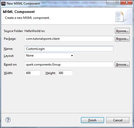
Flash Builder will create the following CustomLogin.mxml file.
<?xml version = "1.0" encoding = "utf-8"?>
<s:Group xmlns:fx = "http://ns.adobe.com/mxml/2009"
   xmlns:s = "library://ns.adobe.com/flex/spark"
   xmlns:mx = "library://ns.adobe.com/flex/mx"
   width = "400" height = "300">
</s:Group>
Let us follow the following steps to test custom controls in a Flex application −
| Step | Description |
|---|---|
| 1 | Create a project with a name HelloWorld under a package com.tutorialspoint.client as explained in the Flex — Create Application chapter. |
| 2 | Modify HelloWorld.mxml as explained below. Keep rest of the files unchanged. |
| 3 | Create CustomLogin.mxml and CustomButton.as component as explained above. Modify these files as explained below. Keep rest of the files unchanged. |
| 4 | Compile and run the application to make sure business logic is working as per the requirements. |
Following is the content of the modified mxml file src/com.tutorialspoint/client/CustomLogin.mxml.
<?xml version = "1.0" encoding = "utf-8"?>
<s:Group xmlns:fx = "http://ns.adobe.com/mxml/2009"
   xmlns:s = "library://ns.adobe.com/flex/spark"
   xmlns:mx = "library://ns.adobe.com/flex/mx" width = "400" height = "300">

   <s:Form>
      <s:FormItem label = "UserName:">
         <s:TextInput width = "200" />
      </s:FormItem>

      <s:FormItem label = "Password:">
         <s:TextInput width = "200" displayAsPassword = "true" />
      </s:FormItem>

      <s:FormItem>
         <s:Button label = "Login" />
      </s:FormItem>
   </s:Form>
</s:Group>
Following is the content of the modified mxml file src/com.tutorialspoint/client/CustomButton.as.
package com.tutorialspoint.client {
   import spark.components.Button;

   public class CustomButton extends Button {

      public function CustomButton() {
         super();
         this.setStyle("color","green");
         this.label = "Submit";
      }
   }
}
Following is the content of the modified mxml file src/com.tutorialspoint/client/HelloWorld.mxml.
<?xml version = "1.0" encoding = "utf-8"?>
<s:Application xmlns:fx = "http://ns.adobe.com/mxml/2009"
   xmlns:s = "library://ns.adobe.com/flex/spark"
   xmlns:mx = "library://ns.adobe.com/flex/mx"
   xmlns:client = "com.tutorialspoint.client.*"
   initialize = "application_initializeHandler(event)">

   <fx:Style source = "/com/tutorialspoint/client/Style.css" />
   <fx:Script>
      <![CDATA[
        import mx.events.FlexEvent;

        protected function application_initializeHandler(event:FlexEvent):void {
           //create a new custom button
           var customButton: CustomButton = new CustomButton();
           asPanel.addElement(customButton);
        }

      ]]>
   </fx:Script>

   <s:BorderContainer width = "630" height = "480" id = "mainContainer"
      styleName = "container">
      <s:VGroup width = "100%" height = "100%" gap = "10"
         horizontalAlign = "center" verticalAlign = "middle">
         <s:Label id = "lblHeader" text = "Custom Controls Demonstration"
            fontSize = "40" color = "0x777777" styleName = "heading" />

         <s:Panel title = "Using MXML Component" width = "400" height = "200">
            <client:CustomLogin>
            </client:CustomLogin>
         </s:Panel>

         <s:Panel  title = "Using AS Component" width = "400" height = "100">
            <s:VGroup id = "asPanel" width = "100%" height = "100%" gap = "10"
               horizontalAlign = "center" verticalAlign = "middle">
            </s:VGroup>
         </s:Panel>
      </s:VGroup>
   </s:BorderContainer>
</s:Application>
Once you are ready with all the changes done, let us compile and run the application in normal mode as we did in Flex — Create Application chapter. If everything is fine with your application, it will produce the following result: [ Try it online ]

Flex — RPC Services
Flex provides RPC services to provide server side data to client side. Flex provides a fair amount of control on to server side data.
-
Using Flex RPC services, we can define user actions to be executed on server side.
-
Flex RPC Sservices can be integrated with any server side technologies.
-
One of Flex RPC Service provide inbuilt support for compressed binary data to be transferred over the wire and is pretty fast.
Flex provides the following three types of RPC Services
| Sr.No | RPC Service & Description |
|---|---|
| 1 |
HttpService <mx:HTTPService> tag is used to represent an HTTPService object in an MXML file. When you make a call to HTTPService object’s send() method, it makes an HTTP request to the specified URL, and an HTTP response is returned.You can also use the HTTP HEAD, OPTIONS, TRACE, and DELETE methods. |
| 2 |
WebService The <mx:WebService> is used to get access to the operations of SOAP-compliant web services. |
| 3 |
RemoteObject The <mx:RemoteObject> tag is used to represent an HTTPService object in an MXML file. This tag gives you access to the methods of Java objects using Action Message Format (AMF) encoding. |
We’re going to discuss HTTP Service in detail. We’ll use an XML source file placed at server and access it at client side via HTTP Service.
Items.xml
<items>
   <item name = "Book" description = "History of France"></item>
   <item name = "Pen" description = "Parker Pen"></item>
   <item name = "Pencil" description = "Stationary"></item>
<items>
HTTPService Declaration
Now declare a HTTPService and pass it url of the above file
<fx:Declarations>
   <mx:HTTPService id = "itemRequest"
   url = "http://www.tutorialspoint.com/flex/Items.xml" />
</fx:Declarations>
RPC Call
Make a call to itemRequest.send() method and bind values from lastResult object of itemRequest webservice to Flex UI component.
...
itemRequest.send();
...
<mx:DataGrid id = "dgItems" height = "80%" width = "75%"
   dataProvider = "{itemRequest.lastResult.items.item}">
   <mx:columns>
      <mx:DataGridColumn headerText = "Name" dataField = "name" />
      <mx:DataGridColumn headerText = "Description" dataField = "description" />
   </mx:columns>
</mx:DataGrid>
RPC Service Call Example
Now, Let us follow the steps to test RPC services in a Flex application −
| Step | Description |
|---|---|
| 1 | Create a project with a name HelloWorld under a package com.tutorialspoint.client as explained in the Flex — Create Application chapter. |
| 2 | Modify HelloWorld.mxml as explained below. Keep rest of the files unchanged. |
| 3 | Compile and run the application to make sure business logic is working as per the requirements. |
Following is the content of the modified mxml file src/com.tutorialspoint/HelloWorld.mxml.
<?xml version = "1.0" encoding = "utf-8"?>
<s:Application xmlns:fx = "http://ns.adobe.com/mxml/2009"
   xmlns:s = "library://ns.adobe.com/flex/spark"
   xmlns:mx = "library://ns.adobe.com/flex/mx"
   minWidth = "500" minHeight = "500" creationComplete = "init(event)">

   <fx:Style source = "/com/tutorialspoint/client/Style.css" />
   <fx:Script>
      <![CDATA[
         import mx.events.FlexEvent;
         import mx.rpc.events.FaultEvent;
         import mx.rpc.events.ResultEvent;

         protected function init(event:FlexEvent):void {
            itemRequest.send();
         }
      ]]>
   </fx:Script>

   <fx:Declarations>
      <mx:HTTPService id = "itemRequest"
         url = "http://www.tutorialspoint.com/flex/Items.xml" />
   </fx:Declarations>

   <s:BorderContainer width = "630" height = "480" id = "mainContainer"
      styleName = "container">
      <s:VGroup width = "100%" height = "100%" gap = "10"
         horizontalAlign = "center" verticalAlign = "middle">
         <s:Label id = "lblHeader" text = "RPC Service Demonstration"
            fontSize = "40" color = "0x777777" styleName = "heading" />

         <s:Panel id = "parentPanel" title = "Using RPC Services"
            width = "500" height = "200" >
            <s:layout>
               <s:VerticalLayout  gap = "10"
                  verticalAlign = "middle" horizontalAlign = "center" />
            </s:layout>

            <mx:DataGrid id = "dgItems" height = "80%" width = "75%"
               dataProvider = "{itemRequest.lastResult.items.item}">

               <mx:columns>
                  <mx:DataGridColumn headerText = "Name" dataField = "name" />
                  <mx:DataGridColumn headerText = "Description"
                     dataField = "description" />
               </mx:columns>
            </mx:DataGrid>
         </s:Panel>
      </s:VGroup>
   </s:BorderContainer>
</s:Application>
Once you are ready with all the changes done, let us compile and run the application in normal mode as we did in Flex — Create Application chapter. If everything is fine with your application, it will produce the following result: [ Try it online ]

Flex — FlexUnit Integration
Flash Builder 4 has an excellent inbuilt support for FlexUnit integration in Flex development Cycle.
Create a Test Case Class
You can create a Test Case Class using Flash Builder Create Test Class wizard. Running test cases is a breeze with Flash Builder as you will see in this article.
To create a test case class using Flash Builder, Click on File > New > Test Case Class. Enter the details as shown below.
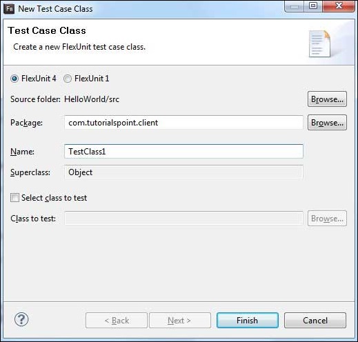
Flash Builder will create the following TestClass1.as a file.
package com.tutorialspoint.client {
   public class TestClass1 {
      [Before]
      public function setUp():void {}

      [After]
      public function tearDown():void {}

      [BeforeClass]
      public static function setUpBeforeClass():void {}

      [AfterClass]
      public static function tearDownAfterClass():void {}
   }
}
FlexUnit Integration Example
Now, let us follow the steps to test FlexUnit Integration in a Flex application −
| Step | Description |
|---|---|
| 1 | Create a project with a name HelloWorld under a package com.tutorialspoint.client as explained in the Flex — Create Application chapter. |
| 2 | Modify HelloWorld.mxml as explained below. Keep rest of the files unchanged. |
| 3 | Create TestClass1.as test case as described above and Modify TestClass1.as as explained below. |
| 4 | Compile and run the application to make sure business logic is working as per the requirements. |
Following is the content of the modified as file src/com.tutorialspoint/client/TestClass1.as.
package com.tutorialspoint.client {
   import org.flexunit.asserts.assertEquals;

   public class TestClass1 {
      private var counter: int = 1;

      [Before]
      public function setUp():void {
         //this code will run before every test case execution
      }

      [After]
      public function tearDown():void {
         //this code will run after every test case execution
      }

      [BeforeClass]
      public static function setUpBeforeClass():void {
         //this code will run once when test cases start execution
      }

      [AfterClass]
      public static function tearDownAfterClass():void {
         //this code will run once when test cases ends execution
      }

      [Test]
      public function testCounter():void {
         assertEquals(counter, 1);
      }
   }
}
Following is the content of the modified mxml file src/com.tutorialspoint/HelloWorld.mxml.
<?xml version = "1.0" encoding = "utf-8"?>
<s:Application xmlns:fx = "http://ns.adobe.com/mxml/2009"
   xmlns:s = "library://ns.adobe.com/flex/spark"
   xmlns:mx = "library://ns.adobe.com/flex/mx"
   minWidth = "500" minHeight = "500">
</s:Application>
Once you are ready with all the changes done, let us compile in normal mode as we did in Flex — Create Application chapter.
Running Test cases
Now Right Click on TestClass1 in package explorer and select Run As > FlexUnit Tests. You’ll see the following output in Flash Builder test window.
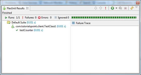
Flash Builder also shows test results in the browser.
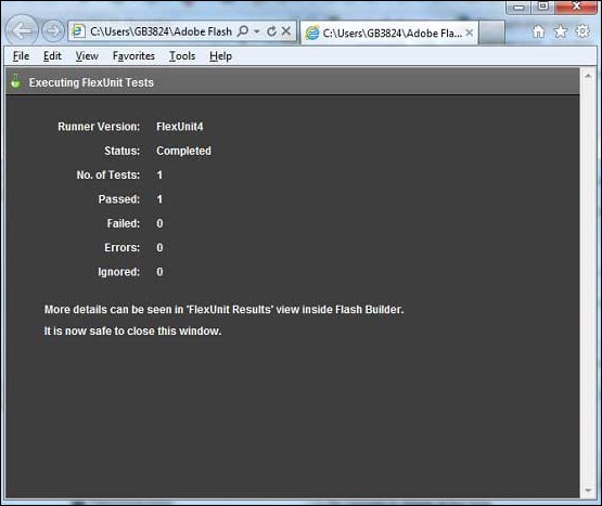
Flex — Debug Application
Flex provides excellent capability of debugging flex code and Flash Builder 4 has an excellent built-in debugger and debugging perspective support.
-
During debug mode, Flex Application runs on Flash Player Debugger version built in Flash Builder 4 which supports debugging capability.
-
So developers get an easy and inbuilt debugging configuration in Flash Builder
In this article, we’ll demonstrate usage of debugging Flex Client code using Flash Builder. We’ll do the following tasks
- Set break points in the code and see them in Breakpoint Explorer.
- Step through the code line by line during debugging.
- View the values of variable.
- Inspect the values of all the variables.
- Inspect the value of an expression.
- Display the stack frame for suspended threads.
Debugging Example
| Step | Description |
|---|---|
| 1 | Create a project with a name HelloWorld under a package com.tutorialspoint.client as explained in the Flex — Create Application chapter. |
| 2 | Modify HelloWorld.mxml as explained below. Keep rest of the files unchanged. |
| 3 | Compile and run the application to make sure business logic is working as per the requirements. |
Following is the content of the modified mxml file src/com.tutorialspoint/HelloWorld.mxml.
<?xml version = "1.0" encoding = "utf-8"?>
<s:Application xmlns:fx = "http://ns.adobe.com/mxml/2009"
   xmlns:s = "library://ns.adobe.com/flex/spark"
   xmlns:mx = "library://ns.adobe.com/flex/mx"
   width = "100%" height = "100%"
   minWidth = "500" minHeight = "500"
   initialize = "application_initializeHandler(event)">

   <fx:Style source = "/com/tutorialspoint/client/Style.css" />
   <fx:Script>
      <![CDATA[
         import mx.controls.Alert;
         import mx.events.FlexEvent;
         protected function btnClickMe_clickHandler(event:MouseEvent):void {
            Alert.show("Hello World!");
         }

         protected function application_initializeHandler(event:FlexEvent):void {
            lblHeader.text = "My Hello World Application";
         }
      ]]>
   </fx:Script>

   <s:BorderContainer width = "500" height = "500" id = "mainContainer"
      styleName = "container">
      <s:VGroup width = "100%" height = "100%" gap = "50" horizontalAlign = "center"
         verticalAlign = "middle">
         <s:Label id = "lblHeader" fontSize = "40" color = "0x777777"
            styleName = "heading" />
         <s:Button label = "Click Me!" id = "btnClickMe"
            click = "btnClickMe_clickHandler(event)" styleName = "button" />
      </s:VGroup>
   </s:BorderContainer>
</s:Application>
Once you are ready with all the changes done, let us compile in normal mode as we did in Flex — Create Application chapter.
Step 1 — Place Breakpoints
Place a breakpoint on the first line of application initialize Handler of HelloWorld.mxml
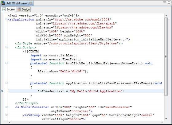
Step 2 — Debug Application
Now click on  Debug application menu and select HelloWorld application to debug the application.

If everything is fine, application will launch in the browser and you will see following debug logs in Flash Builder console.
[SWF] HelloWorldbin-debugHelloWorld.swf
- 181,509 bytes after decompression
[SWF] HelloWorldbin-debugHelloWorld.swf[[DYNAMIC]]1
- 763,122 bytes after decompression
[SWF] HelloWorldbin-debugHelloWorld.swf[[DYNAMIC]]2
- 1,221,837 bytes after decompression
[SWF] HelloWorldbin-debugHelloWorld.swf[[DYNAMIC]]3
- 1,136,788 bytes after decompression
[SWF] HelloWorldbin-debugHelloWorld.swf[[DYNAMIC]]4
- 2,019,570 bytes after decompression
[SWF] HelloWorldbin-debugHelloWorld.swf[[DYNAMIC]]5
- 318,334 bytes after decompression
As soon as Application launches,you will see the focus on Flash Builder breakpoint as we’ve placed the breakpoint on first line of application_initialize Handler method.
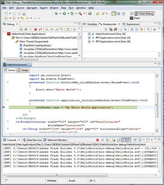
You can see the stacktrace for suspended threads.
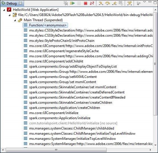
You can see the values for expressions.

You can see the list of breakpoints placed.

Now keep pressing F6 until you reach the last line of application_initializeHandler() method. As reference for function keys, F6 inspects code line by line, F5 steps inside further and F8 will resume the application. Now you can see the list of values of all variables of application_initializeHandler() method.

Now you can see the flex code can be debugged in the same way as a Java Application can be debugged. Place breakpoints to any line and play with debugging capabilities of flex.
Flex — Internationalization
Flex provides two ways to internationalize a Flex application, We’ll demonstrate use of Compile time Internationalization being most commonly used among projects.
| Sr.No | Technique & Description |
|---|---|
| 1 |
Compile Time Internationalization This technique is most prevalent and requires very little overhead at runtime; is a very efficient technique for translating both constant and parameterized strings;simplest to implement. Compile Time internationalization uses standard properties files to store translated strings and parameterized messages, and these properties files are compiled directly in the application. |
| 2 |
Run Time Internationalization This technique is very flexible but slower than static string internationalization. You need to compile the localization properties files separately, leave them external to application, and load them at run time. |
Workflow of internationalizing a Flex Application
Step 1 – Create folder structure
Create a locale folder under src folder of Flex project.This will be the parent directory for all of the properties files for the locales that the application will support. Inside the locale folder, create subfolders, one for each of the application’s locales to be supported. The convention for naming a locale is
{language}_{country code}
For example, en_US represents English of the United States. The locale de_DE represents German. The sample application will support two common languages: English, and German.
Step 2 – Create properties files
Create properties file containing the messages to be used in the application. We’ve created a HelloWorldMessages.properties file under src > locale > en_US folder in our example.
enterName = Enter your name
clickMe = Click Me
applicationTitle = Application Internationalization Demonstration
greeting = Hello {0}
Create properties files containing translated values specific to locale. We’ve created a HelloWorldMessages.properties file under src > locale > de_DE folder in our example. This file contains translations in german language. _de specifies the german locale and we’re going to support german language in our application.
If you are creating properties file using Flash Builder then change the encoding of the file to UTF-8.Select the file and then right-click in it to open its properties window.Select Text file encoding as Other UTF-8. Apply and Save the change.
enterName = Geben Sie Ihren Namen
clickMe = Klick mich
applicationTitle = Anwendung Internationalisierung Demonstration
greeting = Hallo {0}
Step 3 – Specify Compiler options
-
Right-click your project and select Properties.
-
Select Flex Compiler, and add the following to the Additional Compiler Arguments settings −
-locale en_US de_DE
-
Right-click your project and select Properties.
-
Select Flex Build Path, and add the following to the Source Path settings −
srclocale{locale}
Internalization Example
Now Let us follow the following steps to test Internalization technique in a Flex application −
| Step | Description |
|---|---|
| 1 | Create a project with a name HelloWorld under a package com.tutorialspoint.client as explained in the Flex — Create Application chapter. |
| 2 | Modify HelloWorld.mxml as explained below. Keep rest of the files unchanged. |
| 3 | Compile and run the application to make sure business logic is working as per the requirements. |
Following is the content of the modified mxml file src/com.tutorialspoint/HelloWorld.mxml.
<?xml version = "1.0" encoding = "utf-8"?>
   <s:Application xmlns:fx = "http://ns.adobe.com/mxml/2009"
   xmlns:s = "library://ns.adobe.com/flex/spark"
   xmlns:mx = "library://ns.adobe.com/flex/mx"
   minWidth = "500" minHeight = "500">

   <fx:Metadata>
      [ResourceBundle("HelloWorldMessages")]
   </fx:Metadata>

   <fx:Style source = "/com/tutorialspoint/client/Style.css" />
   <fx:Script>
      <![CDATA[
         import mx.controls.Alert;
         [Bindable]
         private var locales:Array =  [{label:"English", locale:"en_US"},
            {label:"German", locale:"de_DE"}];

         private function comboChangeHandler():void {
           resourceManager.localeChain = [localeComboBox.selectedItem.locale];
         }

         protected function clickMe_clickHandler(event:MouseEvent):void {
            var name:String = txtName.text;
            var inputArray:Array = new Array();
            inputArray.push(name);
            Alert.show(resourceManager.getString('HelloWorldMessages'
               ,'greeting',inputArray));
         }
      ]]>
   </fx:Script>

   <s:BorderContainer width = "500" height = "500" id = "mainContainer"
      styleName = "container">
      <s:VGroup width = "100%" height = "100%" gap = "50"
	  horizontalAlign = "center" verticalAlign = "middle">

         <s:Label id = "lblHeader" fontSize = "40"
            color = "0x777777"
            text  = "{resourceManager.getString('HelloWorldMessages','applicationTitle')}"
            styleName = "heading" width = "90%" height = "150" />

         <s:Panel width = "300" height = "150">
            <s:layout>
               <s:VerticalLayout paddingTop = "10" paddingLeft = "10" />
            </s:layout>

            <s:HGroup >
               <s:Label text = "{resourceManager.getString('HelloWorldMessages','enterName')}"
                  paddingTop = "2" />
               <s:TextInput id = "txtName" />
            </s:HGroup>

            <s:Button
               label = "{resourceManager.getString('HelloWorldMessages','clickMe')}"
               click = "clickMe_clickHandler(event)" right = "10" />
         </s:Panel>

         <mx:ComboBox id = "localeComboBox" dataProvider = "{locales}"
            change = "comboChangeHandler()" />
      </s:VGroup>
   </s:BorderContainer>
</s:Application>
Once you are ready with all the changes done, let us compile and run the application in normal mode as we did in Flex — Create Application chapter. If everything is fine with your application, it will produce the following result: [ Try it online ]
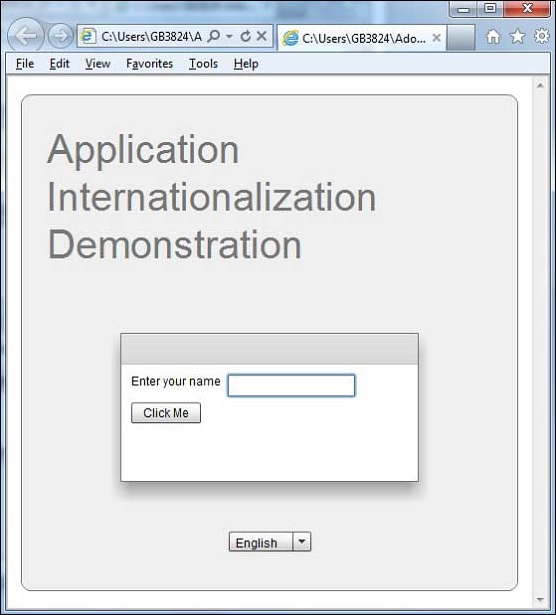
Change the language using language drop down and see the result.
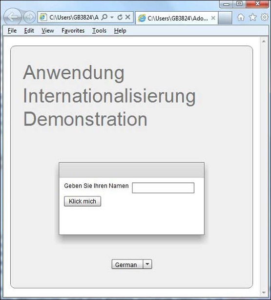
Flex — Printing Support
Flex provides a special class FlexPrintJob to print flex objects.
-
FlexPrintJob can be used to print one or more Flex objects, such as a Form or VBox container.
-
FlexPrintJob prints the object and all objects that it contains.
-
The objects can be all or part of the displayed interface.
-
The objects can be components that format data specifically for printing.
-
The FlexPrintJob class lets you scale the output to fit the page.
-
The FlexPrintJob class automatically uses multiple pages to print an object that does not fit on a single page.
-
The FlexPrintJob class causes the operating system to display a Print dialog box. You cannot print without some user action.
Prepare and send a print job
You print output by preparing and sending a print job. Let’s create an instance of the FlexPrintJob class
var printJob:FlexPrintJob = new FlexPrintJob();
Start the print job
printJob.start();
Flex will cause the operating system to display a Print dialog box. Add one or more objects to the print job and specify how to scale them
printJob.addObject(myObject, FlexPrintJobScaleType.MATCH_WIDTH);
Each object starts on a new page. Send the print job to the printer
printJob.send();
Printing Example
| Step | Description |
|---|---|
| 1 | Create a project with a name HelloWorld under a package com.tutorialspoint.client as explained in the Flex — Create Application chapter. |
| 2 | Modify HelloWorld.mxml as explained below. Keep rest of the files unchanged. |
| 3 | Compile and run the application to make sure business logic is working as per the requirements. |
Following is the content of the modified mxml file src/com.tutorialspoint/HelloWorld.mxml.
<?xml version = "1.0" encoding = "utf-8"?>
<s:Application xmlns:fx = "http://ns.adobe.com/mxml/2009"
   xmlns:s = "library://ns.adobe.com/flex/spark"
   xmlns:mx = "library://ns.adobe.com/flex/mx"
   width = "100%" height = "100%"
   minWidth = "500" minHeight = "500"
   initialize = "application_initializeHandler(event)">

   <fx:Style source = "/com/tutorialspoint/client/Style.css" />
   <fx:Script>
     <![CDATA[
         import mx.controls.Alert;
         import mx.events.FlexEvent;
         import mx.printing.FlexPrintJob;
         import mx.printing.FlexPrintJobScaleType;

         protected function btnClickMe_clickHandler(event:MouseEvent):void {

            // Create an instance of the FlexPrintJob class.
            var printJob:FlexPrintJob = new FlexPrintJob();

            // Start the print job.
            if (printJob.start() != true) return;

            // Add the object to print. Do not scale it.
            printJob.addObject(myDataGrid, FlexPrintJobScaleType.NONE);

            // Send the job to the printer.
            printJob.send();
        }

        protected function application_initializeHandler(event:FlexEvent):void {
            lblHeader.text = "My Hello World Application";
        }
     ]]>
   </fx:Script>

   <s:BorderContainer width = "500" height = "500" id = "mainContainer"
      styleName = "container">
      <s:VGroup width = "100%" height = "100%" gap = "50"
         horizontalAlign = "center"
         verticalAlign = "middle">
         <s:Label id = "lblHeader" fontSize = "40" color = "0x777777"
            styleName = "heading" />

         <mx:DataGrid id = "myDataGrid" width = "300">
            <mx:dataProvider>
               <fx:Object Product = "Flex" Code = "1000" />
               <fx:Object Product = "GWT" Code = "2000" />
               <fx:Object Product = "JAVA" Code = "3000" />
               <fx:Object Product = "JUnit" Code = "4000" />
            </mx:dataProvider>
         </mx:DataGrid>

         <s:Button label = "Print Me!" id = "btnClickMe"
            click = "btnClickMe_clickHandler(event)"
            styleName = "button" />
      </s:VGroup>
   </s:BorderContainer>
</s:Application>
Once you are ready with all the changes done, let us compile and run the application in normal mode as we did in Flex — Create Application chapter. If everything is fine with your application, it will produce the following result: [ Try it online ]

Click on print me button and you can see the printout of the data grid shown below.
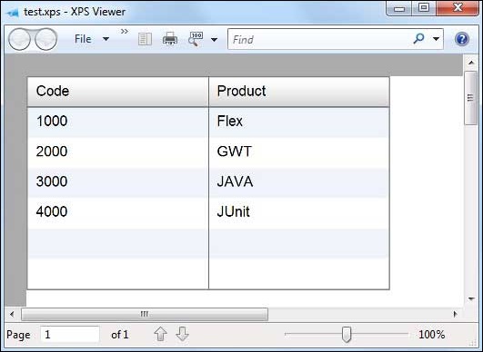
Hide thumbs
Also See for FLEX 2 — CREATING AND EXTENDING COMPONENTS:
- Manual (184 pages)
- Manual (30 pages)
,
-
Contents
-
Table of Contents
-
Troubleshooting
-
Bookmarks
Quick Links
Related Manuals for Adobe FLEX 2 — CREATING AND EXTENDING COMPONENTS
Summary of Contents for Adobe FLEX 2 — CREATING AND EXTENDING COMPONENTS
-
Page 2
United States and other countries. All other trademarks are the property of their respective owners. This product includes software developed by the Apache Software Foundation (http://www.apache.org/). Macromedia Flash 8 video is powered by On2 TrueMotion video technology. © 1992-2005 On2 Technologies, Inc. All Rights Reserved. http:// www.on2.com. -
Page 3: Table Of Contents
Contents Chapter 1: About Flex Documentation ….. . . 7 PART 1: CREATING CUSTOM FLEX COMPONENTS Chapter 2: Creating Flex Components ….. . 13 About creating components.
-
Page 4
Chapter 8: Creating Advanced MXML Components ..91 About reusable MXML components ……91 Adding custom properties and methods to a component . -
Page 5
Chapter 14: Creating Custom Validators ….217 Validating data by using custom validators….. . . 217 Example: Creating a simple validator . -
Page 6
Contents… -
Page 7
CHAPTER 1 About Flex Documentation Creating and Extending Flex 2 Components describes how to create components in MXML and ActionScript. This manual is intended for component developers who are developing new components for use in their Adobe® Flex™ application. Contents Using this manual . -
Page 8: Chapter 1: About Flex Documentation
Accessing the Flex documentation The Flex documentation is designed to provide support for the complete spectrum of participants. Documentation set The Flex documentation set includes the following titles: Book Description Getting Started with Flex 2 Contains an overview of Flex features and application development procedures.
-
Page 9
Typographical conventions The following typographical conventions are used in this book: Italic font indicates a value that should be replaced (for example, in a folder path). ■ indicates code. ■ Code font indicates a parameter. Code font italic ■ Boldface font indicates a verbatim entry. ■… -
Page 10
About Flex Documentation… -
Page 11
PART 1 Creating Custom Flex Components This part contains an introduction to creating custom Adobe Flex components. The following topics are included: Chapter 2: Creating Flex Components ….. . . 13 Chapter 3: Using ActionScript to Create Components . -
Page 13: About Creating Components
CHAPTER 2 Creating Flex Components Adobe Flex supports a component-based development model. You use the predefined components included with Flex to build your applications, and create components for your specific application requirements. You can create components using MXML or ActionScript. Defining your own custom components has several benefits.
-
Page 14: Chapter 2: Creating Flex Components
A common coding practice is to divide an application into functional units, or modules, where each module performs a discrete task. Dividing your application into modules provides you with many benefits, including the following: Different developers or development groups can develop and debug Ease of development modules independently of each other.
-
Page 15: About Creating Components
This example shows the following relationships among the components: You define a main MXML file that contains the tag. ■ <mx:Application> In your main MXML file, you define an ActionScript block that uses the <mx:Script> ■ tag. Inside the ActionScript block, you write ActionScript code, or include external logic defined by an ActionScript file.
-
Page 16
Customizing existing Flex components One reason for you to create a component is to customize an existing Flex component for your application requirements. This customization could be as simple as setting the label property of a Button control to Submit to create a custom button for all of your forms. You might also want to modify the behavior of a Flex component. -
Page 17
The following example shows two components based on the Flex Button component, one defined in ActionScript and the other in MXML: Button.as MyASButton.as MyMXMLButton.mxml <mx:Button> package public class MyASButton extends Button <mx:Script> // Override inherited methods // and properties. // Override inherited methods // and properties. -
Page 18
Some basic guidelines include the following: MXML components and ActionScript components both define new ActionScript classes. ■ Almost anything that you can do in a custom ActionScript custom component, you can ■ also do in a custom MXML component. However, for simple components, such as components that modify the behavior of an existing component or add a basic feature to an existing component, it is simpler and faster to create them in MXML. -
Page 19: Creating Custom Components
Creating custom components You create custom components as either MXML or ActionScript files. This section contains an overview of both methods. Creating MXML components Flex supplies a ComboBox control that you can use as part of a form that collects address information from a customer.
-
Page 20
The main application, or any other MXML component file, references the StateComboBox component, as the following example shows: <?xml version=»1.0″?> <!— intro/MyApplication.mxml —> <!— Include the namespace definition for your custom components. —> <mx:Application xmlns:mx=»http://www.adobe.com/2006/mxml» xmlns:MyComp=»*»> <!— Use the filename as the MXML tag name. —> <MyComp:StateComboBox/>… -
Page 21
The StateComboBox.mxml file specifies the ComboBox control as its root tag, so you can reference all of the properties of the ComboBox control in the MXML tag of your custom component, or in the ActionScript specified in an tag. For example, the <mx:Script>… -
Page 22
For example, you can define a custom button component based on the Flex Button class, as the following example shows: package myComponents // intro/myComponents/MyButton.as import mx.controls.Button; public class MyButton extends Button { // Define the constructor. public function MyButton() { // Call the constructor in the superclass. -
Page 23: Where To Go From Here
Deploying components When you deploy your custom components as MXML or ActionScript files, you typically deploy them in the same directory structure as your application files, in a directory specified in the ActionScript classpath, or for Flex Data Services, in the WEB-INF/flex/user_classes directory.
-
Page 24
Creating Flex Components… -
Page 25: Chapter 3: Using Actionscript To Create Components
CHAPTER 3 Using ActionScript to Create Components You use ActionScript code to create ActionScript components for Adobe Flex, or to add logic to MXML components. ActionScript provides flow control and object manipulation features that are not available in MXML. This topic contains a summary of the general rules for using ActionScript code in custom components.
-
Page 26: Chapter 3: Using Actionscript To Create Components
Your statement must wrap the entire class definition. If you write your ActionScript package class file to the same directory as your other application files, you can leave the package name blank. However, as a best practice, you should store your components in a subdirectory, where the package name reflects the directory location.
-
Page 27: Using Actionscript
You then specify the namespace definition for the component, as the following example shows: <mx:Application xmlns:mx=»http://www.adobe.com/2006/mxml» xmlns:MyComp=»myFormatters.dataFormatters.*»> <!— Declare a formatter and specify formatting properties. —> <MyComp:SimpleFormatter id=»upperFormat» formatString=»upper»/> </mx:Application> Using the import statement You use the statement to import any classes that your class requires. Importing adds a import reference to the class so that you can access classes defined by the import.
-
Page 28
Using the class statement You use the statement to define your class name, and to specify its superclass, as the class following example shows: package myComponents // Import necessary classes import mx.core.Container; import mx.controls.Button; // Import all classes in the mx.events package import mx.events.*;… -
Page 29
You call the method within your constructor to invoke the superclass’s constructor to super() initialize the inherited items from the superclass. The method should be the first super() statement in your constructor; otherwise, the inherited parts of the superclass might not be properly constructed. -
Page 30
Defining properties as variables Properties let you define data storage within your class. You can define your properties as public, which means that they can be accessed by users of the class. You can also define properties as private, which means that they are used internally by the class, as the following example shows: public class MyButton extends Button { // Define private vars. -
Page 31
To define getter and setter methods, precede the method name with the keyword followed by a space and the property name. The following example shows the declaration of a public property named , and the getter and setter methods that get and set the initialCount value of this property: // Define internal private variable. -
Page 32
Defining methods Methods define the operations that your class can perform. You define methods in the body of the class. Your methods can override a method of a superclass, or define new functionality for your components. If the method adds new functionality, you define it using the keyword, as the function following example shows:… -
Page 33
Flex creates an Array called for the optional arguments. Therefore, you can determine rest the number of arguments passed to the method by using , and access the rest.length arguments by using rest[i] Using the super keyword in a method override You use the keyword in a method override to invoke the corresponding method of the super… -
Page 34
About scope Scoping is mostly a description of what the keyword refers to at any given point in your this application. In the main MXML application file, the file that contains the tag, the current scope is the Application object and, therefore, the <mx:Application>… -
Page 35: Chapter 4: Creating Custom Events
CHAPTER 4 Creating Custom Events You can create custom events as part of defining MXML and ActionScript components. Custom events let you add functionality to your custom components to respond to user interactions, to trigger actions by your custom component, and to take advantage of data binding.
-
Page 36: Chapter 4: Creating Custom Events
Custom components that extend existing Flex classes inherit all the events of the base class. Therefore, if you extend the Button class to create the MyButton class, you can use the click event, and the events that all controls inherit, such as , as the mouseOver initialize…
-
Page 37: About Events
Using an event object When a Flex component dispatches an event, it creates an event object, where the properties of the event object contain information describing the event. An event listener takes this event object as an argument and accesses the properties of the object to determine information about the event.
-
Page 38: Dispatching Custom Events
Dispatching custom events Flex defines many of the most common events, such as the event for the Button click control, however, your application may require that you create events. In your custom Flex components, you can dispatch any of the predefined events inherited by the component from its superclass, and dispatch new events that you define within the component.
-
Page 39
Suppose that you want to pass information about the state of your component to the event listener as part of the event object. To do so, you create a subclass of the Event class to create an event, EnableChangeEvent, as the following example shows: package myEvents //events/myEvents/EnableChangeEvent.as import flash.events.Event;… -
Page 40
Using the Event metadata tag You use the metadata tag to define events dispatched by a component so that the [Event] Flex compiler can recognize them as MXML tag attributes in an MXML file. You add the metadata tag in one of the following locations: [Event] Above the class definition, but within the package definition, so ActionScript components… -
Page 41
Once defined using the metadata tag, you can refer to the event in an MXML file, as [Event] the following example shows: <?xml version=»1.0″?> <!— events/MainEventApp.mxml —> <mx:Application xmlns:mx=»http://www.adobe.com/2006/mxml» xmlns:MyComp=»myComponents.*» > <mx:Script> <![CDATA[ import myEvents.EnableChangeEvent; public function enableChangedListener(eventObj:EnableChangeEvent):void { // Handle event. ]]>… -
Page 42
eventObj.isEnabled=true; dispatchEvent(eventObj); For complete examples that create and dispatch custom events, see Chapter 8, “Creating Advanced MXML Components,” on page 91 Chapter 9, “Creating Simple Visual Components in ActionScript,” on page 121. Creating static constants for the Event.type property The constructor of an event class typically takes a single required argument that specifies the value of the event object’s property. -
Page 43
You can use this technique when you define your event classes. The following example modifies the definition of the EnableChangeEventConst class to include a static constant for property: type package myEvents //events/myEvents/EnableChangeEventConst.as import flash.events.Event; public class EnableChangeEventConst extends Event // Public constructor. public function EnableChangeEventConst(type:String, isEnabled:Boolean=false) { // Call the constructor of the superclass. -
Page 44
Now you create an instance of the class by using the static constant, as the following example shows for the MyButtonConst custom component: <?xml version=»1.0″?> <!— eventsmyComponentsMyButtonConst.mxml —> <mx:Button xmlns:mx=»http://www.adobe.com/2006/mxml» click=»dispatchEvent(new EnableChangeEventConst(EnableChangeEventConst.ENABLE_CHANGED));»> <mx:Script> <![CDATA[ import myEvents.EnableChangeEventConst; ]]> </mx:Script> <mx:Metadata> [Event(name=»myEnable», type=»myEvents.EnableChangeEventConst»)] </mx:Metadata>… -
Page 45: Chapter 5: Using Metadata Tags In Custom Components
CHAPTER 5 Using Metadata Tags in Custom Components You insert metadata tags into your MXML and ActionScript files to provide information to the Flex compiler. Metadata tags do not get compiled into executable code, but provide information to control how portions of your code get compiled. This topic describes the metadata tags that you use when creating components in MXML and ActionScript.
-
Page 46: Chapter 5: Using Metadata Tags In Custom Components
About metadata tags Metadata tags provide information to the Flex compiler that describe how your components are used in a Flex application. For example, you might create a component that defines a new event. To make that event known to the Flex compiler so that you can reference it in MXML, you insert the metadata tag into your component, as the following ActionScript class [Event]…
-
Page 47
Using metadata tags The Flex compiler recognizes component metadata statements in your ActionScript class files and MXML files. The metadata tags define component attributes, data binding properties, events, and other properties of the component. Flex interprets these statements during compilation; they are never interpreted during run time. Metadata statements are associated with a class declaration, an individual data field, or a method. -
Page 48
In this example, you add the metadata tag before the class definition to indicate that [Event] the class dispatches an event named . You also include the enableChanged [Inspectable] metadata tag to indicate that the property is accessible in Flex Builder. enableTA In an MXML file, you insert the metadata tags either in an block along with… -
Page 49: Metadata Tags
Metadata tags The following table describes the metadata tags that you can use in ActionScript class files: Description Defines the allowed data type of each element of an Array. For [ArrayElementType] more information, see “ArrayElementType metadata tag” on page Identifies a property that you can use as the source of a data [Bindable] binding expression.
-
Page 50
The following sections describe the component metadata tags in more detail. ArrayElementType metadata tag When you define an Array variable in ActionScript, you specify as the data type of the Array variable. However, you cannot specify the data type of the elements of the Array. To allow the Flex MXML compiler to perform type checking on Array elements, you can use metadata tag to specify the allowed data type of the Array [ArrayElementType]… -
Page 51
The following table describes the property of the [ metadata tag: ArrayElementType] Property Type Description String Specifies the data type of the Array elements, and can be one of elementType the ActionScript data type, such as String, Number, class, or interface. -
Page 52
Before a public, protected, or private property defined as a variable to make that specific ■ property support binding. The tag can have the following forms: [Bindable] public var foo; The Flex compiler automatically generates an event named for the propertyChange property. -
Page 53
You can specify the event name, as the following example shows: [Bindable(event=»changeShortNames»)] public function set shortNames(val:Boolean):void { // Create and dispatch event. dispatchEvent(new Event(«changeShortNames»)); // Get method. public function get shortNames():Boolean { In this case, you are responsible for generating and dispatching the event, typically in the setter method. -
Page 54
In this example, the setter updates the value of the property, and then creates and dispatches an event to invoke an update of the destination of the data binding. In an MXML file, you can make all public properties that you defined as variables usable as the source for data binding by including the metadata tag in an [Bindable]… -
Page 55
The following example uses a static constant as the source for a data-binding expression: <?xml version=»1.0″?> <!— metadata/StaticBinding.mxml —> <mx:Application xmlns:mx=»http://www.adobe.com/2006/mxml»> <mx:Script> <![CDATA[ // This syntax casues a compiler error. // [Bindable] // public static var varString:String=»A static var.»; public static const constString:String=»A static const.»; ]]>… -
Page 56
You insert the metadata tag before the class definition in an ActionScript file, or in [Effect] block in an MXML file. The metadata tag has the following <mx:Metadata> [Effect] syntax: [Effect(name=»eventNameEffect», event=»eventName»)] The following table describes the properties of the [ metadata tag: Effect] Property… -
Page 57
The following table describes the properties of the [ metadata tag: Event] Property Type Description String Specifies the name of the event, including its package name. eventName String Specifies the class that defines the data type of the event object. The eventType class name is either the base event class, Event, or a subclass of the Event class. -
Page 58
metadata tag has the following syntax: [IconFile] [IconFile(«fileName»)] property specifies a PNG, GIF, or JPEG file that contains the icon, as the fileName following example shows: [IconFile(«MyButton.png»)] public class MyButton extends Button Inspectable metadata tag metadata tag defines information about an attribute of your component [Inspectable] that you expose in code hints and in the Property Inspector area of Flex Builder. -
Page 59
The following table describes the properties of the [ metadata tag: Inspectable] Property Type Description String Groups the property into a specific subcategory in the Property category inspector of the Flex Builder user interface. The default category is «Other» String or Sets the initial value in the editor that appears in the Property defaultValue Number… -
Page 60
Property Type Description String Specifies the variable to which this parameter is bound. variable Number Indicates that this inspectable property should be displayed in the verbose Flex Builder user interface only when the user indicates that verbose properties should be included. If this property is not specified, Flex Builder assumes that the property should be displayed. -
Page 61
You insert the metadata tag before an ActionScript property [NonCommittingChangeEvent] definition or before a setter or getter method. The metadata [NonCommittingChangeEvent] tag has the following syntax: [NonCommittingChangeEvent(«event_name»)] In the following example, the component dispatches the event every time the user change enters a keystroke, but the event does not trigger data binding or data validators. -
Page 62
Option Type Description String specifies the data type of the Array arrayType type Array arrayType elements. If the data type is not an ActionScript type such as Number or Date, use a qualified class name in the form packageName.className. String Specifies the units of the property. -
Page 63: Chapter 6: Compiling Components
CHAPTER 6 Compiling Components When you compile an application, you create a SWF file that a user can download and play. You can also compile any custom components that you create as part of the application. When you create a component, you save it to a location that the Flex compiler can access. You can save your components as MXML and ActionScript files, as SWC files, or as Runtime Shared Libraries (RSLs).
-
Page 64: Chapter 6: Compiling Components
Flex component file types When you create a Flex component, you can distribute it in one of several different file formats, as the following table shows: File format Extension Description MXML .mxml A component implemented as an MXML file. ActionScript A component implemented as an ActionScript class.
-
Page 65: About Compiling
The default option is the target file to compile into a SWF file, and it is required to have a value. If you use a space-separated list as part of the options, you can terminate the list with a double hyphen before adding the target file; for example: $ mxmlc -option arg1 arg2 arg3 — target_file.mxml About compiling with Flex Data Services If you have Adobe Flex Data Services, you can use mxmlc to compile your application when…
-
Page 66: Compiling Components With Flex 2 Sdk
An ActionScript component in a subdirectory of the main application directory must ■ define a fully qualified package name that is relative to the location of the application’s root directory. For example, if you define a custom component in the dir1/dir2/myControls/PieChart.as file, its fully qualified package name must be dir1.dir2.myControls, assuming dir1 is an immediate subdirectory of the main application directory.
-
Page 67
For example, you can create a component for use by a single application. In that case, you store it in the directory structure of the application, usually in a subdirectory under the directory that contains the main file of the application. The component is then compiled with the entire application into the resultant SWF file. -
Page 68
Distributing components as RSLs One way to reduce the size of your application’s SWF file is by externalizing shared assets into stand-alone files that can be separately downloaded and cached on the client. These shared assets are loaded by any number of applications at run time, but must be transferred to the client only once. -
Page 69
Distributing a component as an ActionScript file When you distribute a component defined as an ActionScript file, you can store it within the same directory structure as your application files, or in a directory specified in the ActionScript classpath. The MXML tag name for a custom component consists of two parts: the namespace prefix and the tag name. -
Page 70
import mx.formatters.Formatter public class MySimpleFormatter extends Formatter { In this example, the MySimpleFormatter.as file is located in the myComponents/formatter subdirectory of the main application directory. You map the myComponents.formatters namespace to the prefix, as the following example MyComp shows: <mx:Application xmlns:mx=»http://www.adobe.com/2006/mxml» xmlns:MyComp=»myComponents.formatters.*»>… -
Page 71
Distributing a component as a SWC file To create a SWC file, use the compc utility in the flex_install_dir/bin directory. The compc utility generates a SWC file from MXML component source files and/or ActionScript component source files. In this example, you create a SWC file for a custom formatter component that you defined by using the following package and class definition: package myComponents.formatters //Import base Formatter class. -
Page 72: Compiling Components With Flex Data Services
</mx:Application> When you distribute SWC files, ensure that the corresponding ActionScript file is not in the directory structure of the application or in the ActionScript classpath. Otherwise, Flex might use the ActionScript file, rather than the SWC file. When you use mxmlc to compile the main application, ensure that the c:flexmainApp directory is included in the library path, otherwise mxmlc cannot locate the SWC file.
-
Page 73
Distributing components as MXML and ActionScript files You can deploy your components as MXML and ActionScript files by copying them to the /WEB-INF/flex/user_classes directory, or to a directory included in the ActionScript classpath. You set the ActionScript classpath by using the tag in the flex- <source-path>… -
Page 74
Compiling Components… -
Page 75: Part 2: Creating Mxml Components
PART 2 Creating MXML Components This part describes how to create custom Flex components in MXML. The following topics are included: Chapter 7: Creating Simple MXML Components ….77 Chapter 8: Creating Advanced MXML Components .
-
Page 77
CHAPTER 7 Creating Simple MXML Components Adobe Flex applications typically consist of multiple MXML and ActionScript files, and each MXML file is a separate MXML component. MXML components let you encapsulate functionality in a reusable component, extend an existing Flex component by adding new functionality to it, and reference the MXML component by using an MXML tag. -
Page 78: Chapter 7: Creating Simple Mxml Components
For example, Flex supplies a ComboBox control that you can use as part of a form that collects address information from a customer. You can use a ComboBox to let the user select the State portion of the address from a list of the 50 states in the U.S. In an application that has multiple locations where a user can enter an address, it would be tedious to create and initialize multiple ComboBox controls with the information about all 50 states.
-
Page 79: About Mxml Components
The main application, or any other MXML component file, references the StateComboBox component, as the following example shows: <?xml version=»1.0″?> <!— mxml/MyApplication.mxml —> <mx:Application xmlns:mx=»http://www.adobe.com/2006/mxml» xmlns:MyComp=»*»> <MyComp:StateComboBox/> </mx:Application> In this example, the main application file includes a new namespace definition of as part of the tag.
-
Page 80
The StateComboBox.mxmlfile specifies the ComboBox control as its root tag, so you can reference all of the properties of the ComboBox control within the MXML tag of your custom component, or in the ActionScript specified within an tag. For <mx:Script> example, the following example specifies the property and a listener for the rowCount… -
Page 81
Creating composite MXML components A composite MXML component is a component that contains multiple component definitions within it. To create a composite component, you specify a container as its root tag, and then add Flex components as children of the container. For example, the following component contains an address form created by specifying a Form container as the root tag of the component, and then defining several children of the Form… -
Page 82
If you include child tags of the root container tag in an MXML component file, you cannot add child tags when you use the component as a custom tag in another MXML file. If you define an empty container in an MXML file, you can add child tags when you use the component as a custom tag. -
Page 83: Scoping In Custom Components
For example, the following example sets the property and a horizontalPageScrollSize listener for the event for your custom control, but you cannot specify properties for scroll the child CheckBox TextInput controls of the Form container: <?xml version=»1.0″?> <!— mxml/MainEmptyFormProps.mxml—> <mx:Application xmlns:mx=»http://www.adobe.com/2006/mxml» xmlns:MyComp=»*»>…
-
Page 84: Applying Styles To Your Custom Component
The root tag of an MXML component cannot contain an property. Therefore, if you refer to the object defined by the root tag in the body of the component, you must use the this keyword, as the following example shows: <?xml version=»1.0″?>…
-
Page 85
Alternatively, you might develop a component that you want to deploy with a built-in look so that it is not necessary for application developers to apply any additional styles to it. This type of component might be useful for applications that require a header or footer with a fixed look, while the body of the application has more flexibility in its look. -
Page 86
Alternatively, you can define these styles by using a class selector style declaration, as the following example shows: <?xml version=»1.0″?> <!— mxml/myComponents/StateComboBoxWithStyleClassSel.mxml —> <mx:ComboBox xmlns:mx=»http://www.adobe.com/2006/mxml» styleName=»myCBStyle»> <mx:Style> .myCBStyle { openDuration : 1000; fontSize : 15; </mx:Style> <mx:dataProvider> <mx:Array> <mx:String>AK</mx:String> <mx:String>AL</mx:String> </mx:Array>… -
Page 87
Class selectors ■ Type selectors ■ The styles that application developers can apply correspond to the styles supported by the root tag of the MXML component. The following example uses a tag property to set a style for the custom MXML component: <?xml version=»1.0″?>… -
Page 88
You can also use a type selector to define styles. A type selector applies styles to all instances of a component, as the following example shows: <?xml version=»1.0″?> <!— mxml/MainStyleOverrideUsingTypeSel.mxml —> <mx:Application xmlns:mx=»http://www.adobe.com/2006/mxml» xmlns:MyComp=»myComponents.*»> <mx:Style> StateComboBoxWithStyleProps { openDuration : 1000; </mx:Style>… -
Page 89
Applying a type selector to the root tag of a custom component All custom components contain a root tag that specifies the superclass of the component. In the case of StateComboBox.mxml, the root tag is . If you define a type <mx:ComboBox>… -
Page 90
If you define a type selector for a superclass of the custom control, and for the custom control itself, Flex ignores any conflicting settings from the type selector for the superclass, as the following example shows: <?xml version=»1.0″?> <!— mxml/MainStyleOverrideUsingCBTypeSelConflict.mxml —> <mx:Application xmlns:mx=»http://www.adobe.com/2006/mxml»… -
Page 91: Chapter 8: Creating Advanced Mxml Components
CHAPTER 8 Creating Advanced MXML Components One of the common goals when you create MXML components is to create configurable and reusable components. For example, you might want to create MXML components that take properties, dispatch events, define new style properties, have custom skins, or use other customizations.
-
Page 92: Adding Custom Properties And Methods To A Component
With loosely coupled components, you typically define properties of the component to pass information to it. These properties, defined by using variables or setter and getter methods, specify the data type of the parameter value. For more information about defining component properties, see “Adding custom properties and methods to a component”…
-
Page 93
Defining properties and methods in ActionScript With ActionScript, you define properties and methods by using the same syntax that you use in an ActionScript class. For more information on using ActionScript to define properties and methods, see Chapter 3, “Using ActionScript to Create Components,” on page When using ActionScript, you place a property or method definition within an <mx:Script>… -
Page 94
The following MXML application file uses the tag to <MyComp:StateComboBoxPropAS> configure the control to display long state names: <?xml version=»1.0″?> <!— mxmlAdvanced/MainPropAS.mxml —> <mx:Application xmlns:mx=»http://www.adobe.com/2006/mxml» xmlns:MyComp=»myComponents.*»> <MyComp:StateComboBoxPropAS shortNames=»true»/> </mx:Application> The following example modifies the component to add a method that lets you change the display of the state name at run time. -
Page 95
You might use this new method with the event of a Button control to change the click display from long names to short names, as the following example shows: <?xml version=»1.0″?> <!— mxmlAdvanced/MainPropWithMethod.mxml —> <mx:Application xmlns:mx=»http://www.adobe.com/2006/mxml» xmlns:MyComp=»myComponents.*»> <MyComp:StateComboBoxPropMethod id=»myCB» shortNames=»false»/> <mx:Button label=»Use Short Names»… -
Page 96
The following example modifies the example in “Defining properties and methods in ActionScript” on page 93 to define the property by using an MXML tag, rather shortNames than an ActionScript variable definition: <?xml version=»1.0″?> <!— mxmlAdvanced/myComponents/StateComboBoxPropMXML.mxml —> <mx:ComboBox xmlns:mx=»http://www.adobe.com/2006/mxml» creationComplete=»setNameLength();»> <!— Control display of state names. -
Page 97
For more information, see Chapter 3, “Using ActionScript to Create Components,” on page In the following example, the StateComboBoxGetSet.mxml component contains several new properties and methods: <?xml version=»1.0″?> <!— mxmlAdvanced/myComponents/StateComboBoxSetGet.mxml —> <mx:ComboBox xmlns:mx=»http://www.adobe.com/2006/mxml»> <mx:Script> <![CDATA[ // Define private variables. private var stateArrayShort:Array = [«AK», «AL»]; private var stateArrayLong:Array = [«Arkansas», «Alaska»];… -
Page 98
You can also define events to be dispatched when a property changes. This enables you to signal the change so that an event listener can recognize the change. For more information on events, see “Working with events” on page 107. You can call a component’s custom methods and access its properties in ActionScript just as you would any instance method or component property, as the following application shows: <?xml version=»1.0″?>… -
Page 99
Supporting data binding in custom properties The Flex data binding mechanism provides a syntax for automatically copying the value of a property of one object to a property of another object at run time. The following example shows a Text control that gets its data from Slider control’s… -
Page 100
When a property is the source of a data binding expression, any changes to the property must signal an update to the destination property. The way to signal that change is to dispatch an event, as the following example shows: <?xml version=»1.0″?>… -
Page 101
If you omit the event name specification from the metadata tag, Flex [Bindable] automatically generates and dispatches an event named . If the property propertyChange value remains the same on a write, Flex does not dispatch the event or update the property. -
Page 102
You can also use the property to reference the next object up in the parentDocument document chain of a Flex application. The property is inherited by all parentDocument components from the UIComponent class. For an MXML component, the parentDocument property references the Object corresponding to the component that referenced the MXML component. -
Page 103
The simplest way to write StateComboBoxDirectRef.mxml is to use the static property to write the index directly to the mx.core.Application.application TextArea control, as the following example shows: <?xml version=»1.0″?> <!— mxmlAdvanced/myComponents/StateComboBoxDirectRef.mxml —> <mx:ComboBox xmlns:mx=»http://www.adobe.com/2006/mxml» close=»handleCloseEvent(event);»> <mx:Script> <![CDATA[ import flash.events.Event; import mx.core.Application; public function handleCloseEvent(eventObj:Event):void { mx.core.Application.application.myTAMain.text= String(this.selectedIndex);… -
Page 104
You could make the custom component slightly more reusable by using the parentDocument property to reference the TextArea control, rather than the static property. By using the mx.core.Application.application parentDocument property, you can call the custom component from any other MXML component that contains a TextArea control named myTAMain, as the following example shows: <?xml version=»1.0″?>… -
Page 105
Passing a reference to the component A loosely coupled component is a highly reusable component that you can easily use in different places in one application, or in different applications. To make the component from “Supporting data binding in custom properties” on page 99 reusable, you can pass a reference to the TextArea… -
Page 106
Passing a reference to the calling component “Passing a reference to the component” on page 105, you passed a reference to a single component to the custom MXML component. This allowed the MXML component to access only a single component in the main application. One type of reference that you can pass to your component is a reference to the calling component. -
Page 107: Working With Events
Remember, an MXML component corresponds to an ActionScript class, where the ActionScript class name is the filename of the MXML component. Therefore, the MXML component defines a new data type. You can then create a variable named whose data type is that of the calling file.
-
Page 108
The following example uses the StateComboBox.mxml component, and defines the event listener for the component’s event in the main application: close <mx:Application xmlns:mx=»http://www.adobe.com/2006/mxml» xmlns:MyComp=»*»> <mx:Script> <![CDATA[ import flash.events.Event; public function handleCloseEvent(eventObj:Event):void { ]]> </mx:Script> <MyComp:StateComboBox rowCount=»5″ close=»handleCloseEvent(event);»/> </mx:Application> In this example, if the MXML component dispatches a event, the event listener in the close calling MXML file handles it. -
Page 109
With simple MXML components, you can define event listeners in both places, and both event listeners process the event. However, the event listeners defined within the component execute before any listeners defined in the application. Creating custom events All MXML components can dispatch events, either those inherited by the components from their superclasses, or new events that you define within your components. -
Page 110
You dispatch new event types by using the method, as the following dispatchEvent() example shows: <?xml version=»1.0″?> <!— mxmlAdvanced/myComponents/TextAreaEnabled.mxml —> <mx:TextArea xmlns:mx=»http://www.adobe.com/2006/mxml» > <mx:Metadata> [Event(name=»enableChanged», type=»flash.events.Event»)] </mx:Metadata> <mx:Script> <![CDATA[ import flash.events.Event; // Define private variable to hold the enabled state. private var __enableTA:Boolean;… -
Page 111
The following main application includes TextAreaEnabled.mxml and defines an event listener for the event: enableChanged <?xml version=»1.0″?> <!— mxmlAdvanced/MainTextAreaEnable.mxml —> <mx:Application xmlns:mx=»http://www.adobe.com/2006/mxml» xmlns:MyComp=»myComponents.*»> <mx:Script> <![CDATA[ import flash.events.Event; import myComponents.TextAreaEnabled; public function handleEnableChangeEvent(eventObj:Event):void { var tempTA:TextAreaEnabled = eventObj.currentTarget as TextAreaEnabled; if (tempTA.enableTA) { myButton.label=»Click to disable»;… -
Page 112
Handling events from composite components Composite components are components that use a container for the root tag, and define child components in that container. You handle events generated by the root container in the same way as you handle events generated by simple MXML components. That is, you can handle the event within the MXML component, within the referencing file, or both. -
Page 113
To propagate the event outside of the custom component, you define an event listener close for it in the MXML component that redispatches it, as the following example shows: <?xml version=»1.0″?> <!— mxmlAdvanced/myComponents/AddressForm.mxml —> <mx:Form xmlns:mx=»http://www.adobe.com/2006/mxml» xmlns:local=»*»> <mx:Metadata> [Event(name=»close», type=»flash.events.Event»)] </mx:Metadata>… -
Page 114: About Interfaces
In this example, you propagate the event to the calling file. You could, alternatively, create an event type and new event object as part the propagation. For more information on the metadata tag, see Chapter 5, “Using Metadata Tags in Custom Components,” on [Event] page You can handle the…
-
Page 115
Custom MXML components can implement interfaces just as other ActionScript classes can. To do this, you use the attribute. All MXML tags support this attribute. implements The following code is an example of a simple interface that declares several methods: // The following is in a file named SuperBox.as. -
Page 116
Methods that are implemented in the custom component must have the same return type as their corresponding methods in the interface. If no return type is specified in the interface, the implementing methods can declare any return type. About implementing IMXMLObject You cannot define a constructor for an MXML component. -
Page 117
Flex calls the method after it initializes the properties of the IMXMLObject.initialized() component. The following example uses this component: <?xml version=»1.0″?> <!— mxmlAdvanced/MainInitObject.mxml —> <mx:Application xmlns:mx=»http://www.adobe.com/2006/mxml» xmlns:MyComp=»myComponents.*» creationComplete=»initApp();»> <mx:Script> <![CDATA[ public function initApp():void { myTA.text=»myFC.x = » + String(myFC.x); ]]> </mx:Script>… -
Page 118
Creating Advanced MXML Components… -
Page 119: Part 3: Creating Actionscript Components
PART 3 Creating ActionScript Components This part describes how to create custom Adobe Flex components in ActionScript. The following topics are included: Chapter 9: Creating Simple Visual Components in ActionScript 121 Chapter 10: Creating Advanced Visual Components in ActionScript ……… 147 Chapter 11: Creating Custom Style Properties .
-
Page 121: About Actionscript Components
CHAPTER 9 Creating Simple Visual Components in ActionScript You define custom ActionScript components to extend the Adobe Flex component library. For example, you can create a customized Button, Tree, or DataGrid component as an ActionScript component. This topic describes how to create simple visual components in ActionScript, and includes examples of creating components that extend the Flex component hierarchy.
-
Page 122
Flex components are implemented as a class hierarchy in ActionScript. Each component in your application is an instance of an ActionScript class. The following example shows just a portion of this hierarchy: UIComponent Container Button NumericStepper ComboBase Form ComboBox VBox This example shows a portion of the class hierarchy. -
Page 123
Example: Creating a simple component When you define a simple component, you do not create a component yourself, but you modify the behavior of an existing component. In this section, you create a customized TextArea control by extending the mx.controls.TextArea component. -
Page 124
Your class must be specified as for you to be able to access it by using an MXML public tag. In this example, you first define the namespace to specify the location of your custom MyComp component. You then reference the component as an MXML tag by using the namespace prefix. -
Page 125: Adding Properties And Methods To A Component
Adding properties and methods to a component To make your custom components reusable, you design them so that users can pass information to them. This section describes how to add public properties and methods to your components. It also describes how the component user can call the methods and access the properties, and how to make them accessible in MXML.
-
Page 126
return _prop1; public function set prop1(value:Number):void { // Typically sets the private variable to the argument. _prop1=value; // Define any other logic, such as dispatching an event. You can define and initialize a private variable, as the following example shows: private var _prop2:Number=5;… -
Page 127
Defining public properties as variables In the following example, you use the Control+I key combination to extend the TextArea control to let the user increase the font size by one point, or use the Control+M key combination to decrease the font size by one point: package myComponents // as/myComponents/TextAreaFontControl.as import mx.controls.TextArea;… -
Page 128
break; // Was Ctrl-M pressed? case 77 : if (currentFontSize > minFontSize) { currentFontSize = currentFontSize — 1; setStyle(‘fontSize’, currentFontSize); break; default : break; Notice that the call to the method is in the event listener for the getStyle() event. You must wait until component creation is complete before calling creationComplete to ensure that Flex has set all inherited styles. -
Page 129
The following example code defines a component named TextAreaFontControlGetSet that replaces the public property definition for the property shown in “Defining maxFontSize public properties as variables” on page 127: package myComponents // as/myComponents/TextAreaFontControlGetSet.as import mx.controls.TextArea; import flash.events.KeyboardEvent; import flash.events.Event; public class TextAreaFontControlGetSet extends TextArea public function TextAreaFontControlGetSet() super();… -
Page 130
case 73 : if (currentFontSize < maxFontSize) { currentFontSize = currentFontSize + 1; setStyle(‘fontSize’, currentFontSize); break; // Was Ctrl-M pressed? case 77 : if (currentFontSize > minFontSize) { currentFontSize = currentFontSize — 1; setStyle(‘fontSize’, currentFontSize); break; default : break; In this example, the setter method checks that the specified font size is less than the predefined limit of 30 pixels. -
Page 131
You can use the metadata tag in your ActionScript component to define [DefaultProperty] a single default property, as the following example shows: package myComponents // as/myComponents/TextAreaDefaultProp.as import mx.controls.TextArea; // Define the default property. [DefaultProperty(«defaultText»)] public class TextAreaDefaultProp extends TextArea { public function TextAreaDefaultProp() super();… -
Page 132
The one place where Flex prohibits the use of a default property is when you use the ActionScript class as the root tag of an MXML component. In this situation, you must use child tags to define the property, as the following example shows: <?xml version=»1.0″?>… -
Page 133
For example, in the section “Defining public properties in ActionScript” on page 125, you created a class with the public property . You can use the property maxFontSize maxFontSize as the destination of a binding expression, as the following example shows: <?xml version=»1.0″?>… -
Page 134
The following example modifies the component in the section “Defining public properties in ActionScript” on page 125 to make the properties usable as maxFontSize minFontSize the source for data bindings: // Define public properties for tracking font size. [Bindable] public var maxFontSize:Number = 15; [Bindable] public var minFontSize:Number = 5;… -
Page 135
When you define a property by using getter and setter methods so that the property is usable as the source for data binding, you include the metadata tag before the getter [Bindable] method, and optionally include the name of the event dispatched by the setter method when the property changes, as the following example shows: package myComponents // as/myComponents/TextAreaFontControlBinding.as… -
Page 136
// keyDown event handler. private function myKeyDown(eventObj:KeyboardEvent):void { // Was Ctrl key pressed? if (eventObj.ctrlKey) switch (eventObj.keyCode) { // Was Ctrl-I pressed? case 73 : if (currentFontSize < maxFontSize) { currentFontSize = currentFontSize + 1; setStyle(‘fontSize’, currentFontSize); break; // Was Ctrl-M pressed? case 77 : if (currentFontSize >… -
Page 137
Defining a method override You can override a method of a base class in your ActionScript component. To override the method, you add a method with the same signature to your class, and prefix it with the keyword. The following example overrides the method to open override HBox.addChild() -
Page 138
The following example uses this component in an application: <?xml version=»1.0″?> <!— as/MainHBoxWithAlert.mxml —> <mx:Application xmlns:mx=»http://www.adobe.com/2006/mxml» xmlns:MyComp=»myComponents.*»> <mx:Script> <![CDATA[ import mx.controls.Button; public function addButton():void { var myButton:Button = new Button(); myButton.label = «New Button»; myHBox.addChild(myButton); ]]> </mx:Script> <MyComp:HBoxWithAlert id=»myHBox»> </MyComp:HBoxWithAlert> <mx:Button label=»Add Button»… -
Page 139
Initializing inherited properties with tag attributes in MXML In an MXML component, you can initialize the value of any inherited public, writable property by defining a child tag of the MXML component with an property that matches the name of the inherited property. For example, you define a custom Panel component based on the Flex Panel container, named MyPanel.as, as the following example shows: package myComponents import mx.containers.Panel;… -
Page 140: Defining Events In Actionscript Components
You can use your custom component in the following Flex application: <?xml version=»1.0″?> <!— as/MainCodeBehindExample.mxml —> <mx:Application xmlns:mx=»http://www.adobe.com/2006/mxml» xmlns:MyComps=»myComponents.*»> <MyComps:MyPanelComponent id=»myP»/> <mx:Button label=»Copy» click=»myP.xfer();»/> </mx:Application> If the value of the property of a TextInput control does not match an inherited property name, Flex creates a property of the component, where the property defines the name of the new property.
-
Page 141
Custom components that extend existing Flex classes inherit all the events of the superclass. If you extend the Button class to create the MyButton class, you can use the events inherited from the Button class, such as , as the following example mouseOver creationComplete shows:… -
Page 142
Your custom component can also define event listeners within the component itself to handle the events internally. For example, “Defining public properties as variables” on page 127 defined event listeners for the events within the body of the keyDown creationComplete component. -
Page 143
You might define some custom events that are used internally by your component, and are not intended to be recognized by the other components. For example, the following component defines a custom event, dispatches it, and handles it all within the component: package myComponents import mx.controls.TextArea;… -
Page 144: Applying Styles To Custom Components
If you do not identify an event in the class file with the metadata tag, the compiler [Event] generates an error when an MXML component attempts to register a listener for that event. Any component can register an event listener for the event in ActionScript using the method, even if you omit the metadata tag.
-
Page 145
The following ActionScript class file sets the styles of the color borderColor BlueButton control: package myComponents // as/myComponents/BlueButton.as import mx.controls.Button; public class BlueButton extends Button public function BlueButton() { super(); // Set the label text to blue. setStyle(«color», 0x0000FF); // Set the borderColor to blue. setStyle(«borderColor», 0x0000FF);… -
Page 146: Chapter 10: Creating Advanced Visual Components In Actionscript
In addition to setting the property, you can set the font face, font size, and other style color properties. For more information on the available style properties, see Flex 2 Developer’s Guide. You can also define new style properties for your components. For more information, see Chapter 10, “Creating Advanced Visual Components in ActionScript,”…
-
Page 147: About Creating Advanced Components
CHAPTER 10 Creating Advanced Visual Components in ActionScript This topic describes the details of creating advanced visual components for use in Adobe Flex applications. This topic assumes that you are familiar with creating simple ActionScript components as described in Chapter 9, “Creating Simple Visual Components in ActionScript,”…
-
Page 148
You usually create a component as a subclass of an existing class. For example, to create a component that is based on the Button control, you create a subclass of the mx.controls.Button class. To make your own component, you create a subclass of the mx.core.UIComponent class. -
Page 149: About Creating Advanced Components
Component users do not call these methods directly; Flex calls them as part of the initialization process of creating a component, or when other method calls occur. For more information, see “About the component instantiation life cycle” on page 150. About the invalidation methods During the lifetime of a component, your application might modify the component by changing its size or position, modifying a property that controls its display, or modifying a…
-
Page 150
The following table describes the invalidation methods: Invalidation method Description Marks a component so that its method gets invalidateProperties() commitProperties() called during the next screen update. Marks a component so that its method gets called invalidateSize() measure() during the next screen update. Marks a component so that its invalidateDisplayList() layoutChrome() -
Page 151
The following example creates a Button control in ActionScript and adds it to a container: // Create a Box container. var boxContainer:Box = new Box(); // Configure the Box container. // Create a Button control. var b:Button = new Button() // Configure the button control. -
Page 152
Dispatches the event on the component. At this time, all of the initialize component’s children are initialized, but the component was not sized or processed for layout. You can use this event to perform additional processing of the component before it is laid out. Dispatches the event on the parent container. -
Page 153
You can remove a component from a container by using the method. If there removeChild() are no references to the component, it is eventually deleted from memory by the garbage collection mechanism of Adobe Flash Player 9. About the steps for creating a component When you implement a component, you override component methods, define new properties, dispatch new events, or perform any other customizations required by your application. -
Page 154
For example, you can implement a custom Button control that uses a new mechanism for defining its default size. In that case, you only need to override the method. For an measure() example, see “Implementing the measure() method” on page 162. -
Page 155: Implementing The Component
The following table lists the main interfaces implemented by Flex components: Interface IChildList Indicates the number of children in a container. IDeferredInstantiationUIComponent Indicates that a component or object can effect deferred instantiation. IFlexDisplayObject Specifies the interface for skin elements. IFocusManagerComponent Indicates that a component or object is focusable, which means that the components can receive focus from the FocusManager.
-
Page 156
“Basic component structure” on page 156 ■ “Implementing the constructor” on page 157 ■ “Implementing the createChildren() method” on page 157 ■ “Implementing the commitProperties() method” on page 158 ■ “Implementing the measure() method” on page 162 ■ “Implementing the layoutChrome() method” on page 166 ■… -
Page 157
Implementing the constructor Your ActionScript class should define a public constructor method for a class that is a subclass of the UIComponent class, or a subclass of any child of the UIComponent class. The constructor has the following characteristics: No return type ■… -
Page 158
// Call the createChildren() method of the superclass. super.createChildren(); // Test for the existence of the children before creating them. // This is optional, but do this so a subclass can create a different // child. if (!text_mc) { text_mc = new TextArea(); text_mc.explicitWidth = 80;… -
Page 159
Calls to the method occur before calls to the method. This commitProperties() measure() lets you set property values that the method might use. measure() The typical pattern that you use for defining component properties is to define the properties by using getter and setter methods, as the following example shows: // Define a private variable for the alignText property. -
Page 160
Changing the alignment of text in a control does not necessarily change the control’s size. However, if it does, include a call to the method to trigger the invalidateSize() measure() method. The main advantages of using the method are the following: commitProperties() To coordinate the modifications of multiple properties so that the modifications occur ■… -
Page 161
bTextChanged = true; invalidateProperties(); // Changing the text causes the control to recalculate its default size. invalidateSize(); invalidateDisplayList(); // Define a private variable for the alignText property. private var _alignText:String = «right»; private var bAlignTextChanged:Boolean = false; public function get alignText():String { return _alignText;… -
Page 162
Implementing the measure() method method sets the default component size, in pixels, and optionally sets the measure() component’s default minimum size. Flex schedules a call to the method when a call to the method measure() invalidateSize() occurs. The method executes during the next event after a call to the measure() render… -
Page 163
Component users can also override the default size settings in an application by using the component in the following ways: Setting the properties ■ explicitHeight exlicitWidth Setting the properties width height ■ Setting the properties percentHeight percentWidth ■ For example, you can define a Button control with a default size of 100 pixels wide and 50 pixels tall, and a default minimum size of 50 pixels by 25 pixels, as the following example… -
Page 164
You can override the default size settings in an application, as the following example shows: <?xml version=»1.0″?> <!— asAdvanced/MainBlueButtonResize.mxml —> <mx:Application xmlns:mx=»http://www.adobe.com/2006/mxml» xmlns:MyComp=»myComponents.*» > <mx:VBox> <MyComp:BlueButton width=»50%»/> <mx:Button/> </mx:VBox> </mx:Application> In this example, you specify that the width of the button is 50% of the width of the VBox container. -
Page 165
In the following example, you override the method of the TextArea control so that measure() it examines the text passed to the control, and calculates the default size of the TextArea control to display the entire text string in a single line. package myComponents // asAdvanced/myComponents/MyTextArea.as import mx.controls.TextArea;… -
Page 166
Implementing the layoutChrome() method Container class, and some subclasses of the Container class, use the layoutChrome() method to define the border area around the container. Flex schedules a call to the method when a call to the layoutChrome() method occurs. The method executes during invalidateDisplayList() layoutChrome() -
Page 167
A component does not appear on the screen until its method gets updateDisplayList() called. Flex schedules a call to the method when a call to the updateDisplayList() method occurs. The method executes invalidateDisplayList() updateDisplayList() during the next event after a call to the method. -
Page 168
The properties have the following values: Specifies the width of the component, in pixels, in the component’s unscaledWidth coordinates, regardless of the value of the property of the component. This is the scaleX width of the component as determined by its parent container. Specifies the height of the component, in pixels, in the component’s unscaledHeight coordinates, regardless of the value of the… -
Page 169
// of the VBox. var yOfComp:Number = height-vm.bottom; // Temp variable for a container child. var obj:UIComponent; for (var i:int = 0; i < numChildren; i++) // Get the first container child. obj = UIComponent(getChildAt(i)); // Determine the y coordinate of the child. yOfComp = yOfComp — obj.height;… -
Page 170: Making Components Accessible
The following application uses this component: <?xml version=»1.0″?> <!— asAdvanced/MainBottomVBox.mxml —> <mx:Application xmlns:mx=»http://www.adobe.com/2006/mxml» xmlns:MyComp=»myComponents.*» > <MyComp:BottomUpVBox> <mx:Label text=»Label 1″/> <mx:Button label=»Button 1″/> <mx:Label text=»Label 2″/> <mx:Button label=»Button 2″/> <mx:Label text=»Label 3″/> <mx:Button label=»Button 3″/> <mx:Label text=»Label 4″/> <mx:Button label=»Button 4″/> </MyComp:BottomUpVBox>…
-
Page 171: Adding Version Numbers
When you create a component, you can include ActionScript that enables the component and a screen reader for audio communication. When developers use your component to build an application in Flash, they use the Accessibility panel to configure each component instance. Flash includes the following accessibility features: Custom focus navigation ■…
-
Page 172: Best Practices When Designing A Component
Best practices when designing a component Use the following practices when you design a component: Keep the file size as small as possible. ■ Make your component as reusable as possible by generalizing functionality. ■ Use the Border class rather than graphical elements to draw borders around objects. ■…
-
Page 173
Example: Composite component This section uses an example component, called ModalText and defined in the file ModalText.as, that combines a Button control and a TextArea control. You use the Button control to enable or disable text input in the TextArea control. Defining event listeners for composite components Custom components implement the method to create children of the… -
Page 174
However, if a child component dispatches an event, and you want that opportunity to handle the event outside of the component, you must add logic to your custom component to propagate the event. Notice that the event listener for the event for the TextArea change control propagates the event. -
Page 175
You can use both the property or the property as the source for a ■ textPlacement text data binding expression. You can optionally use skins for the up, down, and over states of the Button control. ■ The following is an example MXML file that uses the ModalText control and sets the property to textPlacement left… -
Page 176
The following example shows the ModalText.as file that defines this control: package myComponents // Import all necessary classes. import mx.core.UIComponent; import mx.controls.Button; import mx.controls.TextArea; import flash.events.Event; import flash.text.TextLineMetrics; // ModalText dispatches a change event when the text of the child // TextArea control changes, a textChanged event when you set the text // property of ModalText, and a placementChanged event // when you change the textPlacement property of ModalText. -
Page 177
// different child instead. override protected function createChildren():void { super.createChildren(); // Create and initialize the TextArea control. if (!text_mc) text_mc = new TextArea(); text_mc.explicitWidth = 80; text_mc.editable = false; text_mc.text= _text; text_mc.addEventListener(«change», handleChangeEvent); addChild(text_mc); // Create and initialize the Button control. if (!mode_mc) mode_mc = new Button();… -
Page 178
var buttonWidth:Number = mode_mc.getExplicitOrMeasuredWidth(); var buttonHeight:Number = mode_mc.getExplicitOrMeasuredHeight(); // The default and minimum width are the measuredWidth // of the TextArea control plus the measuredWidth // of the Button control. measuredWidth = measuredMinWidth = text_mc.measuredWidth + buttonWidth; // The default and minimum height are the larger of the // height of the TextArea control or the measuredHeight of the // Button control, plus a 10 pixel border around the text. -
Page 179
if (textPlacement == «left») { text_mc.move(4, 4); mode_mc.move(4 + textWidth + 5, 4); else { mode_mc.move(4, 4); text_mc.move(4 + buttonWidth + 5, 4); // Draw a simple border around the child components. graphics.lineStyle(1, 0x000000, 1.0); graphics.drawRect(0, 0, unscaledWidth, unscaledHeight); /*** i) Add methods, properties, and metadata. ***/ // The general pattern for properties is to specify a private // holder variable. -
Page 180: Troubleshooting
private function handleChangeEvent(eventObj:Event):void { dispatchEvent(new Event(«change»)); // Handle events that are dispatched by the children. private function handleClickEvent(eventObj:Event):void { text_mc.editable = !text_mc.editable; Troubleshooting This section describes some common problems and their solutions when you create components for Flex in Flash. I get an error “don’t know how to parse…”…
-
Page 181
In some cases, helper classes are not ready by the time your component requires them. Flex adds classes to the application in the order that they must be initialized (base classes, and then child classes). However, if you have a static method that gets called as part of the initialization of a class, and that static method has class dependencies, Flex does not know to place that dependent class before the other class, because it does not know when that method is going to be called. -
Page 182
Creating Advanced Visual Components in ActionScript… -
Page 183: Chapter 11: Creating Custom Style Properties
CHAPTER 11 Creating Custom Style Properties Styles are useful for defining the look and feel of your Adobe Flex applications, including letting users set component skins. You can use them to change the appearance of a single component, or apply them across all components. This topic describes how to create style properties for your custom components.
-
Page 184
About inheritance in Cascading Style Sheets When you implement a style property in an ActionScript component, that property is automatically inherited by any subclasses of your class, just as methods and properties are inherited. This type of inheritance is called object-oriented inheritance. Some style properties also support Cascading Style Sheet (CSS ) inheritance. -
Page 185
Setting styles using MXML tag attributes Component users can use MXML tag attributes to set a style property on a component. For example, the following code creates a TextArea control, then sets the style backgroundColor of the component to blue (0x0000FF): <mx:TextArea id=»myTA»… -
Page 186
About overriding the styleChanged() method When a user sets a style on a component, Flex calls the component’s styleChanged() method, passing to it the name of the style being set. When you create a custom component, you can override the method to check the style name passed UIComponent.styleChanged() to it, and handle the change accordingly, as the following example shows:… -
Page 187: Example: Creating Style Properties
Typically, you use a flag to indicate that a style changed. In the updateDisplayList() method, you check the flag and update the component based on the new style setting, as the following example shows: override protected function updateDisplayList(unscaledWidth:Number, unscaledHeight:Number):void { super.updateDisplayList(unscaledWidth, unscaledHeight);…
-
Page 188
This gradient is defined by two colors that you set by using a new style property called . The style takes an array of two colors that component users can set. fillColors fillColors The StyledRectangle.as class defines default colors for the style, but you can also fillColors set them as the following example shows:… -
Page 189
Defining a style property You define a style property for a component in the class definition. To define a new style property: Insert the metadata tag that defines the style before the class definition. [Style] You insert the metadata tag before the class definition to define the MXML tag [Style] attribute for a style property. -
Page 190
The following code example defines the StyledRectangle component and the fillColors style: package myComponents // skinstyle/myComponents/StyledRectangle.as import mx.core.UIComponent; import mx.styles.CSSStyleDeclaration; import mx.styles.StyleManager; import flash.display.GradientType; // Insert the [Style] metadata tag to define the name, type // and other infomration about the style property for the // MXML compiler. -
Page 191
// Define the variable to hold the current gradient fill colors. private var fillColorsData:Array; private var bFillColorsChanged:Boolean = true; // Define variables for additional controls on the fill. // You can create style properties for these as well. private var alphas:Array = [1.0, 1.0]; private var ratios:Array = [0x00, 0xFF];… -
Page 192
Setting default style values One of the issues that you have to decide when you create a style property for your component is how to set its default value. Setting a default value for a style property is not as simple as calling the method in the component’s constructor;… -
Page 193
If you include the tag, the tag creates the default style definition, as <mx:Style> <mx:Style> the following example shows: <?xml version=»1.0″?> <!— skinstyleMainRectCSSStyles.mxml —> <mx:Application xmlns:mx=»http://www.adobe.com/2006/mxml» xmlns:MyComp=»myComponents.*»> <mx:Style> StyledRectangle {fillColors: #FF00FF, #00FFFF} </mx:Style> <MyComp:StyledRectangle/> </mx:Application> Defining a style property for a skin Flex lets you set component skins by using style properties. -
Page 194
Creating Custom Style Properties… -
Page 195: Chapter 12: Creating Template Components
CHAPTER 12 Creating Template Components One way to create reusable components is to define them as template components. A template component defines properties with a general data type that lets the component user specify an object of a concrete data type when using the component. By using a general data type to define component properties, you create highly reusable components that can work with many different types of objects.
-
Page 196
The following example shows an application that uses a template component called MyTemplateComponent: <?xml version=»1.0″?> <!— templating/MainTemplateButton.mxml —> <mx:Application xmlns:mx=»http://www.adobe.com/2006/mxml» xmlns:MyComp=»myComponents.*» height=»700″ width=»700″> <mx:Panel paddingTop=»10″ paddingBottom=»10″ paddingRight=»10″ paddingLeft=»10″> <MyComp:MyTemplateComponent id=»myTComp1″> <MyComp:topRow> <mx:Label text=»top component»/> </MyComp:topRow> <MyComp:bottomRow> <mx:Button label=»Button 1″/> <mx:Button label=»Button 2″/> <mx:Button label=»Button 3″/>… -
Page 197: Implementing A Template Component
The implementation of the topRow and bottomRow properties lets you specify any Flex component as a value, as the following example shows: <?xml version=»1.0″?> <!— templating/MainTemplateLink.mxml —> <mx:Application xmlns:mx=»http://www.adobe.com/2006/mxml» xmlns:MyComp=»myComponents.*» height=»700″ width=»700″> <mx:Panel paddingTop=»10″ paddingBottom=»10″ paddingRight=»10″ paddingLeft=»10″> <MyComp:MyTemplateComponent id=»myTComp2″> <MyComp:topRow> <mx:TextArea text=»top component»/>…
-
Page 198
The following code shows the implementation of MyTemplateComponent: <?xml version=»1.0″?> <!— templating/myComponents/MyTemplateComponent.mxml —> <mx:VBox xmlns:mx=»http://www.adobe.com/2006/mxml» initialize=»init();»> <mx:Script> <![CDATA[ import mx.containers.HBox; import mx.core.UIComponent; // Define a property for the top component. public var topRow:UIComponent; // Define an Array of properties for a row of components. // Restrict the type of the Array elements // to mx.core.UIComponent. -
Page 199
Using IDeferredInstance in a template component Deferred creation is a feature of Flex where Flex containers create only the controls that initially appear to the user. Flex then creates the container’s other descendants if the user navigates to them. For more information, see Chapter 6, “Improving Startup Performance,” in Building and Deploying Flex 2 Applications. -
Page 200
The following example shows an alternative implementation for the MyTemplateComponent component shown in the section “About template components” on page 195, named MyTemplateComponentDeferred.mxml, by defining the topRow and bottomRow properties to be of type IDeferredInstance: <?xml version=»1.0″?> <!— templating/myComponents/MyTemplateComponentDeferred.mxml —> <mx:VBox xmlns:mx=»http://www.adobe.com/2006/mxml»… -
Page 201
In MXML, when the compiler encounters a value declaration for a property of type IDeferredInstance, instead of generating code to construct and assign the value to the property, the compiler generates code to construct and assign an IDeferredInstance implementation object, which then produces the value at run time. You can pass any data type to a property of type IDeferredInstance. -
Page 202
Defining an array of template properties You can define an array of template properties, as the following example shows: // Define an Array of deferred properties for a row of components. // Do not restrict the type of the component. [ArrayElementType(«mx.core.IDeferredInstance»)] public var bottomRow:Array;… -
Page 203
In the second example, you can only assign values of type mx.controls.Button to it. Each Array element is created when the application loads. The following template component shows an alternative implementatin of the MyTemplateComponent that restricts the type of components to be of type mx.controls.Button: <?xml version=»1.0″?>… -
Page 204
Creating Template Components… -
Page 205: Part 4: Creating Nonvisual Flex Components
PART 4 Creating Nonvisual Flex Components This part describes how to create formatter, validator, and effect components for Adobe Flex. The following topics are included: Chapter 13: Creating Custom Formatters ….207 Chapter 14: Creating Custom Validators .
-
Page 207
CHAPTER 13 Creating Custom Formatters Adobe Flex includes several predefined formatters that you can use in your applications to format data. You also might have to extend the functionality of these predefined formatters, or create formatters for your specific application needs. This topic describes how to create a custom data formatter. -
Page 208: Creating A Custom Formatter
Creating a custom formatter You create a custom formatter by creating a class that extends the mx.formatters.Formatter base class, or by creating a class that extends one of the standard formatter classes, which all extend mx.formatters.Formatter. The following example shows the class hierarchy for formatters: Formatter all formatter classes…
-
Page 209
Creating a simple formatter This example defines a simple formatter class that converts any string to all uppercase or all lowercase letters depending on the value passed to the property. By default, the formatString formatter converts a String to all uppercase. package myFormatters // formatters/myFormatter/SimpleFormatter.as import mx.formatters.Formatter… -
Page 210
You can use this formatter in a Flex application, as the following example shows: <?xml version=»1.0″ ?> <!— formatters/FormatterSimple.mxml —> <mx:Application xmlns:mx=»http://www.adobe.com/2006/mxml» xmlns:MyComp=»myFormatters.*»> <!— Declare a formatter and specify formatting properties. —> <MyComp:SimpleFormatter id=»upperFormat» myFormatString=»upper» /> <!— Trigger the formatter while populating a string with data. —> <mx:TextInput id=»myTI»… -
Page 211: Using The Switchsymbolformatter Class
Using the SwitchSymbolFormatter class You can use the SwitchSymbolFormatter utility class when you create custom formatters. You use this class to replace placeholder characters in one string with numbers from a second string. For example, you specify the following information to the SwitchSymbolFormatter class: “The Social Security number is: ###-##-####”…
-
Page 212
Handling errors with the SwitchSymbolFormatter class Unlike other formatters, the SwitchSymbolFormatter class does not write its error messages into an property. Instead, it is your responsibility to test for error conditions and return error an error message if appropriate. The custom formatter component in the following example formats nine-digit Social Security numbers by using the SwitchSymbolFormatter class: package myFormatters // formatters/myFormatter/CustomSSFormatter.as… -
Page 213
error=»Invalid Format String»; return «» // If the formatString and value are valid, format the number. var dataFormatter:SwitchSymbolFormatter = new SwitchSymbolFormatter(); return dataFormatter.formatValue( formatString, value ); The following example uses this custom formatter in an application: <?xml version=»1.0″ encoding=»UTF-8″?> <!— formatters/formatterSS.mxml —> <mx:Application xmlns:mx=»http://www.adobe.com/2006/mxml»… -
Page 214: Extending A Formatter Class
Extending a Formatter class You can extend the Formatter class to create a custom formatter, or any formatter class. This section shows an example that extends the ZipCodeFormatter class by allowing an extra format pattern: «#####*####». In this example, if the user omits a format string, or specifies the default value of «#####*####», the formatter returns the ZIP code using the format «#####*####».
-
Page 215
// If the formatString is anything other than ‘#####*####, // call super and validate and format as usual using // the base ZipCodeFormatter. return super.format(value); Notice that the ExtendedZipCodeFormatter class did not have to define a formatString property because it is already defined in its base class, ZipCodeFormatter. The following example uses this custom formatter in an application: <?xml version=»1.0″… -
Page 216
Creating Custom Formatters… -
Page 217: Chapter 14: Creating Custom Validators
CHAPTER 14 Creating Custom Validators Data validators let you validate the data in an object. Adobe Flex supplies a number of standard validators that you can use in your application, however, you can also define custom validators for your specific application needs. This topic describes how to create custom validators.
-
Page 218
The following image shows the class hierarchy for validators: Validator All validator classes About overriding the doValidation() method Your custom validator class must contain an override of the protected method that takes a single argument, of type Object, Validator.doValidation() value, and returns an Array of ValidationResult objects. -
Page 219: Example: Creating A Simple Validator
A String that specifies the name of the subfield associated with the subField ValidationResult object. In your override of the method, you can define an empty Array and doValidation() populate it with ValidationResult objects as your validator encounters errors. About the validate() method You use the method to programmatically invoke a validator from Validator.validate()
-
Page 220
This validator extends the Validator base class, as the following example shows: package myValidators import mx.validators.Validator; import mx.validators.ValidationResult; public class AgeValidator extends Validator { // Define Array for the return value of doValidation(). private var results:Array; // Constructor. public function AgeValidator() { // Call base class constructor. -
Page 221
return results; This example first defines a public constructor that calls to invoke the constructor of super() its base class. The base class can perform the check to ensure that data was entered into a required field, if you set the property of the validator to required true… -
Page 222: Example: Validating Multiple Fields
Example: Validating multiple fields A validator can validate more than one field at a time. For example, you could create a custom validator called NameValidator to validate three input controls that represent a person’s first, middle, and last names. To create a validator that examines multiple fields, you can either define properties on the validator that let you specify the multiple input fields, as does the Flex DateValidator class…
-
Page 223
You can implement the NameValidator class, as the following example shows: package myValidators import mx.validators.Validator; import mx.validators.ValidationResult; public class NameValidator extends Validator { // Define Array for the return value of doValidation(). private var results:Array; public function NameValidator () { super();… -
Page 224
return results; In this example, because you are using a single validator to validate three subfields of the Object passed to the validator, you include the optional second argument to the constructor for the ValidationResult class to specify the subfield that caused the validation error. This inclusion permits Flex to identify the input component that caused the error, and to highlight that component in the application. -
Page 225
method returns a validation error as soon as it detects the first doValidation() validation error. You can modify so that it examines all of the input fields doValidation() before returning an error message, as the following example shows. This custom valiudator is named NameValidatorAllFields.as: package myValidators import mx.validators.Validator;… -
Page 226
return results; Notice that you remove the statement from the body of the statements so that the return method contains only a single statemen. This modification allows you to detect three return different validation errors at once. Creating Custom Validators… -
Page 227: Chapter 15: Creating Effects
CHAPTER 15 Creating Effects Behaviors let you add animation and motion to your application when some user or programmatic action occurs, where a behavior is a combination of a trigger paired with an effect. A trigger is an action, such as a mouse click on a component, a component getting focus, or a component becoming visible.
-
Page 228: About Creating A Custom Effect
About creating a custom effect Flex implements effects by using an architecture in which each effect is represented by two classes: a factory class and an instance class. Therefore, to implement a custom effect, you create two classes: the factory class and the instance class. You create a factory class by creating a subclass of the mx.effects.Effect class, or by creating a…
-
Page 229
<!— Define factory class. —> <mx:WipeDown id=»myWD» duration=»1000″/> <!— Assign factory class to effect targets. —> <mx:Button id=»myButton» mouseDownEffect=»{myWD}»/> <mx:Button id=»myOtherButton» mouseDownEffect=»{myWD}»/> By convention, the name of a factory class is the name of the effect, such as Zoom or Fade. The instance class implements the effect logic. -
Page 230
The following table lists the methods and properties that you define in a factory class: Factory method/property Description constructor (Required) The class constructor. You typically call method to invoke the superclass super() constructor to initialize the inherited items from the superclasses. -
Page 231
The following table lists the methods and properties that you define in an instance class: Instance method/property Description constructor (Required) The class constructor. You typically call method to invoke the superclass super() constructor to initialize the inherited items from the superclasses. -
Page 232
Example: Defining a simple effect To define a simple custom effect, you create a factory class from the Effect base class, and the instance class from the mx.effects.EffectInstance class. The following example shows an effect class that uses a Sound object to play an embedded MP3 file when a user action occurs. -
Page 233
To define your instance class, you create a subclass from the mx.effects.EffectInstance class. In the class definition, you must define a constructor and methods, and you can play() optionally define an method to stop the effect. end() package myEffects // myEffects/MySoundInstance.as import mx.effects.EffectInstance;… -
Page 234
To use your custom effect class in an MXML file, you insert a tag with the same name as the factory class in the MXML file. You reference the custom effect the same way that you reference a standard effect. The following example shows an application that uses the MySound effect: <?xml version=»1.0″?>… -
Page 235
Example: Passing parameters to effects To make your effects more robust, you often design them to let the user pass parameters to them. The example in this section modifies the sound effect from the previous section to take a parameter that specifies the MP3 file to play: package myEffects // MySoundParam.as import mx.effects.Effect;… -
Page 236
Notice that the method still returns an empty Array. That is getAffectedProperties() because returns the list of properties of the effect target that are getAffectedProperties() modified by the effect, not the properties of the effect itself. In your instance class, you define a property named soundMP3, corresponding to the property with the same name in the factory class. -
Page 237: About Tween Effects
You can now pass the URL of an MP3 to the effect, as the following example shows: <?xml version=»1.0″?> <!— effects/MainSoundEffectParam.mxml —> <mx:Application xmlns:mx=»http://www.adobe.com/2006/mxml» xmlns:MyComps=»myEffects.*»> <MyComps:MySoundParam id=»mySoundEffect» soundMP3=»http://localhost:8100/flex/assets/sample.mp3″/> <!— Use the SoundEffect effect with a mouseOver trigger. —> <mx:Label text=»play MP3″ rollOverEffect=»mySoundEffect»/> </mx:Application>…
-
Page 238
When you define effects based on the TweenEffect class, you must override the () method, and optionally override the TweenEffectInstance.onTweenUpdate () method. TweenEffectInstance.onTweenEnd This section describes how to create a tween effect. However, Flex supplies the AnimateProperty class that you can use to create a tween effect for a single property of the target component. -
Page 239
In this example, the effect works by modifying the property of the target rotation component. Therefore, your override of the method returns an getAffectedProperties() array that containsa single element. You derive your instance class from the TweenEffectInstance class, and override the play() , and methods, as the following example shows:… -
Page 240: Writing An Effect For A Transition
In this example, Tween object invokes the callback method on a regular onTweenUpdate() interval, passing it values between . At the end of the effect, the angleFrom angleTo Tween object calls the callback method with a value of . By onTweenUpdate() angleTo invoking the…
-
Page 241
Flex uses the following rules to determine the start and end values of effect properties when you use the effect in a transition: If the effect defines the values of any properties, it uses the properties in the transition, as the following example shows: <mx:Transition fromState=»*»… -
Page 242
Using the propertyChanges property property contains a PropertyChanges object. A EffectInstance.propertyChanges PropertyChanges object contains the properties described in the following table: Property Description A target component of the effect. The properties of the target start PropertyChanges class define how the target component is modified by the change to the view state. -
Page 243
Flex applies the destination view state to the application. Flex dispatches the event. currentStateChange Flex plays the effects defined in the transition. As part of playing the effect, Flex invokes the factory class method, play() , to initialize for effect instances. Effect.play() propertyChanges.end Example: Creating a transition effect… -
Page 244
RotationTransInstance(inst).angleTo = angleTo; In the RotationTransInstance.as class, you modify the method to calculate the default play() values for the properties. This method performs the following angleFrom angleTo actions: Determines whether the user set values for the properties. angleFrom angleTo If not, determines whether the property was Effectinstance.propertyChanges initialized with start and end values. -
Page 245
// Check whether angleTo is set. if (isNaN(angleTo)) // If not, look in propertyChanges.end for a value. // Otherwise, set it to 360. angleTo = (propertyChanges.end[«rotation»] != undefined) ? propertyChanges.end[«rotation»] : 360; // Create a Tween object. The tween begins playing immediately. var tween:Tween = createTween(this, angleFrom, angleTo, duration);… -
Page 246
The following application uses the RotationTrans effect: <?xml version=»1.0″ encoding=»UTF-8″?> <!— effects/MainRotationTrans.mxml —> <mx:Application xmlns:mx=»http://www.adobe.com/2006/mxml» xmlns:MyComp=»myEffects.*»> <!— Define the two view states, in addition to the base state.—> <mx:states> <mx:State name=»One»> <mx:SetProperty target=»{p1}» name=»x» value=»110″/> <mx:SetProperty target=»{p1}» name=»y» value=»0″/> <mx:SetProperty target=»{p1}» name=»width» value=»200″/> <mx:SetProperty target=»{p1}»… -
Page 247: Defining A Custom Effect Trigger
x=»0″ y=»0″ width=»100″ height=»100″ click=»currentState=’One'» > <mx:Label fontSize=»24″ text=»One»/> </mx:Panel> <mx:Panel id=»p2″ title=»Two» x=»0″ y=»110″ width=»100″ height=»100″ click=»currentState=’Two'» > <mx:Label fontSize=»24″ text=»Two»/> </mx:Panel> <mx:Panel id=»p3″ title=»Three» x=»110″ y=»0″ width=»200″ height=»210″ click=»currentState=»» > <mx:Label fontSize=»24″ text=»Three»/> </mx:Panel> </mx:Canvas> </mx:Application> Defining a custom effect trigger You can create a custom effect trigger to handle situations for which the standard Flex triggers do not meet your needs.
-
Page 248
// Define the private variable for the bright setting. private var _bright:Boolean = true; // Define the setter to dispatch the events // corresponding to the effect triggers. public function set bright(value:Boolean):void { _bright = value; if (_bright) dispatchEvent(new Event(«brighten»)); else dispatchEvent(new Event(«darken»));… -
Page 249
The application in the following example uses the MyButton control. The darkenEffect properties are set to the FadeOut and FadeIn effects, respectively. The brightenEffect event of a second Button control toggles the MyButton control’s property and click bright executes the corresponding effect (FadeOut or FadeIn). <?xml version=»1.0″?>… -
Page 250
Overriding the initEffect() method The EffectInstance class defines the method that you can override in your initEffect() custom effect. This method has the following signature: public initEffect(event:Event):void where is the Event object dispatched by the event that triggered the effect. event For example, a user might create an instance of an effect, but not provide all of the configuration information that is required to play the effect. -
Page 251: Index
Index composite MXML components 81 compound components 172 accessibility, custom components 170 constructor ActionScript about 28 classpath 65 implementing 157 coding practices 25 createChildren() method 157 custom components 21 creating components defining components 121 adding events 143 distributing components as 69 extending a class 16 Application object, accessing 101 using metadata statements 47…
-
Page 252
deploying components 23 dispatchEvent() method 143 IconFile metadata keyword 49 IDeferredInstance interface 199 images, Embed metadata keyword 49 import statement 27 Effect metadata keyword 49 Inspectable metadata keyword 49 effects instance class 228 custom 228 InstanceType metadata keyword 60 custom effect trigger 247 instantiation, troubleshooting custom components defining custom 233 for transitions 240… -
Page 253
MXML components about 77 tags creating 78 for metadata 49 reusable 91 See also specific tag names template components about 195 data types 197 NonCommittingChangeEvent metadata keyword 49, transitions 240 troubleshooting 180 tween effects 237 type selector 89 package statement 25 performance, RSLs 23, 68 postal codes, formatting 211 UIComponent methods 148… -
Page 254
Index…
Технология Macromedia Flash, ставшая собственностью компании Adobe, во многом предвосхитила концепцию RIA. Когда наше время потребовало от Flash нечто существенно большего, чем красивые элементы управления и надоедливые баннеры, родилось воплощение Rich Internet Application от Adobe — платформа Adobe Flex.
Flex расширяет возможности Flash, позволяя описывать интерфейс приложения на XML. Логика приложения пишется на языке ActionScript 3. Результатом компиляции является файл формата SWF.
Скомпилированный файл может выполняться как в браузере, в среде Flash Player, так и в виде самостоятельного приложения платформы Adobe AIR. Это является и основным преимуществом Flex перед Microsoft Silverlight — он «условно кроссплатформен», может исполняться в любом браузере, для которого существует Flash-проигрыватель или соответствующие библиотеки.
Физически Flex представляет собой framework, набор классов, расширяющих возможности Flash. Среди базовых возможностей — локализация, валидация вводимых данных, форматоры текстовых полей и прочие возможности, позволяющие вести RAD-разработку. Кроме этого, Flex предоставляет богатые мультимедийные возможности, включая потоковое мультимедиа, доступ к веб-камере и микрофону пользователя.
Сетевые возможности среды включают HTTP-запросы, интерфейс к веб-сервисам, бинарные сокеты (это возможность передачи RealTime-данных). Flex может взаимодействовать с сервером, получая данные через XML, SOAP, Sockets, ZLIB и т. д.
Еще встроенный формат сериализации AMF, операции с координатами трехмерного пространства, встроенные графические фильтры (такие как расфокусировка, падающая тень), возможность расширения функционала путем написания собственных модулей.
В основе построения интерфейса, так же как и в Silverlight, лежит XML-язык разметки — MXML.
Для создания приложений с использованием технологии Flex Adobe System создана мощная среда разработки.
К недостаткам технологии можно отнести некоторую избыточность, заложенную в самой архитектуре Flex-framework. В каждое приложение необходимо включать стандартный набор классов, занимающий более 700 Кб в итоговом swf-файле. Естественно, это не лучшее решение для веб-среды, особенно если речь идет о мобильных устройствах с ограниченными ресурсами. Правда, в более поздних версиях флеш-плеера реализована возможность подгружать только необходимые классы flex, не включая их в каждый отдельный исполняемый swf-файл. Но один раз в кэш плеера среда загрузиться должна, да и загрузку самого плеера никто не отменял.
В конце 2007 года компания Adobe решила открыть исходный код среды Flex и начать его распространение на условиях Mozilla Public License (MPL).
Последняя версия среды Adobe Flex — Flex 4.5 Hero Release — была выпущена в октябре 2010 года.
В 2011 году компания Adobe приняла решение о передаче Flex в состав Apache Software Foundation. В январе 2012-го Apache Foundation утвердила принятие разработок в свой инкубатор, который, к сожалению, имеет нехорошую репутацию «кладбища проектов». Хотя в данном случае вряд ли будет все так плохо — Flex давно активно применяется во многих решениях.
30 марта 2011 г.

Моё знакомство с Adobe Flex началось случайно. Я люблю изучать новые технологии и когда решив использовать Flash для сайта, мне захотелось чего то большего. Flex подошел как нельзя лучше. Большое количество готовых компонентов, гибкость и легкость, а возможность использовать готовый проект как отдельную программу, с помощью Adobe AIR, бесплатность и Action Script 3.0 вконец заманили меня.
С чего начать
А начнем мы с установки среды разработки (IDE). Я выбрал простую и бесплатную FlashDevelop версии 3.3.4. Для её работы нам понадобится свежая версия Microsoft .net framework и JDK, JRE. Запустим установку FlashDevelop. Следуя подсказкам мастера необходимо убедиться, что пункт Install Flex SDK, а так же подпункт Standalone/Partable списка Advanced выбраны.

Во время установки будет скачан последний Flex SDK, а что либо настраивать нам более не придется.
Тот самый «Hello, World!»
Любое первое приложение всегда приветствует мир и наше не будет исключением.
Запустим FlashDevelop и создадим новый проект (Projects-New Project). Из появившегося списка нас интересует пункт Air Flex 4 Projector. Поле Name означает название нашего проекта, я оставил New Project. Поле Location означает в какой папке на вашем жестком диске будет размещаться проект. Поле Package заполнять не обязательно, но я рекомендую заполнять его для применения в дальнейшей разработке. Чекбокс Create directory for project, при положительном состояние, означает, что мы хотим создать отдельную подпапку для нашего проекта.

Нажимаем Ok и наша IDE генерирует проект. Тут стоит сказать несколько слов и размещение файлов и их значение.
Откроем файл Main.xml.
<?xml version="1.0" encoding="utf-8"?>
<s:WindowedApplication xmlns:fx="http://ns.adobe.com/mxml/2009"
 xmlns:s="library://ns.adobe.com/flex/spark"
 xmlns:mx="library://ns.adobe.com/flex/mx">

 <fx:Declarations>
 </fx:Declarations>

</s:WindowedApplication>
Знакомая структура, не так ли? Flex для построения элементов сцен использует обычный xml.
Давайте наконец таки поприветствуем мир. После закрытия добавим следующую строчку
Клавишей F5 на клавиатуре соберем и запустим наше приложение.

В итоге
Adobe Flex это гибкая и мультиплатформенная среда. Action Script 3.0 для написания кода. Готовый проект можно запускать в браузере или как полноценное приложение. Его гибкость позволяет нам использовать преимущества flash и desktop приложений, а большое количество компонентов упрощает разработку, но о них я расскажу позднее.
Полезные ссылки
- Официальная документация от Adobe
- Flex Example — Блог с большим количеством примеров
- Adobe документация по AS 3.0
- Похожие статьи
- Предыдущие из рубрики
- PHP mail() doesn’t work . HestiaCP, exim421 декабря 2022 г.
- Как написать драйвер для Linux16 декабря 2013 г.
- Модификация Android. Часть 2.17 ноября 2013 г.
- Модификация Android. Часть 1.15 ноября 2013 г.
- Сплетение Android SlidingMenu с Support Library15 ноября 2013 г.
Technical white paper
Adobe
®
Flex
™
2
While few would question the benefits that Internet-based applications have brought to businesses
and consumers alike, the actual experience of interacting with many web-based applications
leaves much to be desired, especially when compared with the richness and usability of the best
desktop applications.
For consumer-oriented applications, such as e-commerce, the web’s page-based model and lack
of client-side intelligence can make even relatively simple transactions confusing and error prone. As
a result, online businesses are losing millions of dollars to abandoned shopping carts or costly
customer service calls.
For business applications, the problem is particularly acute. While the web deployment model
has allowed IT organizations to reduce the cost of software deployment, it has also created a
community of underserved business users that long for a return to the usability and responsiveness
of desktop and client/server applications. As a result, businesses are losing millions of dollars per
year due to low productivity or poor decisions.
Fortunately, after long focusing on the technical challenges of web-enabling their application
infrastructure, forward-looking IT professionals are now turning their attention to design patterns
and technologies that can improve the client side of the equation. As a result, we are now seeing
widespread deployment of rich Internet applications (RIAs), a new class of applications that
combines the responsiveness and interactivity of desktop applications with the broad reach and
ease of distribution of the web.
RIAs can drive increased return on investment (ROI) by simplifying and improving the user
interaction—enabling users to find information more easily, complete tasks quickly and
accurately, and use rich data visualization to make better decisions. Before realizing these
benefits, however, IT professionals must navigate through a new set of technologies as well as
understand the architectural and developer skill requirements implied by the move toward
RIA-style applications.
This technical white paper discusses both the short-term and long-term requirements of RIAs
and discusses how the Adobe Flex 2 product family helps IT organizations take advantage of
existing skills and infrastructure to efficiently deliver a broad range of RIAs that can scale from
simple marketing applications to mission-critical enterprise applications.